We’d like to remind Forumites to please avoid political debate on the Forum.
This is to keep it a safe and useful space for MoneySaving discussions. Threads that are – or become – political in nature may be removed in line with the Forum’s rules. Thank you for your understanding.
📨 Have you signed up to the Forum's new Email Digest yet? Get a selection of trending threads sent straight to your inbox daily, weekly or monthly!
The Forum now has a brand new text editor, adding a bunch of handy features to use when creating posts. Read more in our how-to guide
Nationwide rebranding
Comments
-
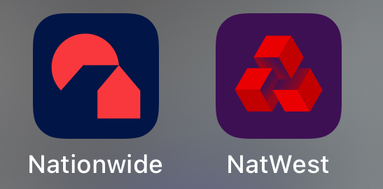
Lot's of logos don't really make sense, they are just meant to be distinctive and easily identifiable. Nationwide has failed there by making everything so similar to Natwest.
0 -
Love the new branding. Looks more modern and more professional. As for those who are confusing the NW icon with the NatWest icon when side by side just move them apart!!! They don't cause me to mix them up.1
-
Malchester said:Love the new branding. Looks more modern and more professional. As for those who are confusing the NW icon with the NatWest icon when side by side just move them apart!!! They don't cause me to mix them up.
 I don’t see the confusion personally with them being side by side.Im an ex employee RBS GroupHowever Any Opinion Given On MSE Is Strictly My Own2
 -
It used to be a tree, now it is the Sun.GeoffTF said:Definitely Pacman at work there. It cannot be the sun, because there is a building behind it.1 -
I've just seen yet another comment from someone with visual difficulties that the colour choice is a poor decision and makes the branding less accessible. Nationwide replied by essentially saying "these meet our guidelines". I am really annoyed with Nationwide with this rebrand. There is clearly something wrong with the accessibility of this branding, yet Nationwide is just ignoring what people are saying about it.3
-
Nationwide are different from most ( all?) other building societies as they are a clearing bank. So you can bank with Nationwide in the same way as you can with HSBC, NatWest etcZaul22 said:There's a lot more use of and focus on the word 'bank' now. Are they changing from a building society to a bank... or just want people to think they are?0 -
stclair said:Malchester said:Love the new branding. Looks more modern and more professional. As for those who are confusing the NW icon with the NatWest icon when side by side just move them apart!!! They don't cause me to mix them up.I don’t see the confusion personally with them being side by side.
Looking at them side by side you can see the difference, but if you are swiping through a list of apps it's not immediately obvious which is which. Normally you'd want a clear identity to distinguish yourself from your competition so it's bizarre that they have chosen something so similar.
6 -
Nationwide isn't a clearing bank. They use Barclays as their clearing bank.Albermarle said:
Nationwide are different from most ( all?) other building societies as they are a clearing bank. So you can bank with Nationwide in the same way as you can with HSBC, NatWest etcZaul22 said:There's a lot more use of and focus on the word 'bank' now. Are they changing from a building society to a bank... or just want people to think they are?0 -
The new TV advert is shown in this article
https://www.thisismoney.co.uk/money/markets/article-12605531/Nationwide-boost-branches-Building-society-launches-rebrand-1980s.html
1 -
It's a message about keeping up with mortgage payments. If you don't keep them up, the smoke from your chimney turns into a giant pacman and eats your house while you're asleep and a crow watches on, laughing probably.4


Confirm your email address to Create Threads and Reply

Categories
- All Categories
- 354.1K Banking & Borrowing
- 254.3K Reduce Debt & Boost Income
- 455.3K Spending & Discounts
- 247.1K Work, Benefits & Business
- 603.8K Mortgages, Homes & Bills
- 178.4K Life & Family
- 261.3K Travel & Transport
- 1.5M Hobbies & Leisure
- 16.1K Discuss & Feedback
- 37.7K Read-Only Boards