We’d like to remind Forumites to please avoid political debate on the Forum.
This is to keep it a safe and useful space for MoneySaving discussions. Threads that are – or become – political in nature may be removed in line with the Forum’s rules. Thank you for your understanding.
📨 Have you signed up to the Forum's new Email Digest yet? Get a selection of trending threads sent straight to your inbox daily, weekly or monthly!
The Forum now has a brand new text editor, adding a bunch of handy features to use when creating posts. Read more in our how-to guide
Nationwide rebranding

gt94sss2
Posts: 6,376 Forumite


Nationwide have changed their logo and branding.
Now live on their website and app.
Have to say, I am not a fan of the redesign.

More details at https://www.nationwide.co.uk/about-us/a-good-way-to-bank/whats-changing/
Now live on their website and app.
Have to say, I am not a fan of the redesign.
More details at https://www.nationwide.co.uk/about-us/a-good-way-to-bank/whats-changing/
6
Comments
-
And how much will they waste updating signs and similar in the branches9
-
Flat cards, at long last. Does that leave only Barclays and Co-operative Bank as the only significant high street current account provider issuing debit cards with raised digits?2
-
Couple of things I've noticed - the prominent 'Building Society' branding is gone and you have to drill in to the 'About Us' section before you find them referring to themselves as such now. Further their tagline is now "A good way to bank.".
The other thing - the Fairer Share info has received the new branding: https://www.nationwide.co.uk/about-us/fairer-share/
I wouldn't expect this would happen unless they intended to rerun the fun. Of course, not a certainty (stranger things have happened!) and even if they do we have no idea what the criteria would be next time around.4 -
Hopefully, they're finally demutualising and I'll get my share of my Building Society before Debs & Co give it all awayWillPS said:Couple of things I've noticed - the prominent 'Building Society' branding is gone and you have to drill in to the 'About Us' section before you find them referring to themselves as such now. Further their tagline is now "A good way to bank.".
The other thing - the Fairer Share info has received the new branding: https://www.nationwide.co.uk/about-us/fairer-share/
I wouldn't expect this would happen unless they intended to rerun the fun. Of course, not a certainty (stranger things have happened!) and even if they do we have no idea what the criteria would be next time around. 0
0 -
They are clearly trying to imitate NatWest with the colour and especially the new logo, a bit like how Lidl design their own brand products so imitate the branded ones.If they want to get anywhere they really need to update their hopeless app instead of fiddling with cosmetic things.1
-
I would have thought the last thing they would want to do is imitate NatWest's branding. People get confused enough already as both can be referred to as NW. I can't see any advantage to increasing that confusion. Banks (and BSoc's) want to stand out from each other, not blend in. So any resemblance is more likely, to my mind, to be a mistake, not deliberate.Rob5342 said:They are clearly trying to imitate NatWest with the colour and especially the new logo, a bit like how Lidl design their own brand products so imitate the branded ones.If they want to get anywhere they really need to update their hopeless app instead of fiddling with cosmetic things.
Lidl etc make their own products with graphics (and also naming) similar to branded stuff to encourage take-up as the items are similar to branded. That's clearly deliberate and intended to remind (and maybe even confuse) people of the alternative branded item. But that's just one-off purchases. A completely different ballgame to having the whole corporate image similar surely..5 -
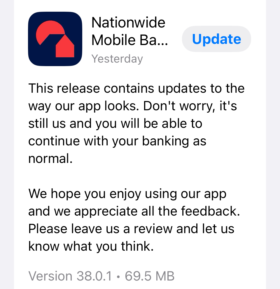
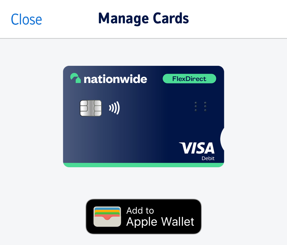
Thanks for the information.Their iOS app has an update with the new branding and you can add the new design debit card to Apple Wallet, if you so wish:
 2
2 -
Is Flex Direct intended to be confused with First Direct?
1 -
The purple background, white text and red logo are virtually identical colours to Natwest, and the shape and size of the logo is very similar (just take the bottom left swirl off the Natwest logo, reshape the other two slightly and you have the Nationwide logo). They can't have been unaware of all that.Zanderman said:
I would have thought the last thing they would want to do is imitate NatWest's branding. People get confused enough already as both can be referred to as NW. I can't see any advantage to increasing that confusion. Banks (and BSoc's) want to stand out from each other, not blend in. So any resemblance is more likely, to my mind, to be a mistake, not deliberate.Rob5342 said:They are clearly trying to imitate NatWest with the colour and especially the new logo, a bit like how Lidl design their own brand products so imitate the branded ones.If they want to get anywhere they really need to update their hopeless app instead of fiddling with cosmetic things.
0


Confirm your email address to Create Threads and Reply

Categories
- All Categories
- 354.1K Banking & Borrowing
- 254.3K Reduce Debt & Boost Income
- 455.3K Spending & Discounts
- 247.1K Work, Benefits & Business
- 603.7K Mortgages, Homes & Bills
- 178.3K Life & Family
- 261.2K Travel & Transport
- 1.5M Hobbies & Leisure
- 16.1K Discuss & Feedback
- 37.7K Read-Only Boards