We’d like to remind Forumites to please avoid political debate on the Forum.
This is to keep it a safe and useful space for MoneySaving discussions. Threads that are – or become – political in nature may be removed in line with the Forum’s rules. Thank you for your understanding.
📨 Have you signed up to the Forum's new Email Digest yet? Get a selection of trending threads sent straight to your inbox daily, weekly or monthly!
The Forum now has a brand new text editor, adding a bunch of handy features to use when creating posts. Read more in our how-to guide
Nationwide rebranding
Comments
-
Same colours as Metro Bank?
0 -
Looks like Pacman about to eat a house, not the best imagery with the current state of mortgages!2
-
The connotations of the new logo clearly have not been scrutinized adequately. A really poor effort, trying to re-position themselves in the sector. This looks like the only purpose is to present themselves like a bank, nothing to do with looking after their members interests.Brian_badonde said:Looks like Pacman about to eat a house, not the best imagery with the current state of mortgages!2 -
subjecttocontract said:Don't see the point. I open accounts with financial institutions based on their offers of a suitable return. It has nothing to do with their logo. Nationwide offers me an 8% reg saver and others go there for the £200 switch bonus. I couldn't care less what their new logo shows.This kind of thing is about brand recognition. If you are looking at a list of similar savings accounts then you might click the NationWest one instead of the others because you have remembered the logo from an advert or on your friends debit card. There's not a lot of logic to it, but when people are faced with arbitrary choices that kind of thing makes a difference. It's like buying a bottle of wine on the way to your Mum's house, logically the wine is the only thing that matters but when presented with various options you might pick the one with the logo you remember from someones house, or the one with the calm looking picture. If there was one with Darren's Red Wine scribbled onto a white label in biro then a lot of people wouldn't touch it.Obviously not everyone is swayed by that kind of thing but enough are to make it worth spending a lot of money on. Personally I wouldn't use NationWest for my current account as they are so old fashioned, especially their unbelievably hopeless app.0
-
What is a modern mutual?
One with some members who are more equal than others..... 6
6 -
I agree but there isn't anything about this that particularly stands out in a positive or eye catching way.Rob5342 said:subjecttocontract said:Don't see the point. I open accounts with financial institutions based on their offers of a suitable return. It has nothing to do with their logo. Nationwide offers me an 8% reg saver and others go there for the £200 switch bonus. I couldn't care less what their new logo shows.
This kind of thing is about brand recognition. If you are looking at a list of similar savings accounts then you might click the NationWest one instead of the others because you have remembered the logo from an advert or on your friends debit card. There's not a lot of logic to it, when people are faced with arbitrary choices that kind of thing makes a difference. It's like buying a bottle of wine on the way to your Mum's house, logically the wine is the only thing that matters but when presented with various options you might pick the one with the logo you remember from someones house, or the one with the calm looking picture. If there was one with Darren's Red Wine scribbled onto a white label in biro then a lot of people wouldn't touch it.
If we're talking logos and/or debit cards, for good or bad Santander's bright red stands out, Monzo's orange, First Direct's black..... but this is just samey......it even clashes to a degree with Nat West. Similar name, similar branding. Defeats the object.
I find it both sad and amusing that an entity such as Nationwide really fall for this PR guff, it won't make a blind bit of difference.
The PR agency must be laughing their cheesy wotsits off.4 -
It's not terrible as far as a rebrand goes. Too many recently have tried too hard to be cool and modern you can no longer tell what the company is. In that sense it's a success. However does it draw me in as a customer? I don't think so.0
-
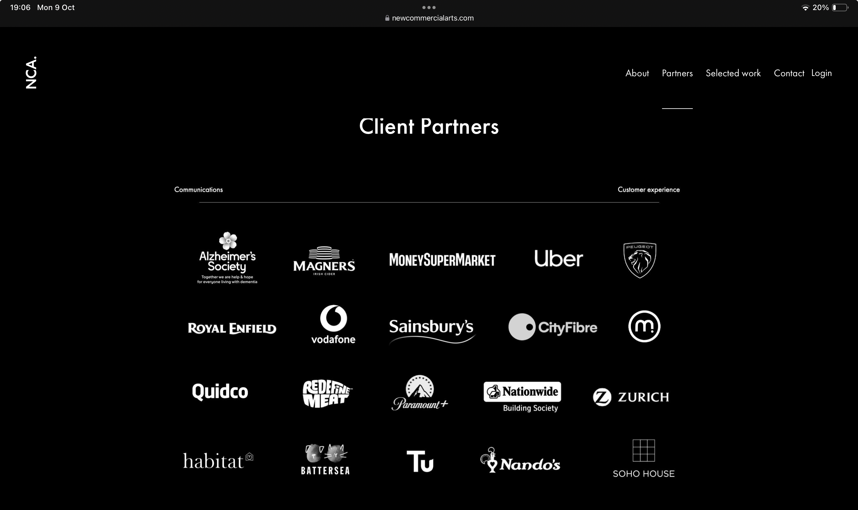
Apparently both the rebrand and the new advert were created by a company called New Commercial Arts. Amusingly, it hasn't updated its website with the new logo:Bazzalona13295 said:
I agree but there isn't anything about this that particularly stands out in a positive or eye catching way.Rob5342 said:subjecttocontract said:Don't see the point. I open accounts with financial institutions based on their offers of a suitable return. It has nothing to do with their logo. Nationwide offers me an 8% reg saver and others go there for the £200 switch bonus. I couldn't care less what their new logo shows.
This kind of thing is about brand recognition. If you are looking at a list of similar savings accounts then you might click the NationWest one instead of the others because you have remembered the logo from an advert or on your friends debit card. There's not a lot of logic to it, when people are faced with arbitrary choices that kind of thing makes a difference. It's like buying a bottle of wine on the way to your Mum's house, logically the wine is the only thing that matters but when presented with various options you might pick the one with the logo you remember from someones house, or the one with the calm looking picture. If there was one with Darren's Red Wine scribbled onto a white label in biro then a lot of people wouldn't touch it.
If we're talking logos and/or debit cards, for good or bad Santander's bright red stands out, Monzo's orange, First Direct's black..... but this is just samey......it even clashes to a degree with Nat West. Similar name, similar branding. Defeats the object.
I find it both sad and amusing that an entity such as Nationwide really fall for this PR guff, it won't make a blind bit of difference.
The PR agency must be laughing their cheesy wotsits off.
https://www.newcommercialarts.com/partners
https://www.campaignlive.co.uk/article/nationwide-embarks-its-biggest-rebrand-36-years/1839966
3 -
The phrase 'money for old rope' springs to mind.wmb194 said:
Apparently both the rebrand and the new advert were created by a company called New Commercial Arts. Amusingly, it hasn't updated its website with the new logo:Bazzalona13295 said:
I agree but there isn't anything about this that particularly stands out in a positive or eye catching way.Rob5342 said:subjecttocontract said:Don't see the point. I open accounts with financial institutions based on their offers of a suitable return. It has nothing to do with their logo. Nationwide offers me an 8% reg saver and others go there for the £200 switch bonus. I couldn't care less what their new logo shows.
This kind of thing is about brand recognition. If you are looking at a list of similar savings accounts then you might click the NationWest one instead of the others because you have remembered the logo from an advert or on your friends debit card. There's not a lot of logic to it, when people are faced with arbitrary choices that kind of thing makes a difference. It's like buying a bottle of wine on the way to your Mum's house, logically the wine is the only thing that matters but when presented with various options you might pick the one with the logo you remember from someones house, or the one with the calm looking picture. If there was one with Darren's Red Wine scribbled onto a white label in biro then a lot of people wouldn't touch it.
If we're talking logos and/or debit cards, for good or bad Santander's bright red stands out, Monzo's orange, First Direct's black..... but this is just samey......it even clashes to a degree with Nat West. Similar name, similar branding. Defeats the object.
I find it both sad and amusing that an entity such as Nationwide really fall for this PR guff, it won't make a blind bit of difference.
The PR agency must be laughing their cheesy wotsits off.
https://www.newcommercialarts.com/partners
https://www.campaignlive.co.uk/article/nationwide-embarks-its-biggest-rebrand-36-years/1839966 4
4 -
Bazzalona13295 said:
The phrase 'money for old rope' springs to mind.wmb194 said:
Apparently both the rebrand and the new advert were created by a company called New Commercial Arts. Amusingly, it hasn't updated its website with the new logo:Bazzalona13295 said:
I agree but there isn't anything about this that particularly stands out in a positive or eye catching way.Rob5342 said:subjecttocontract said:Don't see the point. I open accounts with financial institutions based on their offers of a suitable return. It has nothing to do with their logo. Nationwide offers me an 8% reg saver and others go there for the £200 switch bonus. I couldn't care less what their new logo shows.
This kind of thing is about brand recognition. If you are looking at a list of similar savings accounts then you might click the NationWest one instead of the others because you have remembered the logo from an advert or on your friends debit card. There's not a lot of logic to it, when people are faced with arbitrary choices that kind of thing makes a difference. It's like buying a bottle of wine on the way to your Mum's house, logically the wine is the only thing that matters but when presented with various options you might pick the one with the logo you remember from someones house, or the one with the calm looking picture. If there was one with Darren's Red Wine scribbled onto a white label in biro then a lot of people wouldn't touch it.
If we're talking logos and/or debit cards, for good or bad Santander's bright red stands out, Monzo's orange, First Direct's black..... but this is just samey......it even clashes to a degree with Nat West. Similar name, similar branding. Defeats the object.
I find it both sad and amusing that an entity such as Nationwide really fall for this PR guff, it won't make a blind bit of difference.
The PR agency must be laughing their cheesy wotsits off.
https://www.newcommercialarts.com/partners
https://www.campaignlive.co.uk/article/nationwide-embarks-its-biggest-rebrand-36-years/1839966
Ironic or what that the New Commercial Arts website features the old Nationwide logo
1
Confirm your email address to Create Threads and Reply

Categories
- All Categories
- 354.1K Banking & Borrowing
- 254.3K Reduce Debt & Boost Income
- 455.3K Spending & Discounts
- 247.1K Work, Benefits & Business
- 603.7K Mortgages, Homes & Bills
- 178.3K Life & Family
- 261.2K Travel & Transport
- 1.5M Hobbies & Leisure
- 16.1K Discuss & Feedback
- 37.7K Read-Only Boards


