We’d like to remind Forumites to please avoid political debate on the Forum.
This is to keep it a safe and useful space for MoneySaving discussions. Threads that are – or become – political in nature may be removed in line with the Forum’s rules. Thank you for your understanding.
Nationwide rebranding
Comments
-
When you say 'everyone else' you really mean everyone who has a similar outlook to you about personal finance, and maybe even spends time on MSE forums.subjecttocontract said:........and if a competitor offers an account with a better interest rate I, like nearly everyone else, will be gone like a flash without a thought for this or any other logo.
However in the real world, there are Billions still languishing in current accounts or low paying savings account.
Even people who take a mild interest ( which is probably the majority of the population) will probably only review their savings once a year at most. Then most will shy away from smaller providers they have never heard of, and stick with the big names, new logo or not.4 -
Does rebranding work?And what it the aim - really, of rebranding.Quality of service seems to bring in the punters but that doesn't go on the head honchos cv.I have yet to forgive them for my 60mile round trip to open an ISA (don't ask) and they didn't tell me I needed a 'cheque book'!I'd rather if they've got that sort of surplus money they gave it to their customers/charity whatever.And this from someone who trained in rebranding........so many, so little reason, often so awful.
I can rise and shine - just not at the same time!
viral kindness .....kindness is contageous pass it on
The only normal people you know are the ones you don’t know very well
2 -
why do they always remove the character of older logos? and what is wrong with capital letters?
its like new football stadiums, they lose the soul of the old place.0 -
tiger135 said:why do they always remove the character of older logos? and what is wrong with capital letters?
its like new football stadiums, they lose the soul of the old place.Some might argue in this case the logo/rebrand is just catching up to the reality of the organisation.'Mutual' for legal purposes only.4 -
If it`s in the directors interest, they would soon demutualise and turn it into a bank.
I expect at the moment they`re making more money leaving it the way it is and wasting 38 million (if that figure is true) on rebranding.
NW has never been known for top paying saving rates.
Although they did give a member`s loyalty bonus earlier this year, the first time ever.
Even that was a bit of a fiasco.
0 -
In the article they say they wanted a modern look, then in a few lines later say they were influenced by 80s and 90s???stclair said:This details the story behind the branding:
https://www.designweek.co.uk/nationwide-rebrand-new-commercial-arts/0 -
I made that number up.2010 said:
I expect at the moment they`re making more money leaving it the way it is and wasting 38 million (if that figure is true) on rebranding.
0 -
That would be the modern 1980s and 1990s... not the old ones.MACKEM99 said:
In the article they say they wanted a modern look, then in a few lines later say they were influenced by 80s and 90s???stclair said:This details the story behind the branding:
https://www.designweek.co.uk/nationwide-rebrand-new-commercial-arts/
3 -
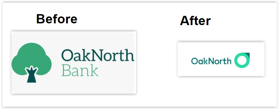
nationwide may have started a trend. I just had an email from OakNorth, advising their rebranding. It looks like trees are on their way out

Hi there,
OakNorth has had a little refresh!
Why the new look?
We started helping ambitious savers like you back in 2015. Since then, things have changed. We’ve launched new products, won industry awards, and brought you a highly-rated mobile app.
We believe your customer experience with us should feel transparent, modern and simple – something our old brand couldn’t always achieve. Our new look and feel is just another way to help you with frictionless saving. Nothing else has changed; our commitment to helping you is as strong as it was when we first began.
What do I need to do?
You don’t need to do anything (apart from admire our new brand, of course).
Has everything been rebranded?
Our website and your mobile banking have been updated with our new brand. Your web online banking will look the same as it does today, but you’ll see our new logo. In the next few weeks, you’ll start to see our new designs rolled out across all of your experiences.
Why we are letting you know?
Seeing things that look different can be alarming, especially when it’s your bank. We want you to know that our new brand is just a fresh lick of paint, but we’re still the same OakNorth.
1 -
From the article linked above,tiger135 said:why do they always remove the character of older logos? and what is wrong with capital letters?
its like new football stadiums, they lose the soul of the old place.
"A noticeable change is Nationwide’s move to a lowercase n. Aesthetically, this makes all letters the same height, Curran feels that a capital N would disrupt the flow from the icon into the wordmark. The goal was to make the wordmark appear “modern but familiar” and “simultaneously bold and humble”, which invovled hundreds of iterations, according to Curran. Building Society was also dropped from the wordmark in an effort to make it “cleaner and sharper”, Kehoe adds."0
Confirm your email address to Create Threads and Reply

Categories
- All Categories
- 354K Banking & Borrowing
- 254.3K Reduce Debt & Boost Income
- 455.3K Spending & Discounts
- 247.1K Work, Benefits & Business
- 603.7K Mortgages, Homes & Bills
- 178.3K Life & Family
- 261.2K Travel & Transport
- 1.5M Hobbies & Leisure
- 16.1K Discuss & Feedback
- 37.7K Read-Only Boards


