We’d like to remind Forumites to please avoid political debate on the Forum.
This is to keep it a safe and useful space for MoneySaving discussions. Threads that are – or become – political in nature may be removed in line with the Forum’s rules. Thank you for your understanding.
📨 Have you signed up to the Forum's new Email Digest yet? Get a selection of trending threads sent straight to your inbox daily, weekly or monthly!
Child & Co RBS Branch to close
Comments
-
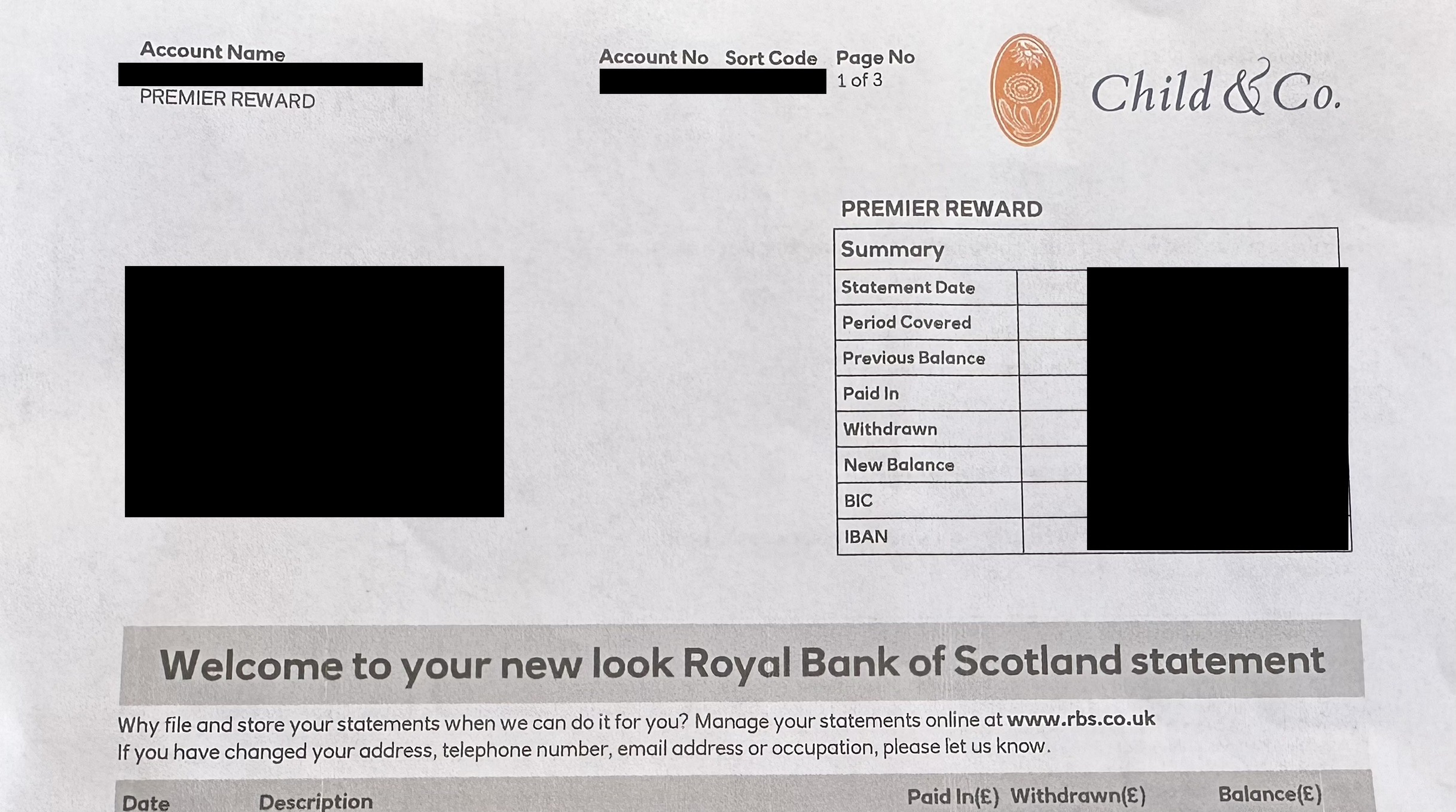
Still branded, but had badly-registered print - the yellow ink in the logo was offset to the left and looked a bit shabbygary1312 said:
Do they still have the Child branding?PloughmansLunch said:Booo! Statements have changed for the worse - I liked the dinky size of the previous format, but had some bog standard A4s through the post today.
I did get one of these new-style statements for my NatWest Reward last week and was wondering if RBS would also be changing format.0 -
I got my first statement a few weeks ago and it was the smaller size with the Child & Co branding in the corner.PloughmansLunch said:Booo! Statements have changed for the worse - I liked the dinky size of the previous format, but had some bog standard A4s through the post today.0 -
2nd Child & Co and 1st NatWest Statement arrived today. Apart from the branding in the corner the formatting is identicalSe1Lad said:
I got my first statement a few weeks ago and it was the smaller size with the Child & Co branding in the corner.PloughmansLunch said:Booo! Statements have changed for the worse - I liked the dinky size of the previous format, but had some bog standard A4s through the post today.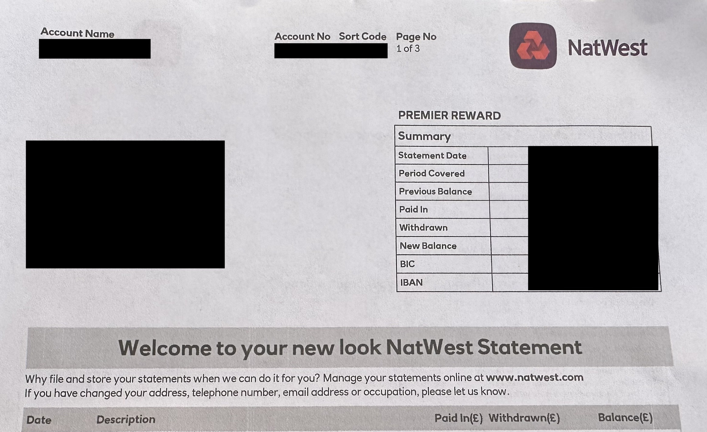
 1
1 -
Yep. Statement formats between RBS and Natwest were pretty much the only thing which hadn't been harmonised between the two, presumably to ensure they were still sending out statements which would fit already-issued binders.
At a guess this change allows Natwest Group to no longer do the printing themselves - instead they can just send them to any secure facility with a standard A4 printer. At the very least they wouldn't need specialised printing equipment if they are still doing it in-house.0 -
It looks cheap but at least they kept the branding.0
-
TBF the previous version wasn’t any better or worse. I think the previous RBS style was pretty much unchanged from the 1990s![Deleted User] said:It looks cheap but at least they kept the branding.0 -
The previous one was on better quality paper and properly printed to high quality. These new ones look as if they have come out of an ink jet printer.0
-
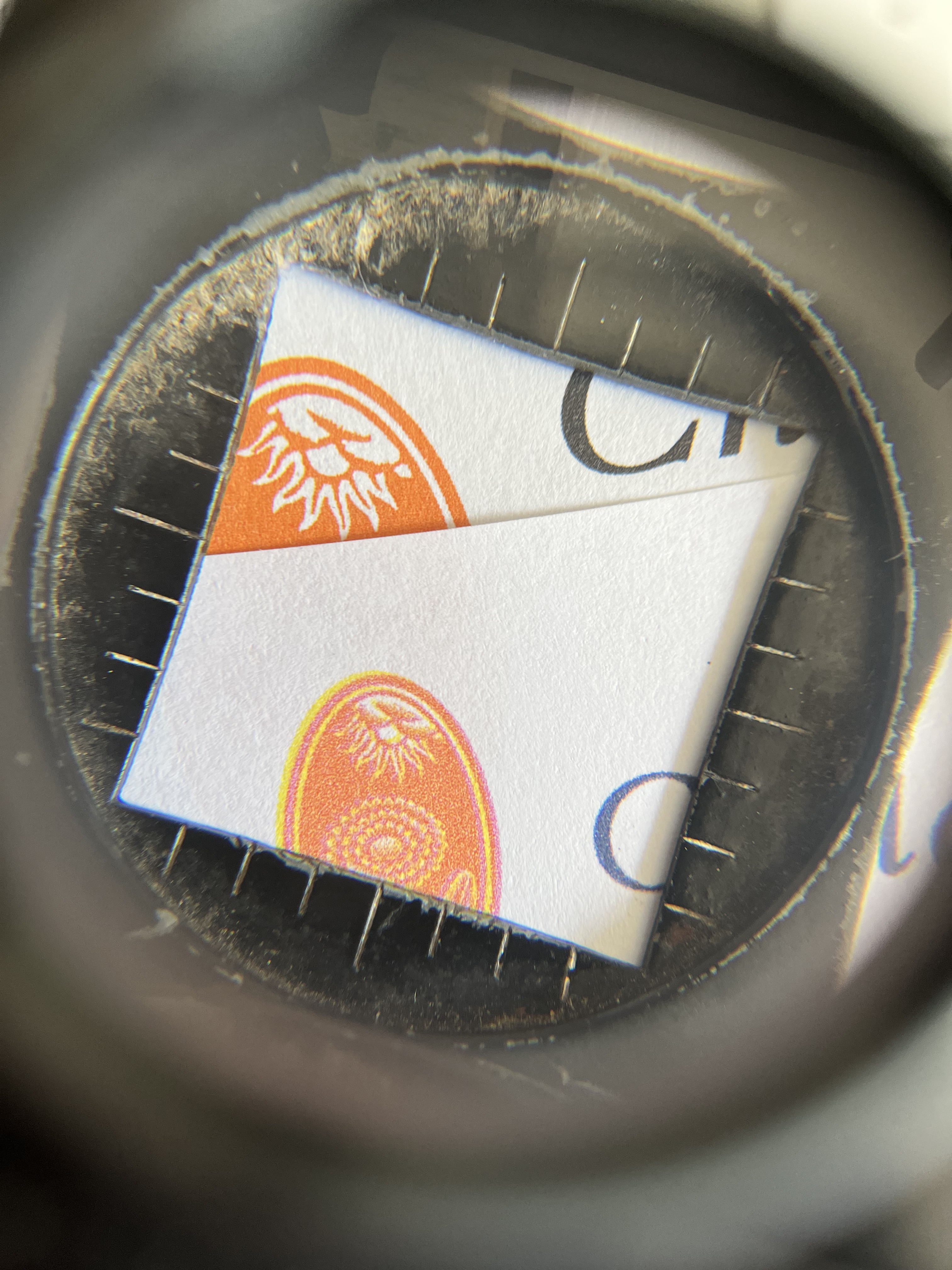
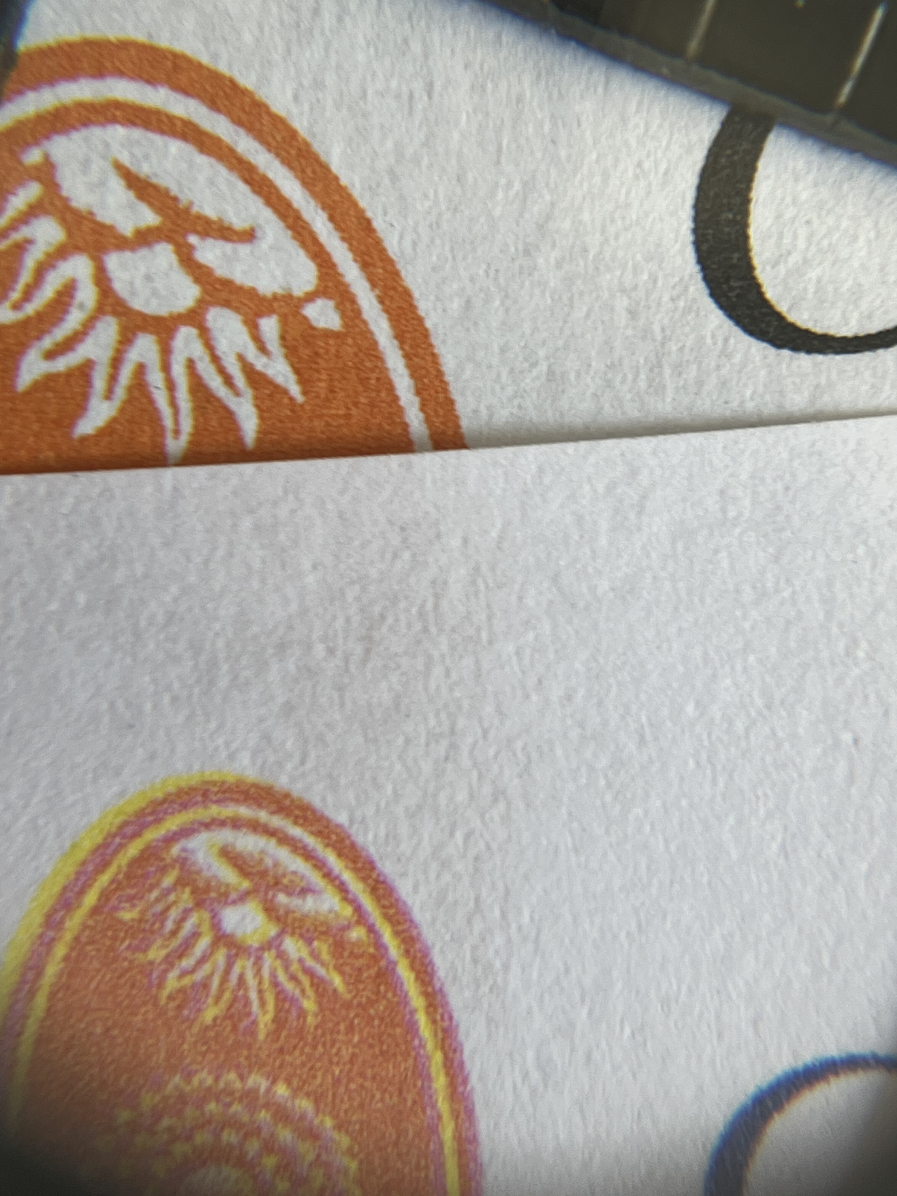
If, like me, you like to spend your days looking at bank statements through a printer’s loupe, the difference is pretty striking. Bottom is the newer style.
 1
1 -
Is the information readable? If so, who cares. You're not about to go flashing your statements off to impress your mates (as one might for a fancy debit card/chequebook).
3 -
It's an entire product, the point I was trying to raise to you in the Barclays thread, but seemed to go over your head. A bank account is a product, if it is a premium product, all aspects should reflect that.0


Confirm your email address to Create Threads and Reply

Categories
- All Categories
- 355K Banking & Borrowing
- 254.6K Reduce Debt & Boost Income
- 455.7K Spending & Discounts
- 247.8K Work, Benefits & Business
- 604.8K Mortgages, Homes & Bills
- 178.7K Life & Family
- 262.5K Travel & Transport
- 1.5M Hobbies & Leisure
- 16.1K Discuss & Feedback
- 37.7K Read-Only Boards