We’d like to remind Forumites to please avoid political debate on the Forum.
This is to keep it a safe and useful space for MoneySaving discussions. Threads that are – or become – political in nature may be removed in line with the Forum’s rules. Thank you for your understanding.
📨 Have you signed up to the Forum's new Email Digest yet? Get a selection of trending threads sent straight to your inbox daily, weekly or monthly!
The Forum now has a brand new text editor, adding a bunch of handy features to use when creating posts. Read more in our how-to guide
Welcome to the new Forum look – give us your feedback
Comments
-
Sorry, it's not good

It takes ages to actually find anything now. It's too bright and mis-aligned.
Another vote for changing back or having the option to choose between old and new as before.1 -
And it's goodbye from him!purdyoaten2 said:Absolutely awful changes for no reason whatsoever - it’s goodbye from me!
3 -
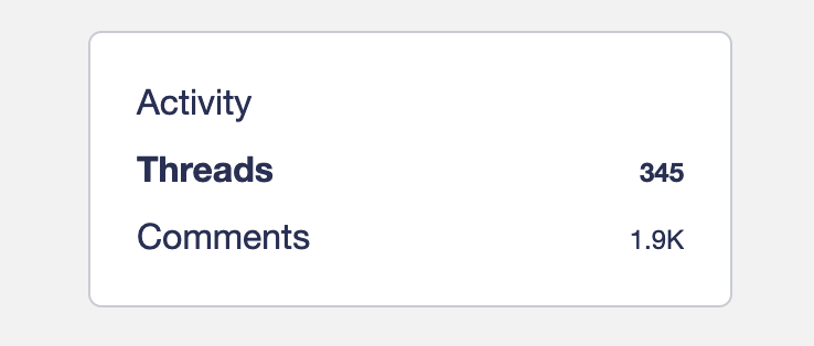
Thanks. When I looked earlier there was nothing there. Hey Hoo... 👍MSE_James said:@born_again - You can still see all threads and replies (comments) on a user's profile - look for this box on the right hand side on a large screen device. The same box appears lower down the page on mobile view:
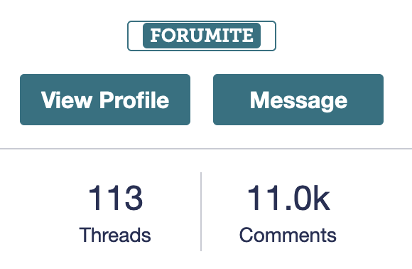
If you click once on a user's avatar or username next to their post, the card that appears also contains clickable links to their threads and comments: Life in the slow lane0
 -
Agree with this, finding it really annoying! Keeps blocking what I'm doing!oliveoyl said:I quite like the new homepage.
There's one thing I find super irritating, it's the way the drop down lists appear as you move your mouse past them (Quick Links & Categories) - could you make them click to reveal drop down?Wins in 2023 - 35
Wins in 2022 - 43
Wins in 2021 - 62
Wins in 2020 - 68
Wins in 2019 - 52 -
It might help everyone to accept this if we knew the reason why MSE required this massive change.
Surely changes should happen but in minor increments based on feedback4 -
No, please go back to how it was. Why are you always changing things for the worse?1
-
Another one here to moan about the "Quick links" dropdown box being annoying - it won't disappear from my screen unless I refresh the page.Thanks to all posters :A1
-
The first time i've visited since the change.
What WERE you thinking?3 -
MikeJXE said:It might help everyone to accept this if we knew the reason why MSE required this massive change.
Surely changes should happen but in minor increments based on feedbackI understand that there will need to be changes from time to time to keep up with new OS and security requirements.Surely that shouldn't also require a complete change in the appearance (particularly colour scheme) on the user side of things.2 -
What I do like is I can easily get to my favourites (maybe I could before but never tried.
I have favourites in banking, savings, energy, techie stuff, and a few more.
What is mostly surprising is they were always very very busy busy I could hardly keep up as I spent most of my day on here.
Now nothing happening1
Confirm your email address to Create Threads and Reply

Categories
- All Categories
- 354.3K Banking & Borrowing
- 254.4K Reduce Debt & Boost Income
- 455.4K Spending & Discounts
- 247.2K Work, Benefits & Business
- 603.9K Mortgages, Homes & Bills
- 178.4K Life & Family
- 261.4K Travel & Transport
- 1.5M Hobbies & Leisure
- 16.1K Discuss & Feedback
- 37.7K Read-Only Boards


