We’d like to remind Forumites to please avoid political debate on the Forum.
This is to keep it a safe and useful space for MoneySaving discussions. Threads that are – or become – political in nature may be removed in line with the Forum’s rules. Thank you for your understanding.
📨 Have you signed up to the Forum's new Email Digest yet? Get a selection of trending threads sent straight to your inbox daily, weekly or monthly!
The Forum now has a brand new text editor, adding a bunch of handy features to use when creating posts. Read more in our how-to guide
Welcome to the new Forum look – give us your feedback
Comments
-
Going to a Board to review new discussions, the screen is a mess. Very difficult to scan down the list of subjects. What was wrong about the compact style before?
I suspect it has been designed by people who are not users of the forum. This may in theory be 'cleaner' per the rules of design, but people come here for information.
On the pages with posts, the amount of wasted space to the left and right is ridiculous (on a PC screen at least). I hope that space has not been left there for adverts and promotions to be placed there in the future.0 -
I've commented on the same issue, it has changed since yesterday, so some work has been done on it, but it doesn't work how intended, or how it used to. Today I'm finding that it's popping up new posts from yesterday or even earlier and sometimes marking them as read, just makes other old ones pop to the top.cymruchris said:I'd like to get my head around notifications, as it really isn't making much sense to me at the moment.[...]But in general, it keeps taking me back to stuff I've seen yesterday, or have already read. Why does it tell us there are X new comments when there are none? Is this a 'Broken and we're trying to fix it' - or is this 'that's how it's supposed to look and work'?
I've found that using the 'bookmarked threads' in the quick links menu (might appear to the right or below content depending on screen size) is much more reliable for actually getting to new unread posts in followed threads. It's a workaround, but slightly less frustrating.0 -
With the help of ublock I am able to use the site, but only bothered with a couple of forums.
I thought why I think it looks like a site for children, I feel it looks cartoonish.
With the near universal dislike of the new look, I fear all that is happening is the shuffling of deckchairs on the Titanic, as the look is the problem.
Let's Be Careful Out There0 -
Hiya @MSE_Laura_FMSE_Laura_F said:
Good point @Black_Cat2 🤭Black_Cat2 said:Can someone explain why my favourite category:Greenfingered MoneySaving
... has an image of someone knitting at the top?!
I'm an avid gardener but even I can't knit whilst weeding my vegetables! 😹
The boards inherit their banner from the category they sit under. But you're right that the Greenfingered MoneySaving should have its own custom banner. I've added a new image (a branch of 'Senegalia pennata'). Let me know what you think.
MSE Laura F
Thanks so much for the new banner! I like the choice you've made 😻
For those of you that are interested there's many amazing garden/plant pics from the contributors in the 'awful weather' thread if anyone wants to pop along for a look 🐈Just my opinion, no offence 🐈2 -
Thanks for the response. You say investigating solutions to issues - does this include going back to the previous forum while you address the hundreds of issues mentioned here? Or is that a non starter?MSE_JC said:
This is exactly the case @boingyboingy said:
They have responded a few pages back. They said:EricMears said:Without any response from MSE, the whole thread becomes utterly pointless.We want you to be aware that even though we're unable to respond to each post, we are reading all of the feedback in the thread. We're sure you'll appreciate that there is a lot of it to go through!It's early days so I imagine they will be taking it all in and then deciding if they need to change anything.
We've responded a few times in the thread, but the team are focusing on reading all the feedback, prioritising and investigating solutions to issues - this all takes time.
We'll have a more detailed general update soon, and we thank everyone for their patience in the meantime.1 -
One thing I've just noticed. I went to check my bookmarks it was showing I have 29. I've just removed 1 and it is now showing I have 30. I counted them and I actually have 24 so something wrong somewhere.2
-
In a word-UNUSABLE.3
-
Just noticed a big problem, that was a great feature in the old software.
Clicking on a user allowed you to vies old threads (very useful as some start new threads on same subject)
This has disappeared (or at least I can't find the option in a users profile..
Pleas get this back, as it really helps to link thread together.
Example
https://forums.moneysavingexpert.com/discussion/6459609/query-about-right-of-way#latest
Life in the slow lane1 -
I can't tell if its website or user issue... go to latest threads - page 1 makes sense I've only read the one thread (that not in bold)

I navigate to page 2 and I've not read any of those with a red mark - shouldn't they show as such (bold/new?)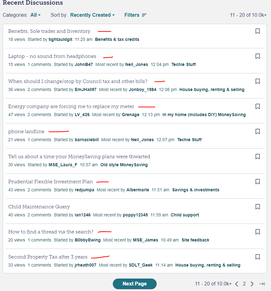
Also when using the navigate buttons at the bottom (not next page button, the < > icons) there's an issue in the refresh - see yellow highlighted sections [edited to add - using a windows laptop, chrome browser] (NB. it'd be good to have a 'previous page' button to sit alongside the 'next page' button?) also edited to add - when you post the page refresh jumps you to the very bottom/footer so you have to annoyingly scroll back up again each time? just me? Aim:12mth Emergency Fund -> £14264/£17076 (83%) Aim 2: Mortgage Overpayment -> Paused until other aim fulfilled.2


Confirm your email address to Create Threads and Reply

Categories
- All Categories
- 354.6K Banking & Borrowing
- 254.5K Reduce Debt & Boost Income
- 455.5K Spending & Discounts
- 247.5K Work, Benefits & Business
- 604.3K Mortgages, Homes & Bills
- 178.5K Life & Family
- 261.9K Travel & Transport
- 1.5M Hobbies & Leisure
- 16.1K Discuss & Feedback
- 37.7K Read-Only Boards