We’d like to remind Forumites to please avoid political debate on the Forum.
This is to keep it a safe and useful space for MoneySaving discussions. Threads that are – or become – political in nature may be removed in line with the Forum’s rules. Thank you for your understanding.
📨 Have you signed up to the Forum's new Email Digest yet? Get a selection of trending threads sent straight to your inbox daily, weekly or monthly!
The Forum now has a brand new text editor, adding a bunch of handy features to use when creating posts. Read more in our how-to guide
Welcome to the new Forum look – give us your feedback
Comments
-
This is because the underlying coding uses {div} and {br} where it should, according to HTML standards, be using {p}. (I have to use curly braces rather than angle brackets, or it tries to parse the angle brackets, and I can't be bothered to shift into HTML mode to use {pre} encoding.)polymaff said:The composition system is even worse in terms of paragraph spacing. Try to single-space paragraphs. If it looks right in the composition mode it becomes double-spaced in Preview - and triple-spaced (may actually be quad-spaced) in the posted item.Just look at some of today's postings - paragraphs all over-spaced.EDIT: Yep, this post is showing this exact effect. It was typed with single-spacing
4 -
If I could ask for one thing it would be...
The ability to go to Recent Discussions / Following / Recently Commented in ONE CLICK
and then, once i've read a few pages worth, the ability to go straight back to the first one (page), and have it refreshed (thereby showing any more new ones)
I have to choose these options every time.How's it going, AKA, Nutwatch? - 12 month spends to date = 3.24% of current retirement "pot" (as at end December 2025)1 -
Really don’t like it. Not as easy to navigate as the previous layout. Thought I’d hit a “spam” board yesterday when I saw it, shocked to find it is the real thing now. Even worse looking on a mobile phone than an iPad.Paddle No 21:wave:1
-
With this new look Sigs should be looked into
A signature should be a few lines at most, not a life story, that is the job of a profile
Let's Be Careful Out There9 -
The main issue for me is the broken notifications. For example I have a few notifications of posts made in the last 24 hours, after reviewing them come back later to hundreds in each of those threads going back over a month. It's great that notifications are threaded now, but once read they should stay read.
2 -
Agreed.HillStreetBlues said:With this new look Sigs should be looked into
A signature should be a few lines at most, not a life story, that is the job of a profile
An earlier post on this thread had a signature that took up almost half a page.
4 -
Installed a 'dark mode' plug-in for Firefox, so I can once again post without suffering severe eye-strain.Biggest issue now is the lack of contrast between the colours used for read and unread threads, together with the really small amount of screen space used for content on a PC.It looks like the mobile version of the site has gone live but the PC version got forgotten...2
-
The red 'plus' roundel on a phone is in the wrong place by being on the right.
It is smack bang in the way of 'Post / Save Comment' when you are typing or editing a reply.
The red roundel thingy should be on the left - or preferably removed altogether because when you are replying on a specific thread, it is completely inappropriate to give newbies the option to 'start a new thread or poll' from that position.
The last thing new posters should be encouraged to do is bypass page one and reading the sticky threads and current posts, and instead just launch straight into a new thread after reading just one very old one from 2014 that Google found for them!PRIVATE 'PCN'? DON'T PAY BUT DON'T IGNORE IT (except N.Ireland).
CLICK at the top or bottom of any page where it says:
Home»Motoring»Parking Tickets Fines & Parking - read the NEWBIES THREAD4 -
I'm with you, it was difficult enough on my phone earlier today but now I am on my laptop I'm having even more trouble with this myself. As I commented earlier today, it's just a page of insipid dullness that leaves me uninspired to dig any deeper at the moment.Spoonie_Turtle said:Having used it a bit more today with more activity, I'm realising how much brain power it takes to parse thread titles out of all the other info displayed. It's given me a headache.
So many things in bold, and the size difference in thread titles is not enough.
Funnily enough looking at it on the screenshot is not actually too bad, but on the full size of the screen and scrolling through whole pages on the board is a lot of mental effort which I don't have to spare. I need that cognitive capacity for reading and responding to posts, not all used up identifying which threads I want to read in the first place.
Ugh.
I'm sorry, I don't want to just be moaning, but this is much more than a niggle.
Using your colour coding idea from earlier, here's some of the info I think needs changing on the image below. The red boxes are just not required info at all - I know I'm on the Energy board, and it frankly doesn't matter how many likes or views a post has at this point when I'm trying to find a topic. That information can be put elsewhere, or made far more discreet. The blue boxes don't need to be bolded, they also take away from the topic title. The green boxes are the information I am actually after, and need to be more prominent, or have the text coloured differently to make them stand out more from the rest of the noise around them.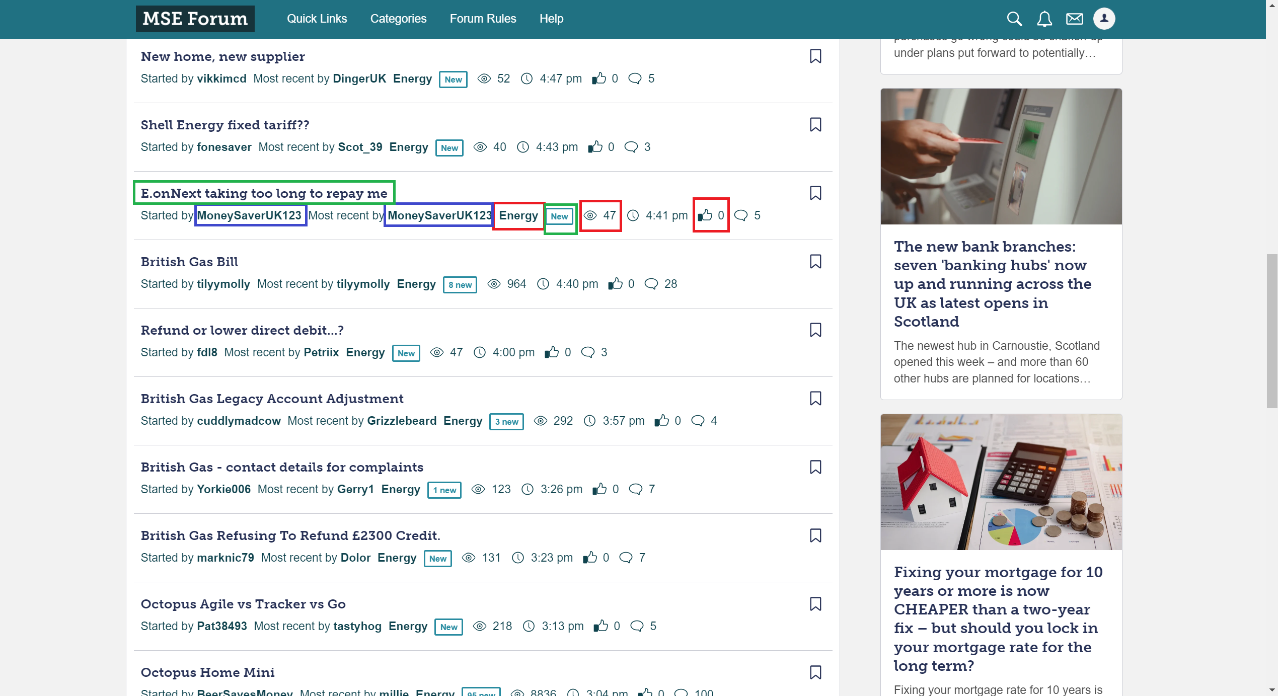
7 -
Not having categories on the front page at the top is very annoying.0


Confirm your email address to Create Threads and Reply

Categories
- All Categories
- 354.6K Banking & Borrowing
- 254.5K Reduce Debt & Boost Income
- 455.5K Spending & Discounts
- 247.5K Work, Benefits & Business
- 604.4K Mortgages, Homes & Bills
- 178.6K Life & Family
- 261.9K Travel & Transport
- 1.5M Hobbies & Leisure
- 16.1K Discuss & Feedback
- 37.7K Read-Only Boards