We’d like to remind Forumites to please avoid political debate on the Forum.
This is to keep it a safe and useful space for MoneySaving discussions. Threads that are – or become – political in nature may be removed in line with the Forum’s rules. Thank you for your understanding.
📨 Have you signed up to the Forum's new Email Digest yet? Get a selection of trending threads sent straight to your inbox daily, weekly or monthly!
The Forum now has a brand new text editor, adding a bunch of handy features to use when creating posts. Read more in our how-to guide
Welcome to the new Forum look – give us your feedback
Comments
-
I totally agree with this.EnglishWelshie said:Clickable links on posts not much different in colour to normal text making you have to look twice.
The word agree in the previous sentence is a link (to show the problem)
BTW in the editor it is blue and underlined, and even in preview it is quite different. It is only when posted that it is hard to see any difference to normal text.
4 -
I doubt anyone expects a response for every post as many of the criticisms are the same.MSE_JC said:Hi all,
We want you to be aware that even though we're unable to respond to each post, we are reading all of the feedback in the thread. We're sure you'll appreciate that there is a lot of it to go through!
Thanks,
MSE JC
As it's getting on for 24 hours since it was rolled out, an update of what are the options MSE are considering would be good.
Keep tweaking
Major update on the new look
Roll back to old look and try again
Keep new look and try again
All of the above?
Let's Be Careful Out There5 -
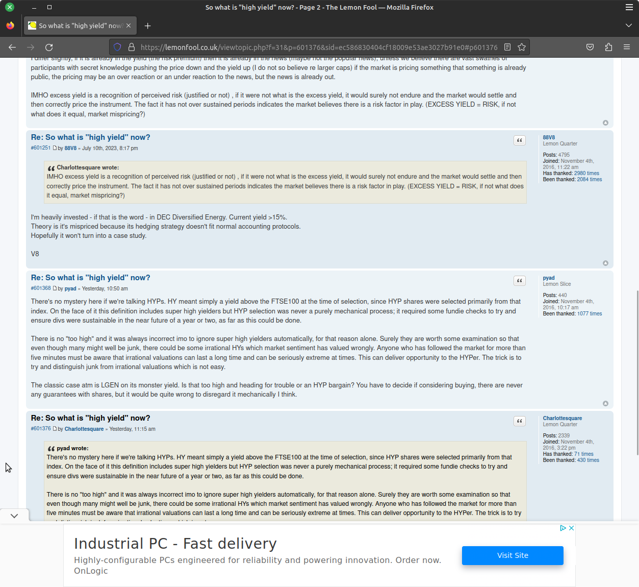
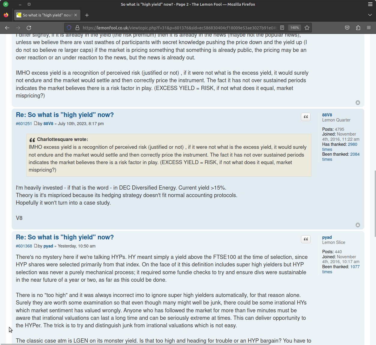
Troytempest said:lemonfool.co.uk is a layout that looks like it was designed by grown ups. MSE looks like it was designed by children.That one is rather good!Look how much content you get on a page!
 Plus the content adjusts to page resizes.
 And if I zoom.
0 -
On first impressions I actually quite like the new look overall on laptop. Maybe the post content text is a bit light.
I haven't tried it on mobile yet.My two bugbears still remain though, both of them in the post editor.The first is the linespacing issue - I'm sure I need to say no more about that, but I will.
It's annoying to have to go back and edit almost every post you make just to sort out the linespacing, the editor itself, or at the very least the preview, should show exactly how the submitted post will be formatted.Fixing that would help remove some of the excess whitespace too, a lot of posts even on this thread have double rows of white lines between lines of text.The second should be easier to fix - Why is there no underscore text icon and yet there is a strikeout?
Surely underscore would be the more useful of the two for most user?
As it is though there is plenty of room on that menu bar to add the underscore and have both.
Someone with forum admin access could to do that in seconds, it isn't difficult to add/remove those icons.PS. I do like that in the expanded editor you can turn the background black, I can't remember that being in Ye olde forum.0 -
Really? I suggested it was a bit Teletubbies, and maybe a new editor had decided to apply the new broom concept, but I don’t recall anything personal. Regardless you could have removed the bit that upset you rather than all of it. A dozen likes inside 10 minutes suggests my main points were quite valid, and as a former web dev (now retired) I have some insight not just to the techie stuff but accessibility and ease of use.MSE_JC said:
As mentioned earlier in the thread, the Forum's rules about polite and mindful posts still apply. While we want people to share their thoughts about the new design (both good and bad), we ask that people refrain from making unfriendly comments about MSE staff.Username03725 said:Well. My bulleted list from less than an hour ago of why this is so poor has gone.
Not up to a bit of criticism then MSE?
Honestly...
https://www.moneysavingexpert.com/site/forum-faqs/
"Be respectful, polite, friendly and mindful of the impact of your posts to other community members, Forum Ambassadors and MSE staff – everyone is human here. This rule is non-negotiable."
"Our team are human, have feelings and run this Forum to help you."
I presume you read and noted my criticisms…
Thanks.5 -
My first opinion upon seeing it yesterday was negative, having browsed it yesterday and today it has only reinforced my view that this "upgrade" was in fact a significant step backwards.
Overall, the layout uses colours which are far too similar and overall the site is too bright visually. The colour scheme is poor for normally sighted individuals, in those with visual impairments it would be regarded as abysmal. You have also broken convention with clickable links, both in colour and their fact that they do not semi-bold as links should.
On mobile, space is poorly used, with the box and space around each post taking up excessive amounts of screen space, the stacking of name, badges "Forumite" and time of posting stacked up over four lines, that means it takes up far more space than needed. Then there is then excessive white space around the post content itself, as well as below the "Report, Quote Thanks" buttons. There is even more excess white space if the poster has quoted a previous poster. This makes very poor use of the display. The site is less efficient to navigate, with fewer posts on each page of a thread requiring far more presses and loading.
On desktop the site again makes poor use of screen space, the posts taking up less than a third of the width of the screen. No one would want a full width option, especially with 4k screens, but the actual body text taking up 23% of the width of the screen is a very bad design choice. The large "header" for each individual post as well as too much white space around the posts makes scrolling inefficient and is again a poor UI choice. The moving of navigation elements to the right of the screen is odd to say the least, breaks with convention across the internet and UI design and should not be done, ever.
The text editor now displays in a different font, both in the font itself and the font size compared to the body text, this is a poor design decision, although just about tolerable. The preview does not match what the post looks like once it is posted.
I will post other issues I note as and when I find them.5 -
the linespacing issue -
It's annoying to have to go back and edit almost every post you make just to sort out the linespacing, the editor itself, or at the very least the preview, should show exactly how the submitted post will be formatted.
1. Agreed.
Constantly editing to remove unexpected double linespacing.
2. Also, on a mobile how can one hop back to page one of the thread, to re-read the OP and the first few posts on a very long thread to remind yourself of the facts?
e.g. look at the end/latest posts of this parking fines thread on a mobile:
https://forums.moneysavingexpert.com/discussion/6371484/ccj-issued-to-wrong-address-despite-telling-them-3yrs-ago-of-move#latest
On a laptop you can click to go straight back to page one to skim-read the opening info, to refresh your memory about which parking firm, which location, and whether the person has an actual court claim or just daft debt collector threatograms.
On a mobile, p1 doesn't display and on a long thread you cannot possibly get back that far.
3. The worst things for me (and I use a laptop, a tablet or a phone) are
(a) the wasted space, making long threads now twice the length they were. We used to see 20 posts on a page. Now it's 10 with white space in between.
(b) the fact that new posts on threads are not showing as bold any more, when scrolling around a board. Spotting the tiny unremarkable, un-bolded box 'NEW' next to threads I haven't read yet is giving me eye strain. I only click to read new posts and on the parking board we answer around 100 queries per day. This is making it very, very hard not to miss a new post.
Please 'bold' threads with unread posts again or - alternatively - fill in the NEW box with a bright colour like red (not off-white or pastel please).
No idea how people with visual impairments can possibly read this new forum.
PRIVATE 'PCN'? DON'T PAY BUT DON'T IGNORE IT (except N.Ireland).
CLICK at the top or bottom of any page where it says:
Home»Motoring»Parking Tickets Fines & Parking - read the NEWBIES THREAD3 -
Another thing to add. Where is the option to make sure skimlinks is turned off? A very important part of the settings when clicking through competition links for compers as not all sites like when you click through a competitions website link. I've looked in my profile settings but can't find the option anywhere.3
-
I use a laptop (not a mobile) so my comments reflect only laptop usage. Change is always difficult and, although I expect I will get used to the new layout given time, I'm not a fan of the new look. Time will tell if I have the will or energy to stick with it.
Text - Much too large (and my eyesight is far from perfect) therefore fewer posts per page
Quick links - Do they really need to be at the top of the page and on the right hand side?
Pictures (eg Home Page, MSE News) - Too many, don't add value and make pages look messy
Navigation - Not user friendly or intuitive; too much scrolling/clicking needed to get to where you want to be
Contrast - Light coloured text on a light coloured background is not a good idea
Favourites - Why re-name them 'Followed Content'?
Report icon - Too near to Quote/Thanks icons
Loading of pages seems slower than it wasBe kind to others and to yourself too.9
Confirm your email address to Create Threads and Reply

Categories
- All Categories
- 353.4K Banking & Borrowing
- 254.1K Reduce Debt & Boost Income
- 455K Spending & Discounts
- 246.5K Work, Benefits & Business
- 602.8K Mortgages, Homes & Bills
- 178K Life & Family
- 260.4K Travel & Transport
- 1.5M Hobbies & Leisure
- 16K Discuss & Feedback
- 37.7K Read-Only Boards


