We’d like to remind Forumites to please avoid political debate on the Forum.
This is to keep it a safe and useful space for MoneySaving discussions. Threads that are – or become – political in nature may be removed in line with the Forum’s rules. Thank you for your understanding.
The MSE Forum Team would like to wish you all a very Happy New Year. However, we know this time of year can be difficult for some. If you're struggling during the festive period, here's a list of organisations that might be able to help
📨 Have you signed up to the Forum's new Email Digest yet? Get a selection of trending threads sent straight to your inbox daily, weekly or monthly!
Has MSE helped you to save or reclaim money this year? Share your 2025 MoneySaving success stories!
Hating the look of the Nationwide Banking app
Comments
-
Not quite sure what's going on but they seem to be showing up for me now, however my latest Google Play one isn't, Ahh well.Exodi said:People complaining about change and water is wet.
I don't mind the Nationwide app. As someone quite involved in Graphic Design, I had been cringing at the old-fashioned design Nationwide had been sporting for way too long.
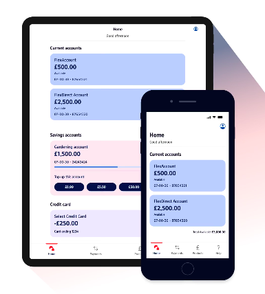
On my phone, Nationwide displays ~3 product account on the home page, which I think isn't too bad - I expect some overpaid UX developer has found this to be suitable for the majority of customers.
Let's not forget people lost their minds over the refresh of the MSE forum - I can't say I remember a single thing about the old one I wish back.
It always happens (unfortunately). People foaming at the mouth over this on X/Twitter will move on to complain about something else in a week or two.
They still display for me?jameseonline said:The company logos in transactions list seems to have gone.
Overpaid developer?🤣
I've got Google Pixel Pros, basically all I see is 2 current accounts + an advert for ways to bank/Virgin Money or whatever, yes I can get rid of ads but just want to see as many accounts without having to do that or scrolling, I currently have 5 savings accounts with Nationwide, only 2 of which are important, Start To Save Issue 2 & Flex Regular Issue 2.
With dismissing the ad I only then see 2 Current accounts and 1 Savings account
Don't think you can reorder accounts can you?, that would make things slightly better.
Love the reordering accounts for NatWest & RBS apps, literally just drag the accounts up and down, only exception is the My Rewards info which is always at bottom of list and can't be moved.0 -
Not sure about iOS tbh as I'm Android but going from that screenshot, personally feel the boxes don't need to be as tall or wide but can still have all the same info, like you could move account number & sort code up & to the right where the current empty blue/pink space is or have 2 accounts side by side rather than 1 on top of anothercoffeehound said:It's interesting that the text appears to be the same size on both an ipad and iphone 5 (remember them?)
which would indicate the size is hard-coded pixels rather than scaling with screen size and user accessibility setting. It may be that they are using a platform where both apps are created from a single codebase, with loss of some native features like dynamic fonts. On iOS the version jumps from 42 to 44.3 which also hints at difficulties implementing the new features1 -
"Hate" is a very strong word. You should; probably reserve that word for when it truly applies.
Maybe "dislike" or "not keen" would fit better, just to keep things in perspective.0 -
2 meters? Chuffing 'ell, speak for yourself!! I'm struggling after about 18 inches! 🤣🤣harpo1 said:Just got the new app. Hate it!!
The text is soo big . Just checked - you can read it from more than 2 metres away!!. No more checking the account in a public place.
Terrible
(But yes, I'm not keen on it either)0 -
I'm sure somewhere that I read in their blurb that they had got rid of the Log Out button and that they would do it for you - lo and behold I couldn't find a log out button last night.
Messaged them this morning and by this afternoon they informed where to find it - I swear it wasn't there last night (or was it?) .0 -
Also hate it.
Too much scrolling to see my accounts, not quick glances anymore.1 -
I like the new app as my accounts are easy to read and as I only have 2 accounts they are visible on the home page. If I had more accounts I wouldn’t mind having to scroll, just like I have to on other banking apps0
-
It is a very poor design from a multitude of perspectives. Text is oversized, too much wasted space, lots of white space, no dark mode, excessive gaps between UI elements etc. It looks like someone has tried to make a "clean" design, which is fine, but that also takes careful planning and skill to make it flow and make it easily useful, this looks like it was created by an amateur with no understanding of UI and UX design. It looks like something Fisher Price would create for under fives, not something created for adults to easily manage their accounts.3
-
Except white space is often a key element of accessibilityMattMattMattUK said:It is a very poor design from a multitude of perspectives. Text is oversized, too much wasted space, lots of white space, no dark mode, excessive gaps between UI elements etc. It looks like someone has tried to make a "clean" design, which is fine, but that also takes careful planning and skill to make it flow and make it easily useful, this looks like it was created by an amateur with no understanding of UI and UX design. It looks like something Fisher Price would create for under fives, not something created for adults to easily manage their accounts.0 -
That depends on how it is used, there should be clear differentiation between UI elements, but leaving large areas of white/dead space in a UI helps no one. As an example the encapsulation of each account on the new Nationwide app is good from an accessibility perspective, it provides a clear visual separation between each element, however it is taken to an extreme with large amounts of dead space both within those blocks and also on the general page. It also creates inefficiency in display area and increases the need for additional scrolling, which is bad from a UX perspective. I have five accounts with Nationwide, they used to all fit on one screen, with clear separation, they now are not all visible at once, they take two full screens (scrolling to display), within a current account there is so much dead space that upon clicking into an account it only partially displays the first transaction, where as before it used to show the 4-5 most recent transactions. There are also no accessibility options within the app itself so I very much doubt accessibility was high on their design priority list.Lightning360 said:
Except white space is often a key element of accessibilityMattMattMattUK said:It is a very poor design from a multitude of perspectives. Text is oversized, too much wasted space, lots of white space, no dark mode, excessive gaps between UI elements etc. It looks like someone has tried to make a "clean" design, which is fine, but that also takes careful planning and skill to make it flow and make it easily useful, this looks like it was created by an amateur with no understanding of UI and UX design. It looks like something Fisher Price would create for under fives, not something created for adults to easily manage their accounts.1
Confirm your email address to Create Threads and Reply

Categories
- All Categories
- 353K Banking & Borrowing
- 253.9K Reduce Debt & Boost Income
- 454.8K Spending & Discounts
- 246.1K Work, Benefits & Business
- 602.2K Mortgages, Homes & Bills
- 177.8K Life & Family
- 260K Travel & Transport
- 1.5M Hobbies & Leisure
- 16K Discuss & Feedback
- 37.7K Read-Only Boards


