We’d like to remind Forumites to please avoid political debate on the Forum.
This is to keep it a safe and useful space for MoneySaving discussions. Threads that are – or become – political in nature may be removed in line with the Forum’s rules. Thank you for your understanding.
📨 Have you signed up to the Forum's new Email Digest yet? Get a selection of trending threads sent straight to your inbox daily, weekly or monthly!
The Forum now has a brand new text editor, adding a bunch of handy features to use when creating posts. Read more in our how-to guide
Welcome to the new Forum look – give us your feedback
Comments
-
Agreed, maybe wouldn't go as far as happy still too much white, seems to have managed being bright and drab at the same time, and that's a bit of a feat, but certainly a vast improvement.Swipe said:I am happy with the forum now with the following ublock origin tweaks to remove the quick links drop down menu and to widen the page width:forums.moneysavingexpert.com##.css-ryf5vr-titleBarNavStyles-navigation.css-ab4nix-titleBarStyles-nav.headerNavigation
forums.moneysavingexpert.com###themeHeader
forums.moneysavingexpert.com##.WarningMessage.DismissMessage
forums.moneysavingexpert.com##.MainContent.Content:style(width: 99% !important)
forums.moneysavingexpert.com###themeFooter
I also removed the badges with uBlock for me easier on the eye.
Let's Be Careful Out There2 -
I still have two big observations that could possibly be improved and made better.
1. The landing page is far too heavily loaded with click-bait. It makes it "not safe for work". It would be much better if the "View All Categories" link was brought to the top and prominent position rather than needing to scroll down.
2. If you visit other websites and return to the forum, the route back brings these very massive and very annoying drop downs that cover the screen and require excessive mouse movement to get back to any content underneath. Can these be disabled?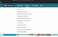
In the meantime, I am finding this very difficult to use now as a forum and cannot be an active participant. Hopefully there will be a listening team that can make things better.
3 -
10_66 said:I'm already over 110% and the right third of my screen is taken up with that broad empty space that you get under the Quick Links and News boxes.That space on the right is just the way that most forum softwares work these days, you'll see the same on Invision Community, IP board, vBulletin etc.etc.Once a 'field' is set to contain that stuff at the side then it continues all down the page, even if there is nothing to show the empty field is still there.
The easiest way to prevent it is not to have that side field on particular pages.
(It can be overcome so that the side field only extends as far as it needs to, that's a bit tricker to implement needing to split the main content into 2 fields of different widths).A couple of examples:And this is Landlordzone forum which is on vBulletin software, they do have the fields on the threads so you always get the space at the right the same as we currently see here on MSE forum:
This is the homepage from the MalwareBytes forum which is on Invision Community software and you can see the same space on the right under the 'notices'.
(Give MalwareBytes their due, they don't have that side field on the actual boards or threads so that those do use the full width).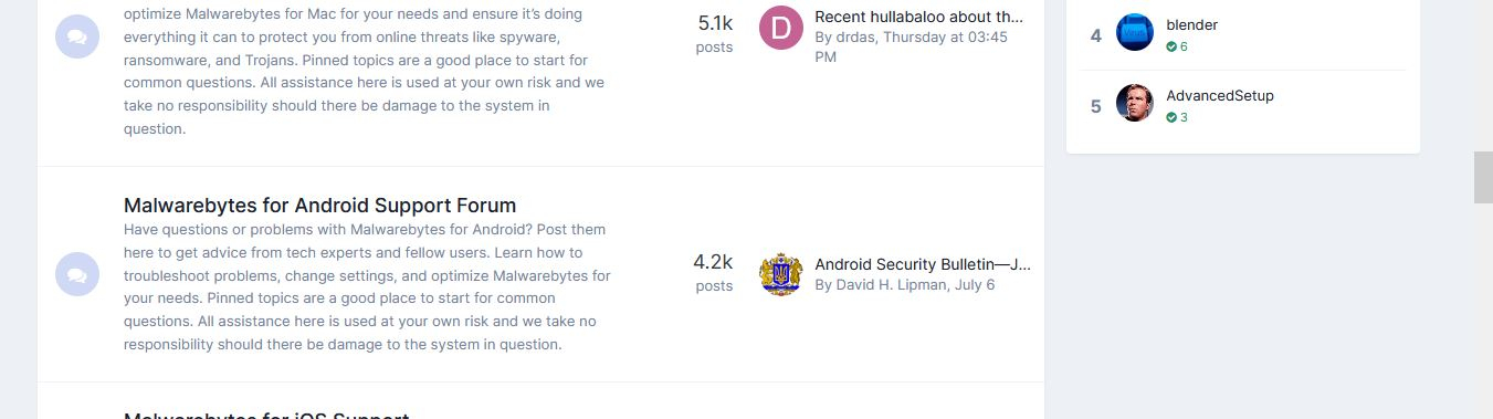
0 -
I have read the thread on changes that have been made thanks to our feedback, and there is an improvement as a result. But I am afraid I still wish most of the changes hadn't been made. I am still having problems negotiating the boards now, although they are a bit easier to read. I tend to go to the 'all boards' listing to find what I want (which at least is there which it wasn't a couple of changes ago) but it all seems a bit more bother than its worth.
I was addicted to this forum a couple of years ago, definitely not anymore. Not surprised less people visit and make threads now. Accessibility of the MSE boards doesn't really seem to have been thought through and how important that is. Its hard work using this forum now, even using a pc to access it.
I have to be honest, in the old days when Martin Lewis owned it, it was easier to access (get to boards you wanted to) entertaining, interesting and relevant to me. Its a shame its gone the way it has. What I mean by this is it was just a forum with a normal simple forum set up, with clear board titles you could access and get to the part you wanted to. So many rules now too (sorry). I've seen many long term contributors stop using the site. I know I hardly make any posts now compared to what I used to make. The most recent changes.., have only made posting on here even more rare.
I do understand that other forums have the same presentation, but I don't use them. Because it feels like you have to have a degree in forumology to use them. I guess I am too old hat. Why make forums so complicated? I just want to write, making comments and offer help where I can. Just because so many other forums are making things complicated, it doesn't mean all have to go that way. Forums should be easy to use to enable people to post, and negotiate so they can read them. Again, I can't do these things as easily as I'd like. You shouldn't have to 'educate' yourself to use forums (and to be honest I wouldn't know where to go to educate myself).4 -
The problem if they move it to the right of the screen is that it could then be just as easily mis-hit when scrolling on a mobile devise as the red, round make a post/poll dot is now by a right-handed person.MikeyPGT said:Report button - This has been moved as a number of you mentioned it wasn’t ideal having it close to the Quote button.
Thanks for taking on so many of the comments - the contrast is much better - however with regard to the above is there any way it could be moved right to the far right of the screen as it is still very tight to the 'thanks' button and very easy to mis-hit.1 -
Please could we have "all boards" as the default and a link at the side if you want the categories display instead.
The text size in the comment box reduced to be consistent with the posts.Proud member of the wokerati, though I don't eat tofu.Home is where my books are.Solar PV 5.2kWp system, SE facing, >1% shading, installed March 2019.Mortgage free July 20232 -
Doesn't seem to do that for me in FFSwipe said:I am happy with the forum now with the following ublock origin tweaks to remove the quick links drop down menu and to widen the page width:forums.moneysavingexpert.com##.css-ryf5vr-titleBarNavStyles-navigation.css-ab4nix-titleBarStyles-nav.headerNavigation
forums.moneysavingexpert.com###themeHeader
forums.moneysavingexpert.com##.WarningMessage.DismissMessage
forums.moneysavingexpert.com##.MainContent.Content:style(width: 99% !important)
forums.moneysavingexpert.com###themeFooter
2 -
Much improved but ...Make the drop down menus smaller, just the width of the text rather than full pageMove the right hand boxes underneath or on top and widen the forum to full width.2
-
That happened to me, but I had already played about with uBlock.molerat said:
Doesn't seem to do that for me in FFSwipe said:I am happy with the forum now with the following ublock origin tweaks to remove the quick links drop down menu and to widen the page width:forums.moneysavingexpert.com##.css-ryf5vr-titleBarNavStyles-navigation.css-ab4nix-titleBarStyles-nav.headerNavigation
forums.moneysavingexpert.com###themeHeader
forums.moneysavingexpert.com##.WarningMessage.DismissMessage
forums.moneysavingexpert.com##.MainContent.Content:style(width: 99% !important)
forums.moneysavingexpert.com###themeFooter
I decided to start again and when I put just those filters in it did widen the page, then added the other stuff I wanted to block like the whole drop down menu bar.
Let's Be Careful Out There0


Confirm your email address to Create Threads and Reply

Categories
- All Categories
- 354.6K Banking & Borrowing
- 254.5K Reduce Debt & Boost Income
- 455.5K Spending & Discounts
- 247.5K Work, Benefits & Business
- 604.3K Mortgages, Homes & Bills
- 178.5K Life & Family
- 261.9K Travel & Transport
- 1.5M Hobbies & Leisure
- 16.1K Discuss & Feedback
- 37.7K Read-Only Boards