We’d like to remind Forumites to please avoid political debate on the Forum.
This is to keep it a safe and useful space for MoneySaving discussions. Threads that are – or become – political in nature may be removed in line with the Forum’s rules. Thank you for your understanding.
📨 Have you signed up to the Forum's new Email Digest yet? Get a selection of trending threads sent straight to your inbox daily, weekly or monthly!
The Forum now has a brand new text editor, adding a bunch of handy features to use when creating posts. Read more in our how-to guide
Welcome to the new Forum look – give us your feedback
Comments
-
Pollycat said:Just curious why this upgrade seems to think it's necessary to show how many 'thanks' a thread has...
Is this seen as one of the most important features?
As with a lot of content designed for mobile users they need it to be attractive to 3 year olds. Remember whenyou first went to school and got a gold star. Maybe it is just me but it seeems like they want to push everyones
IQ's down to that level and keep it there.
Guessing most of us grew out of badges and gold stars when we started at the big school?Censorship Reigns Supreme in Troll City...7 -
I notice the changes made since my last comment on the subject here and wanted to say thank you for listening and making the improvements. The difference between the screen grab in that post and the one below speak for themselves I think, it's much easier to see the information now the area is less cluttered and better sorted. Thank you!
 2
2 -
Thank you MSE folk, that's much easier to view on a tablet (set in dark mode).
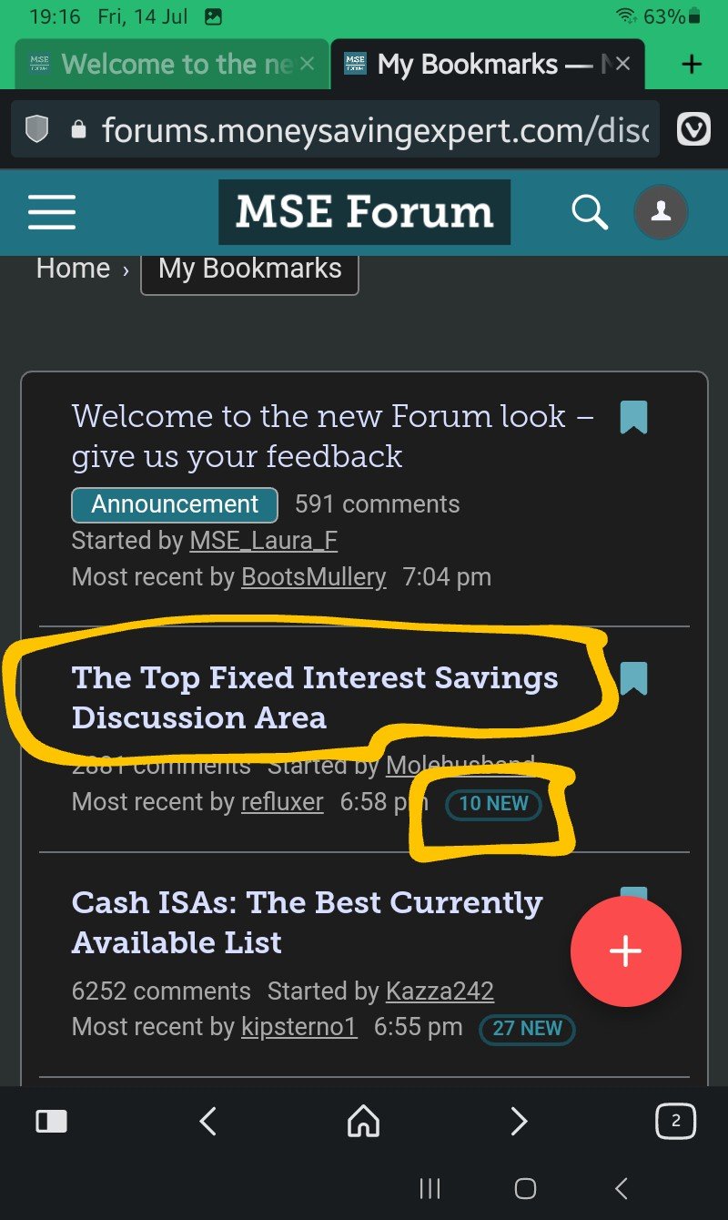
I usually glance at the titles of threads I've bookmarked and how many new posts there are (highlighted in yellow above), which now seem to have fixed positions on the page, and stand out more.
With regards to the "create a new thread" button, if I start a thread here, I then need to select which thread it goes in. Human nature suggests people will not read through the entire list, and start threads anywhere, and everywhere. Mods will be moving threads all day long.
Could the "create a new thread" be limited to within forum/sub forum?
E.g. I have a question about my electric bill... oh there's an energy section... let me read some posts.... now I want to create my own post... ahh, the system will only let me create it within the board that I'm reading.
Other people may have better ideas obviously.0 -
Excellent post ... 10/10 ⭐forgotmyname said:Pollycat said:Just curious why this upgrade seems to think it's necessary to show how many 'thanks' a thread has...
Is this seen as one of the most important features?
As with a lot of content designed for mobile users they need it to be attractive to 3 year olds. Remember whenyou first went to school and got a gold star. Maybe it is just me but it seeems like they want to push everyones
IQ's down to that level and keep it there.
Guessing most of us grew out of badges and gold stars when we started at the big school?3 -
And on a separate subject, please don't put the "Report" link in the right hand corner (green box), as that's where right handed folk put their thumb, when scrolling up the screen of tablets and phones.
I'm sure left handed people are cursing about where the "Quote" link is though. Eek.
It's bad enough dodging the huge red "Create a new post" button, but at least that doesn't appear on every post.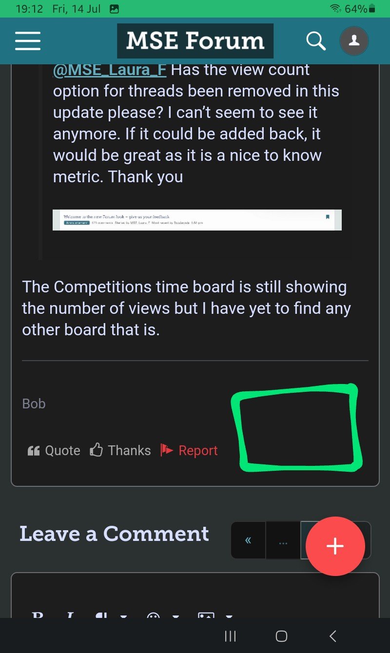
1 -
I do wonder what people you are looking to attract to the site / forum.MSE_JC said:Colours - The colour palette of the new design is something that can be adjusted, but it is a careful balancing act between making the page visually interesting and easily readable. We've continued to fine tune the colours post launch, and have now brought it more in line with the previous design of the Forum. Let us know what you think.version (Rich Text) of the text editor we currently use (WYSIWYG).
I would have thought it's people looking to save money, needing help, or those willing to give help.
All those in my mind the priority is easy reading, if not they will just leave the site, I can't see people flocking to the site "as it looks nice"
I really can't see anyone that needs some kind of help being put off if the site hasn't got fancy bells and whistles, but can if they struggle reading or navigating it.
Let's Be Careful Out There5 -
Thank you for the significant improvements 👍Hopefully we'll get to be able to mark all topics as read soon; I'm glad you're still looking into it.0
-
Not that anyone cares, but I won’t be frequenting these forums anymore. The layout is horrendous. The whole thing is just too much like hard work to navigate.What was wrong with the way it was? Goodbye!2
-
It’s a case of getting used to. I.E., blame the user🙄0
-
I'm not fussed about thanks but don't knock gold stars!dealyboy said:
Excellent post ... 10/10 ⭐forgotmyname said:Pollycat said:Just curious why this upgrade seems to think it's necessary to show how many 'thanks' a thread has...
Is this seen as one of the most important features?
As with a lot of content designed for mobile users they need it to be attractive to 3 year olds. Remember whenyou first went to school and got a gold star. Maybe it is just me but it seeems like they want to push everyones
IQ's down to that level and keep it there.
Guessing most of us grew out of badges and gold stars when we started at the big school?
The excellent and very long running 'Giving up/Cutting Down Alcohol' thread (and others I believe) uses emojis to record days achieved. It is like a star chart and hugely motivating.
MSE have ensured (unlike in the last 'improvement') that the emojis/gifs used still function. 👏👏👏2


Confirm your email address to Create Threads and Reply

Categories
- All Categories
- 354.6K Banking & Borrowing
- 254.5K Reduce Debt & Boost Income
- 455.5K Spending & Discounts
- 247.5K Work, Benefits & Business
- 604.3K Mortgages, Homes & Bills
- 178.6K Life & Family
- 261.9K Travel & Transport
- 1.5M Hobbies & Leisure
- 16.1K Discuss & Feedback
- 37.7K Read-Only Boards