We’d like to remind Forumites to please avoid political debate on the Forum.
This is to keep it a safe and useful space for MoneySaving discussions. Threads that are – or become – political in nature may be removed in line with the Forum’s rules. Thank you for your understanding.
Welcome to the new Forum look – give us your feedback
Comments
-
If MSE guys are struggling to provide a parent forum link at the bottom of the page, please could they at least add a "Jump to the top of page" link at the bottom?2
-
MSE_James said:@born_again - You can still see all threads and replies (comments) on a user's profile - look for this box on the right hand side on a large screen device. The same box appears lower down the page on mobile view:
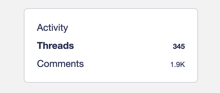
If you click once on a user's avatar or username next to their post, the card that appears also contains clickable links to their threads and comments:
Just had another one. Not showing the activity icon.
https://forums.moneysavingexpert.com/profile/activity/Paula2023
Life in the slow lane0 -
Utterly shambolic - can't find what seemed to be a master list - had just about got to used to the changes they made to the original and these latest changes are atrocious. Considering how many of us are on here did someone not think it might be an idea to test the changes before they spent money on them?0
-
Who decided that the site needed changing to this extent and why? I find the new layout completely confusing. All I want to do is to start working through the new comps that have been added to the list since I was last there. Now everything seems to be in sub-categories and it's taking far more time to cover the same ground than before. Please STOP. Will you just admit you're wrong. The changes aren't for the bette. Please can we go back to the way things were? And please put clickable links, direct or otherwise, in BOLD. I can't tell you how disappointed and frustrated I am at these changes. If I can't get a grip, I may very well decide to stop entering competitions. It's no longer fun when you have to struggle and strain to find what should be glaringly obvious.0
-
Totally agreeSea_Shell said:We really shouldn't have to jump through those hoops to get a usable forum though, should we.
It should just work, straight from the box. ☹️
I had zero uBlock custom rules for MSE before the update, in fact my last custom rule was 2019.
Now I have over 30 lines just for MSE Let's Be Careful Out There0
 -
Try scrolling a bit further down the page - there are two sections headed 'Activity'born_again said:Just had another one. Not showing the activity icon.Official MSE Forum Team member.Please report all problem posts to forumteam@moneysavingexpert.com0 -
The basic format of the Competitions Time area is the same as it was before - nothing of the structure of the comping board and its sub-categories has changed at all.Tuppence11 said:All I want to do is to start working through the new comps that have been added to the list since I was last there. Now everything seems to be in sub-categories and it's taking far more time to cover the same ground than before.
Official MSE Forum Team member.Please report all problem posts to forumteam@moneysavingexpert.com0 -
I've spent a short amount of time in Photoshop to show how I think the think the posts should be laid out, opposed to how they are right now. They key thing I've done is try to make it easier on the eyes to find what I want, rather than a wall of text.The forums as they stand at time of posting:

What I think looks better:
I don't expect everybody to agree on my personal opinion, but I find the above far easier on the eyes.
4 -
For some reason I can only see what is under 'spoiler' by quoting the post - clicking on it doesn't seem to work. Is this a new bug since the update?poppellerant said:I've spent a short amount of time in Photoshop to show how I think the think the posts should be laid out, opposed to how they are right now. They key thing I've done is try to make it easier on the eyes to find what I want, rather than a wall of text.The forums as they stand at time of posting:
What I think looks better:I don't expect everybody to agree on my personal opinion, but I find the above far easier on the eyes.
If you want me to definitely see your reply, please tag me @forumuser7 Thank you.
N.B. (Amended from Forum Rules): You must investigate, and check several times, before you make any decisions or take any action based on any information you glean from any of my content, as nothing I post is advice, rather it is personal opinion and is solely for discussion purposes. I research before my posts, and I never intend to share anything that is misleading, misinforming, or out of date, but don't rely on everything you read. Some of the information changes quickly, is my own opinion or may be incorrect. Verify anything you read before acting on it to protect yourself because you are responsible for any action you consequently make... DYOR, YMMV etc.3 -
Hello,
It's been a few days since we rolled out the Forum's new look, and we've had a LOT of feedback from you. The team have gone through it (and are continuing to do so), and I’ll address some of the most prominent points and recurring themes. There's a lot to cover, so a heads up that this is a lengthy post.
What we’ve changed based on your feedback
Report button - This has been moved as a number of you mentioned it wasn’t ideal having it close to the Quote button.
Colours - The colour palette of the new design is something that can be adjusted, but it is a careful balancing act between making the page visually interesting and easily readable. We've continued to fine tune the colours post launch, and have now brought it more in line with the previous design of the Forum. Let us know what you think.
White post background - The background colour of posts is now subtly off-white, which should make it a bit easier on the eye.
‘New’ thread tag- Tweaked shape and capitalised to make it stand out more.
Font size and line height in posts - Adjustments have been made to these to make posts more readable.
Links in posts - Now bolded up and underlined to make them easier to see.
‘Back to top’ - There’s now a button at the bottom of the page in a thread which jumps you back up to the top.
Thread info on discussion lists - We’ve resized, de-emphasised or otherwise removed some of the information elements on discussion lists as many of you felt that they cluttered the page too much. We’d like to hear your feedback on this, as we want these pages to be readable but still provide useful information.
Under investigation
The issues below require more looking at, and may need longer term work:
Mark All Read
Mark Category Read
Breadcrumb’ trail at the bottom of a page
Moving between specific page numbers – this was also an issue on the previous version.
Other
Desktop and mobile - The new design is adaptive, so it expands automatically for desktop users and condenses/stacks for mobile. This resolves a lot of display issues that were on the previous version which, with the vast majority of our users viewing the Forum on a phone/tablet, means a less buggy experience. Given that our platform provider was ending support for the previous Forum design, moving to the new version was the only way those issues were going to be fixed.
When it comes to the blank space on either side of the screen on desktop, it’s worth noting that the space dedicated to post content actually takes up more page width than it did in the previous version.
Paragraphs in new posts - On occasion some of you have seen paragraph spacing behave unexpectedly when creating a new post. This is because the new design is intended to work with a different version (Rich Text) of the text editor we currently use (WYSIWYG).
A couple of months ago we attempted to roll out the Rich Text editor to help pave the way for the new design, but unfortunately it didn't work as intended and we also had some feedback from users about the functionality, so we reverted back to WYSIWYG. We will make the switch to Rich Text eventually, as it will resolve a number of bugs and prepare the Forum for new features in the future.
The homepage - Previously, the Forum homepage consisted mainly of a large menu of all the categories followed by some boxes linking to MSE news articles, deals and guides, then a few basic boxes for Forum threads. Our research indicated that not very many people used the large category menu, and even fewer were scrolling down to see the boxes underneath.
As a result, it wasn't necessarily the best use of space. The new version is intended to be a 'newspaper front page', acting as a showcase for all of the great content from across the Forum while still having useful navigation functions. Between the floating navigation bar, Quick Links side menu and Forum Categories carousel there are multiple ways to navigate to areas of the Forum quickly.
In the coming weeks and months we'll be experimenting with the layout and types of content featured on it, which is why we're asking for your ideas on what you'd love to see.
I think it's important to point out that there are no 'adverts' nor is there any 'clickbait' on the page - or indeed on any MSE page (you can check out our editorial code here). All of the content on there is either from the Forum or from the main MoneySavingExpert site, chosen because it is interesting, topical, useful or fun. We know that some users will prefer to jump straight to the threads and boards they want to see (hence all the navigation options), but we hope that many will enjoy seeing these regularly updated highlights.
General
In some instances, the feedback is a case of getting used to the new look, ie: a function that you might think has been removed is actually in a slightly different place, has a slightly different name or has a slightly different appearance.
The new design did undergo testing prior to launch, but - as is sometimes the case with anything of this nature - there are some issues that were only identifiable once the changes were applied to the live site.
The change has also been necessary in preparation for a host of improvements and updates further down the line, including some things that users have been requesting for a while. This is vital for future-proofing the Forum. As a result, we won’t be reverting back to the previous design. But we will carry on listening to your feedback and, where possible, make changes.
And finally...
Regrettably, we’ve had to remove several posts in the thread that were crossing the line. The Forum’s design and functions are absolutely fair game for criticism, but MSE staff are not. This is not a new rule. All users of the Forum – newbies, veterans, Ambassadors and Forum Team – are to be treated with the same respect. Abusive comments are not constructive, and having to remove otherwise useful feedback as a result is helpful to no-one.
The Forum Team’s purpose is to help provide and maintain a safe, friendly and useful free-to-use MoneySaving resource for our Forumites. It’s the reason we clock on in the morning, and I can assure you that we’re not in the business of wilfully undermining that mission. There’s no hidden agenda, we’re not in any ivory towers…we’re a friendly neighbourhood team of MoneySaving community managers, and there’s no community without you, our users.
The team have been and will continue to work hard on getting various issues fixed. Some fixes may take a bit more time than others. Where and when we can, we’ll give you timeframes for them. We ask for your patience in the meantime.
--------------------------------------------------------------------------------------------------------------------------------------------------------------------------------------------------------------------------------------------------------------------------------------------------------
Official MSE Forum Team member.Please report all problem posts to forumteam@moneysavingexpert.com34


Confirm your email address to Create Threads and Reply

Categories
- All Categories
- 354.6K Banking & Borrowing
- 254.5K Reduce Debt & Boost Income
- 455.5K Spending & Discounts
- 247.5K Work, Benefits & Business
- 604.3K Mortgages, Homes & Bills
- 178.6K Life & Family
- 261.9K Travel & Transport
- 1.5M Hobbies & Leisure
- 16.1K Discuss & Feedback
- 37.7K Read-Only Boards