We’d like to remind Forumites to please avoid political debate on the Forum.
This is to keep it a safe and useful space for MoneySaving discussions. Threads that are – or become – political in nature may be removed in line with the Forum’s rules. Thank you for your understanding.
📨 Have you signed up to the Forum's new Email Digest yet? Get a selection of trending threads sent straight to your inbox daily, weekly or monthly!
The Forum now has a brand new text editor, adding a bunch of handy features to use when creating posts. Read more in our how-to guide
Economy crash =/= stock market crash?
Comments
-
Where are we now regarding Hell Cycles?beavere38 said:The world is in a mess that's for sure. People getting "Pinged" and having to take time off. Kids being kept off school (my daughter's school is shut again for 2 weeks) so you have to take time off work. The government stopping paying everyone's wages. Businesses crippled by staff shortages and restrictions. Against this backdrop the world's stock markets are booming?
You can only blow a balloon up for so long before it goes bang.
The all time high and end of the bull run in 1987 on the Dow Jones was 16th August. The flash crash came a few weeks later. 16th and 17th August 1987 were significant days for another reason:
"The very first worldwide weekend of world prayers known as the "Harmonic Convergence" of August 16 and 17, 1987, was set as to the ending of "Nine Hell Cycles" each 52-years long."
All coincidence of course? 0
0 -
"Businesses crippled by staff shortages" means there is more work than people need surely, doesn't that mean things are going great and starting to open up again? Sounds like cause for celebration to me.beavere38 said:The world is in a mess that's for sure. People getting "Pinged" and having to take time off. Kids being kept off school (my daughter's school is shut again for 2 weeks) so you have to take time off work. The government stopping paying everyone's wages. Businesses crippled by staff shortages and restrictions. Against this backdrop the world's stock markets are booming?
You can only blow a balloon up for so long before it goes bang.
The all time high and end of the bull run in 1987 on the Dow Jones was 16th August. The flash crash came a few weeks later. 16th and 17th August 1987 were significant days for another reason:
"The very first worldwide weekend of world prayers known as the "Harmonic Convergence" of August 16 and 17, 1987, was set as to the ending of "Nine Hell Cycles" each 52-years long."
All coincidence of course?
Also, love that last picture. If you compare enough stats you will always find a pattern, especially if you throw in a little mumbo jumbo. More people die in hospitals than they do skydiving, that doesn't make skydiving safe, or mean you should avoid a hospital if you are injured. Statistics, even real statistics, can be misleading. For example, some people have no legs, but no one has three legs. Does that mean that most people have an above average number of legs?
I am starting to suspect that this is just a bit of a wind up, but if it isn't, I strongly suggest you try and put this stuff out of your mind and spend some quality time with your daughter instead.Think first of your goal, then make it happen!2 -
Where there's profit to be made. A phoenix will rise from the ashes. People in business simply get on with resolving the challenges posed. No time to idly sit around mopping.beavere38 said:Businesses crippled by staff shortages and restrictions.2 -
Time to invest in cleaning companies then?Thrugelmir said:
Where there's profit to be made. A phoenix will rise from the ashes. People in business simply get on with resolving the challenges posed. No time to idly sit around mopping.beavere38 said:Businesses crippled by staff shortages and restrictions.
 4
4 -
barnstar2077 said:
I am starting to suspect that this is just a bit of a wind up, but if it isn't, I strongly suggest you try and put this stuff out of your mind and spend some quality time with your daughter instead.
I am hoping that there is a 55-year cycle of England winning major football tournaments.
0 -
What did they win in 1911?
Eco Miser
Saving money for well over half a century0 -
So, that turned out not to be the case then.beavere38 said:PLEASE NOTE: These are my thoughts only and are for entertainment purposes and are not intended as investment advice. I believe the drop last week is just the start of a massive stock market correction similar to 1928, 2008 etc. The housing market will also experience a crash. There are plenty of people explaining the thinking for this on youtube. For starters here is the daily FTSE where you can see we have broken down through the upward trendline. 0
0 -
That’s exactly what technical analysis is. The main skill of technical analysts is in saying lots without actually saying anything, hence the “it may move a lot, a little, or not at all” post above.barnstar2077 said:Are you saying that because they have been going up for a while that we must be due a correction? (Like using the law of averages to try and predict a roulette spin.)
Charts have zero predictive ability. They can’t do; it makes no sense theoretically, and when tested it turns out not to work in practice either.
I executed one trade, ever, based on technicals, the first ever trade of my career. I looked through the charts, drew the support lines, consulted a more senior trader to check I was doing it right, then bought some Eurodollar futures.
They immediately dropped, to, through, and then we’ll below the “support.”
I closed my position out then went back to ask him what happened, why a price would plummet through the support line that it had previously been slowly approaching.
”Ah well” he said “that’s what we call a breakout.”
It was a good lesson in technical analysis, technical analysts, and the way they use hindsight to explain everything.4 -
In that previous post it's hard to imagine many private investors drawing trend lines and placing an order on Eurodollar futures.
Could we have the first slide please. Thank you.
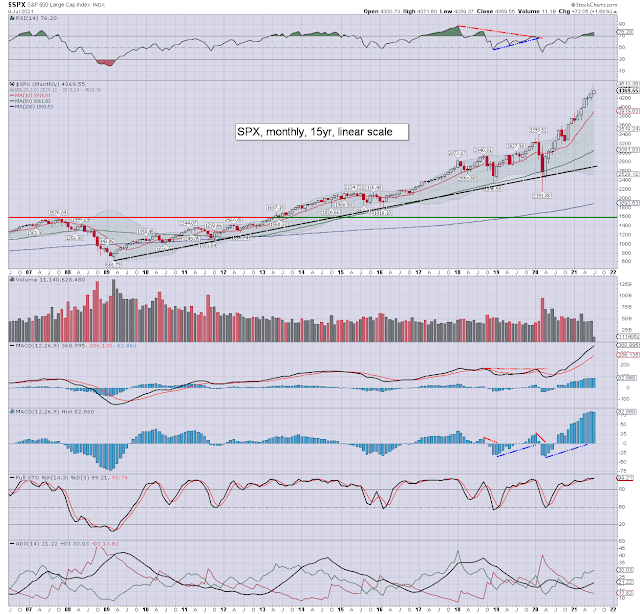
The first monthly chart I've posted and again it highlights most indicators on the top in overbought regions. In the 15 year span we can see price and the 200 average is at its highest in years .Look at that line on the right of the chart around 1950 and the index itself over 4000.
spx+m+jul9.png (640×614) (bp.blogspot.com)
Next slide please.
The weekly is similar with indicators overbought and the distance between price and the 200 average at its highest since 1999.
$SPX | SharpChart | StockCharts.com
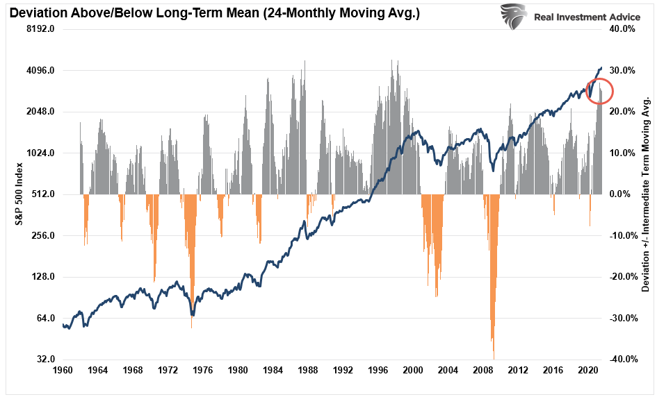
The grey area highlighted here clearly shows an extended picture.
SP500-Deviation-Above-Below-Trend-062521.png (945×572) (realinvestmentadvice.com)
And the last slide please.
The daily also showing the same situation where indicators are overbought.
$SPX | SharpChart | StockCharts.com
Conclusion. Warning signals all over the place not that the tea leaves can tell you the next move. A bit of consolidation or a healthy correction wouldn't be a surprise.
3 -
When? What do you suggest people do about the warnings?coastline said:In that previous post it's hard to imagine many private investors drawing trend lines and placing an order on Eurodollar futures.
Could we have the first slide please. Thank you.
The first monthly chart I've posted and again it highlights most indicators on the top in overbought regions. In the 15 year span we can see price and the 200 average is at its highest in years .Look at that line on the right of the chart around 1950 and the index itself over 4000.
spx+m+jul9.png (640×614) (bp.blogspot.com)
Next slide please.
The weekly is similar with indicators overbought and the distance between price and the 200 average at its highest since 1999.
$SPX | SharpChart | StockCharts.com
The grey area highlighted here clearly shows an extended picture.
SP500-Deviation-Above-Below-Trend-062521.png (945×572) (realinvestmentadvice.com)
And the last slide please.
The daily also showing the same situation where indicators are overbought.
$SPX | SharpChart | StockCharts.com
Conclusion. Warning signals all over the place not that the tea leaves can tell you the next move. A bit of consolidation or a healthy correction wouldn't be a surprise.
To convince the sceptics it would be easy to set up 2 identical dummy portfolios, leave one to do as it will and manage the other in line with your signals. If you published the results monthly it would be interesting.0


Confirm your email address to Create Threads and Reply

Categories
- All Categories
- 354.5K Banking & Borrowing
- 254.4K Reduce Debt & Boost Income
- 455.5K Spending & Discounts
- 247.4K Work, Benefits & Business
- 604.3K Mortgages, Homes & Bills
- 178.5K Life & Family
- 261.8K Travel & Transport
- 1.5M Hobbies & Leisure
- 16.1K Discuss & Feedback
- 37.7K Read-Only Boards