We’d like to remind Forumites to please avoid political debate on the Forum.
This is to keep it a safe and useful space for MoneySaving discussions. Threads that are – or become – political in nature may be removed in line with the Forum’s rules. Thank you for your understanding.
📨 Have you signed up to the Forum's new Email Digest yet? Get a selection of trending threads sent straight to your inbox daily, weekly or monthly!
The Forum now has a brand new text editor, adding a bunch of handy features to use when creating posts. Read more in our how-to guide
Energy prices £250 cheaper a year - my electric only £8.83 cheaper??
Comments
-
I think what most people who ask questions on here want is a nice user friendly pie chart showing what the different components are that make up the standing charge, how much each component costs, how much each component has changed since the last price cap and why it has changed.MattMattMattUK said:
That information is published on the Ofgem website, some choose to read it, most do not.username said:What they do need is to break out the standing charge into what it actually covers and itemize the detail, rather than just lumping everything and anything under a fairly useless and generic term, which doesn't mean anything for anyone.
More detail as opposed to less.
If you can provide the link to this on the Ofgem website then you will be helping a lot of these people who are having difficulty finding it.
1 -
The_Green_Hornet said:If you can provide the link to this on the Ofgem website then you will be helping a lot of these people who are having difficulty finding it.This comes close - https://www.ofgem.gov.uk/energy-price-capIt shows the breakdown of the cap figure that the news outlets quote when they refer to the 'saving' through the reduction in the cap.
 Everything else, including the spreadsheets with base data by region etc. is here:
4 -
This is about the 10th time that someone has provided a link to the breakdown summary of the Ofgem SVT cap in response to a question asking specifically about the standing charge. I think we can assume the requested information is not released for public consumption.MWT said:The_Green_Hornet said:If you can provide the link to this on the Ofgem website then you will be helping a lot of these people who are having difficulty finding it.This comes close - https://www.ofgem.gov.uk/energy-price-capIt shows the breakdown of the cap figure that the news outlets quote when they refer to the 'saving' through the reduction in the cap.Everything else, including the spreadsheets with base data by region etc. is here:
0 -
From this very website - who say the information is direct from OFGEM themselves (though this is from a couple of reviews ago, so while the actual figures will have altered I dont expect the eprcentages will have shifted much).The_Green_Hornet said:
I think what most people who ask questions on here want is a nice user friendly pie chart showing what the different components are that make up the standing charge, how much each component costs, how much each component has changed since the last price cap and why it has changed.MattMattMattUK said:
That information is published on the Ofgem website, some choose to read it, most do not.username said:What they do need is to break out the standing charge into what it actually covers and itemize the detail, rather than just lumping everything and anything under a fairly useless and generic term, which doesn't mean anything for anyone.
More detail as opposed to less.
If you can provide the link to this on the Ofgem website then you will be helping a lot of these people who are having difficulty finding it.
https://blog.moneysavingexpert.com/2023/07/martin-lewis--why-are-energy-standing-charges-so-high--what-can-/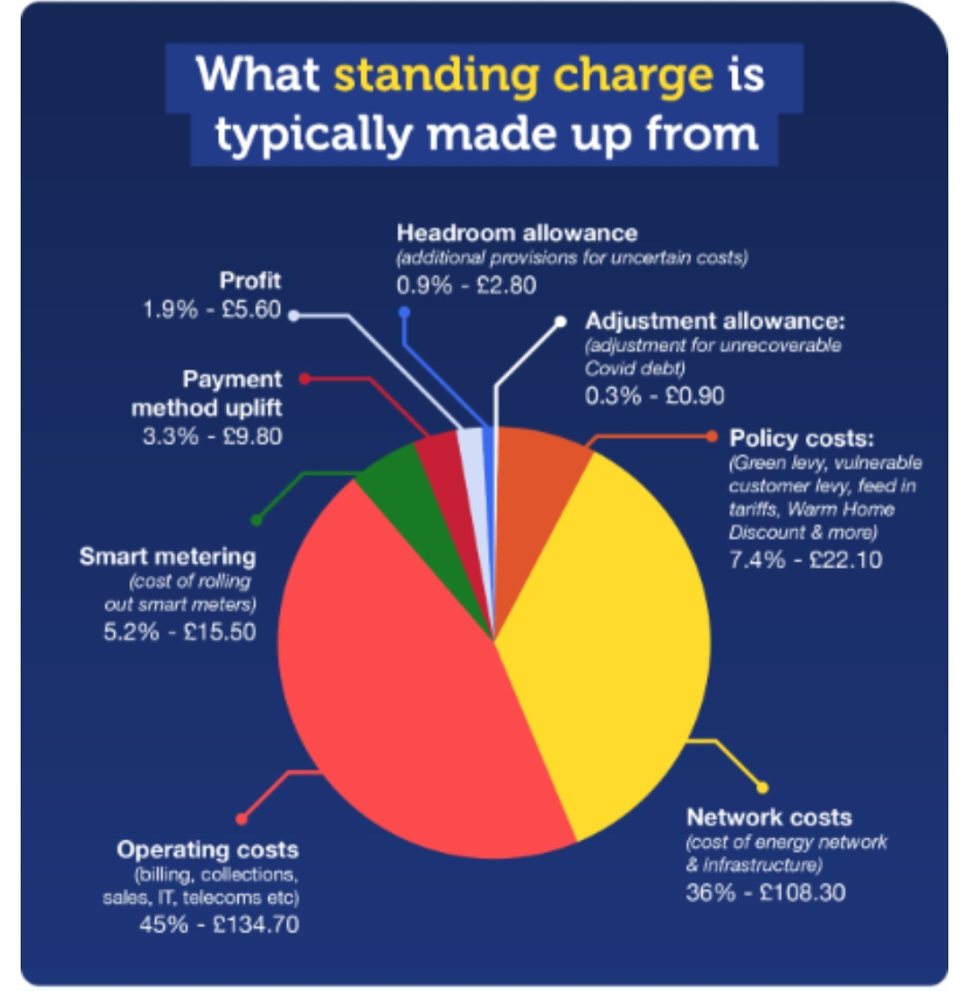
5 -
Yes I was aware of that chart (I even replied on another thread referring to it myself) but one would hope this information would be readily available on the official Ofgem website especially as they have a whole section containing charts on about everything else.GingerTim said:
From this very website - who say the information is direct from OFGEM themselves (though this is from a couple of reviews ago, so while the actual figures will have altered I dont expect the eprcentages will have shifted much).The_Green_Hornet said:
I think what most people who ask questions on here want is a nice user friendly pie chart showing what the different components are that make up the standing charge, how much each component costs, how much each component has changed since the last price cap and why it has changed.MattMattMattUK said:
That information is published on the Ofgem website, some choose to read it, most do not.username said:What they do need is to break out the standing charge into what it actually covers and itemize the detail, rather than just lumping everything and anything under a fairly useless and generic term, which doesn't mean anything for anyone.
More detail as opposed to less.
If you can provide the link to this on the Ofgem website then you will be helping a lot of these people who are having difficulty finding it.
https://blog.moneysavingexpert.com/2023/07/martin-lewis--why-are-energy-standing-charges-so-high--what-can-/
All available charts | Ofgem
1 -
Time to ask MSE to ask for an update!The_Green_Hornet said:
Yes I was aware of that chart (I even replied on another thread referring to it myself) but one would hope this information would be readily available on the official Ofgem website especially as they have a whole section containing charts on about everything else.GingerTim said:
From this very website - who say the information is direct from OFGEM themselves (though this is from a couple of reviews ago, so while the actual figures will have altered I dont expect the eprcentages will have shifted much).The_Green_Hornet said:
I think what most people who ask questions on here want is a nice user friendly pie chart showing what the different components are that make up the standing charge, how much each component costs, how much each component has changed since the last price cap and why it has changed.MattMattMattUK said:
That information is published on the Ofgem website, some choose to read it, most do not.username said:What they do need is to break out the standing charge into what it actually covers and itemize the detail, rather than just lumping everything and anything under a fairly useless and generic term, which doesn't mean anything for anyone.
More detail as opposed to less.
If you can provide the link to this on the Ofgem website then you will be helping a lot of these people who are having difficulty finding it.
https://blog.moneysavingexpert.com/2023/07/martin-lewis--why-are-energy-standing-charges-so-high--what-can-/
All available charts | Ofgem0 -
I wonder why Ofgem doesn't put this on their Information for consumers section on their website?MWT said:The_Green_Hornet said:If you can provide the link to this on the Ofgem website then you will be helping a lot of these people who are having difficulty finding it.This comes close - https://www.ofgem.gov.uk/energy-price-capIt shows the breakdown of the cap figure that the news outlets quote when they refer to the 'saving' through the reduction in the cap.Everything else, including the spreadsheets with base data by region etc. is here:
Understand your electricity and gas bills | Ofgem
Mind you telling consumers that their standing charge has gone up mainly due to 1) Government social and environment schemes and 2) to make sure prepayment and Direct Debit customers pay the same standing charge won't go down too well, especially when they keep getting told on here that it is due to the fixed cost of delivering energy to their properties increasing.
2 -
PennineAcute said:
Just wondering why people think that high users are wealthy?Nobody has said that, but the fact is high users can reduce their bills by using less. Low users cannot.So at some of the rates quoted a low user on 3kWh a day is paying ~45p a unit and a higher user at 15 units is paying ~27p a unit. Which of the two is making more demands on the system and requiring more plant to meet their demand? High standing charges are patently regressive.I have no problems paying my bills but do have more sympathy than some here for those that do have to think about it more. With a smart meter I'd second the poster above who suggested Agile or Tracker. Currently my average for electricity on my tariff (Octopus Go) is around 15p with cheap overnight and 4.07p per kWh on gas tracker.2 -
The fixed costs of operating the network, that includes the social and policy costs, most of which is things like the WHD and subsidy for prepayment users. Personally I think the prepayment subsidy should be abolished, as well as things like the WHD. The benefits system exists to support those on low incomes, governments should not be forcing business to create secondary subsidy systems that distort the market, that support should be provided via the benefits system, funded from general taxation.The_Green_Hornet said:
I wonder why Ofgem doesn't put this on their Information for consumers section on their website?MWT said:The_Green_Hornet said:If you can provide the link to this on the Ofgem website then you will be helping a lot of these people who are having difficulty finding it.This comes close - https://www.ofgem.gov.uk/energy-price-capIt shows the breakdown of the cap figure that the news outlets quote when they refer to the 'saving' through the reduction in the cap.Everything else, including the spreadsheets with base data by region etc. is here:
Understand your electricity and gas bills | Ofgem
Mind you telling consumers that their standing charge has gone up mainly due to 1) Government social and environment schemes and 2) to make sure prepayment and Direct Debit customers pay the same standing charge won't go down too well, especially when they keep getting told on here that it is due to the fixed cost of delivering energy to their properties increasing.
2 -
That MSE article is an excellent read for anyone wanting an unbiased view of how standing charges are currently being implemented by Ofgem. Thank you.The_Green_Hornet said:
Mind you telling consumers that their standing charge has gone up mainly due to 1) Government social and environment schemes and 2) to make sure prepayment and Direct Debit customers pay the same standing charge won't go down too well, especially when they keep getting told on here that it is due to the fixed cost of delivering energy to their properties increasing.MWT said:The_Green_Hornet said:If you can provide the link to this on the Ofgem website then you will be helping a lot of these people who are having difficulty finding it.
I also chuckled at the poll results where 11,100 people were asked for their opinion on standing charges. Only 151 (1.4%) agree with standing charges being increased in order to reduce the unit rates, yet the MSE Energy forum seems to be in a parallel universe where the majority of posters appear to approve. How very, very spooky!
1


Confirm your email address to Create Threads and Reply

Categories
- All Categories
- 354.6K Banking & Borrowing
- 254.5K Reduce Debt & Boost Income
- 455.5K Spending & Discounts
- 247.5K Work, Benefits & Business
- 604.4K Mortgages, Homes & Bills
- 178.6K Life & Family
- 261.9K Travel & Transport
- 1.5M Hobbies & Leisure
- 16.1K Discuss & Feedback
- 37.7K Read-Only Boards