We’d like to remind Forumites to please avoid political debate on the Forum.
This is to keep it a safe and useful space for MoneySaving discussions. Threads that are – or become – political in nature may be removed in line with the Forum’s rules. Thank you for your understanding.
📨 Have you signed up to the Forum's new Email Digest yet? Get a selection of trending threads sent straight to your inbox daily, weekly or monthly!
Alcove Units – Best Solution?
Comments
-
I agree with ThisIsWeird if you step it forward it has to be 20mm + to hide the difference, my work is mostly 2nd fix, finals, kitchens etc, so millimetres matters!
You really need to do some mockups to visualise the finish work.
I’m really enjoying this thread and I’m confident the finished units will be outstanding!
Maybe, just once, someone will call me 'Sir' without adding, 'You're making a scene.'1 -
Has a quick look on the 'net, and found this example. All white, shaker style doors, wooden top.
The units have the shadow gap (hard to say how much, but probably 5-10mm), and the wooden top looks as if it overhangs the units below, and maybe even sits proud of the chimney breast (though, not quite sure it does).
1 -
Nice!
I'd suggest the units are set back around 20mm-ish, and the worktops too, by say, 10mm. Ie, enough so it looks 'intentional'.
It looks 'right'. But the breast could be deeper than yours? What's your depth again?
If you were to make your units that 'shallow', would they be deep enough for what you require? If so, I'd agree that's a good option.
(And do you like the handleless doors?! Should be easy to do - press to make the door pop open.)
1 -
My depth is 35cm. So after that 2cm set back, and another 2cm for the door thickness, it’d give me an internal depth of 31cm. Think that should be okay! Though, I might try and ever so slightly decrease that set back depth – maybe 1 to 1.5cm.
I think I’d prefer to have handles. Not because I don’t like the handle-less aesthetic, but I think in the real world, on MDF doors, they’ll soon get dirty! 1
1 -
10mm-ish setback, and 5 for the w'top should be fine.
0 -
Yes do not put the worktop flush with the chimney breast, in my opinion at least. I think you'll waste a lot of material as you might take too much off and have a big gap at the back. Afterwards, you may 'settle' and and have a protrusion or sub-flushness of a few millimetres which *will* look like you tried to go flush but settled on what you got. Having sub-flush or the protrusion gives you the space to not be perfect.0
-
Okay, have been doing some further thinking, and playing with some visual mock-ups. Well, playing with wood.
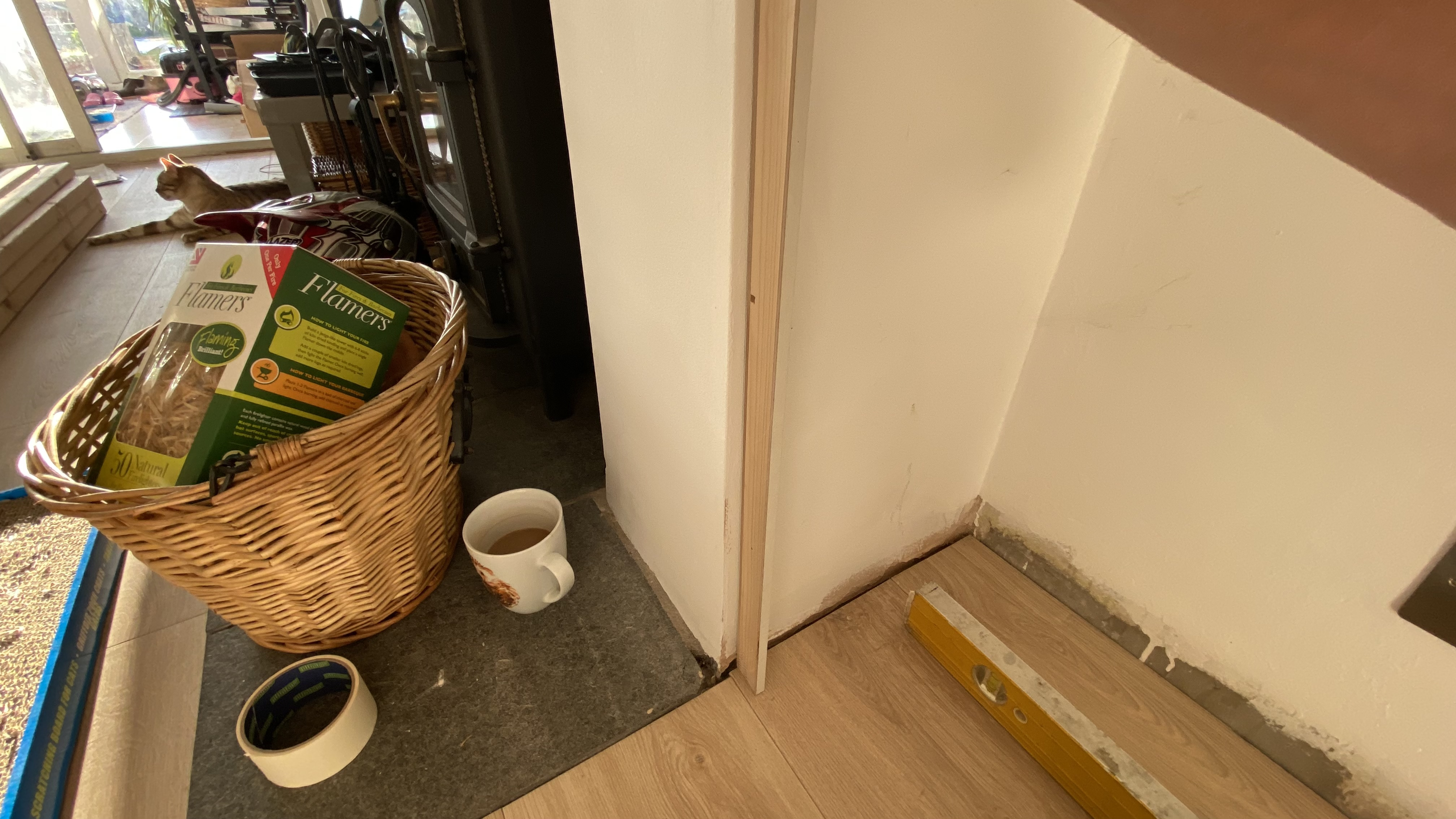
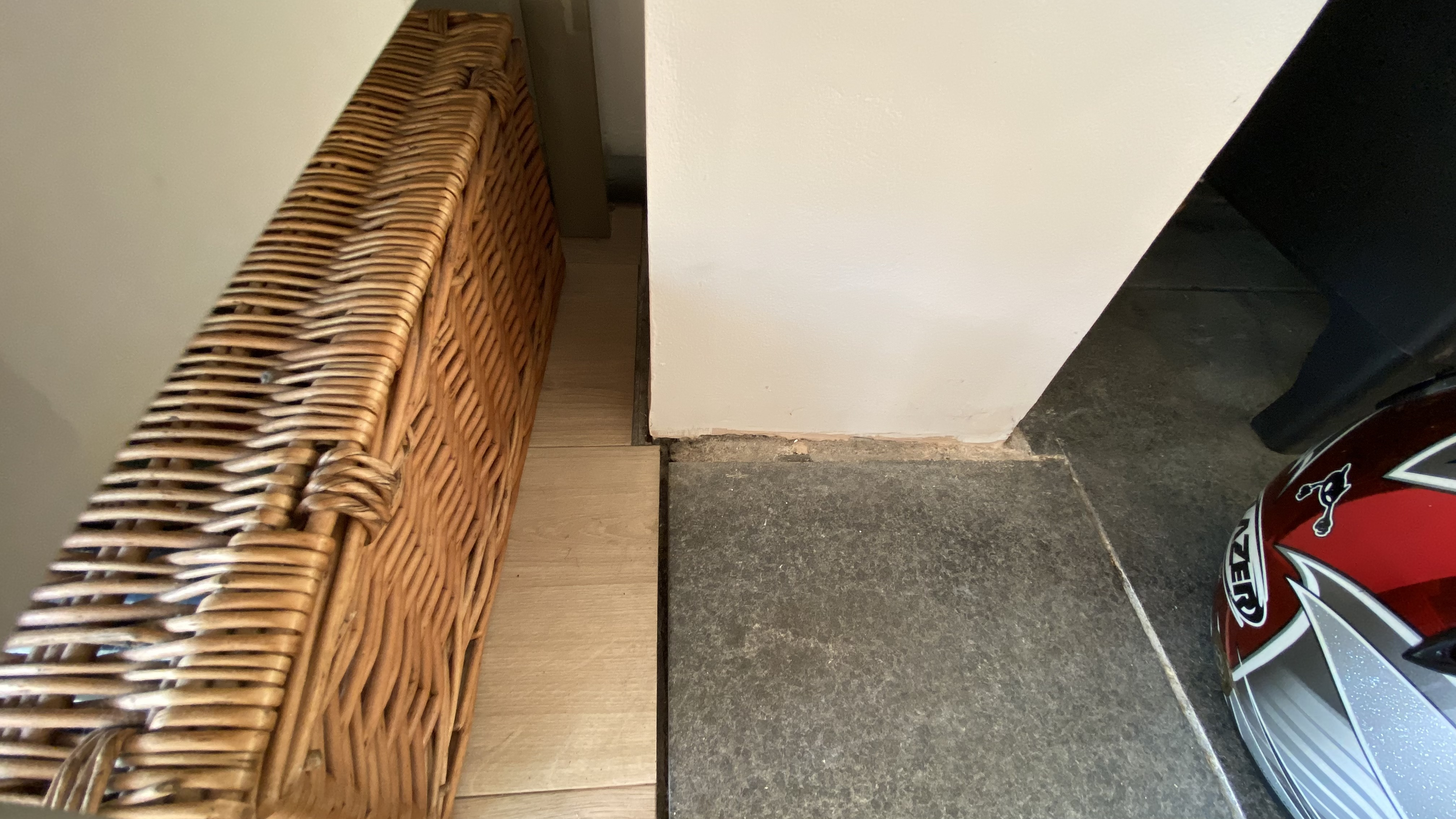
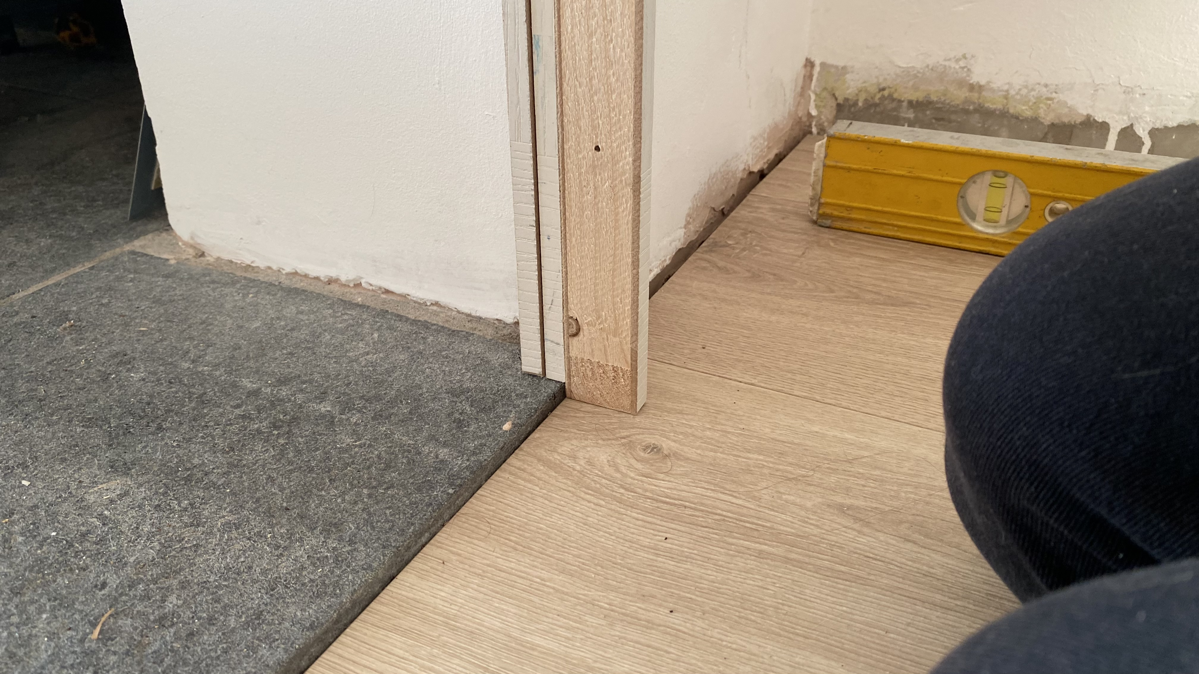
Attached are photos of the left side and ride side, showing how the floor tiles aren’t in alignment with the chimney breast.
I’d started playing with the idea of setting the units back (1cm back, in this case). However, what soon happens, is it shows all the oddities of the floor area – the misalignment, etc. But on the whole, when examining the room as a whole, I think (given the enormous width of the units), this may just look right, and less intrusive.
I also tried bringing it forward, as some of you had suggested. And I’m not 100% sure on how I feel about it. It certainly does hide a multitude of sins in the floor area, and hides a lot of the misalignment. But, just wasn’t a fan of scribing to the tile. Anywho, maybe if I did it this way, it may look okay? Though perhaps, it might need to come forward a tad more, as it’s currently only scribed over a puny amount of tile.Thoughts? I’m torn between the two!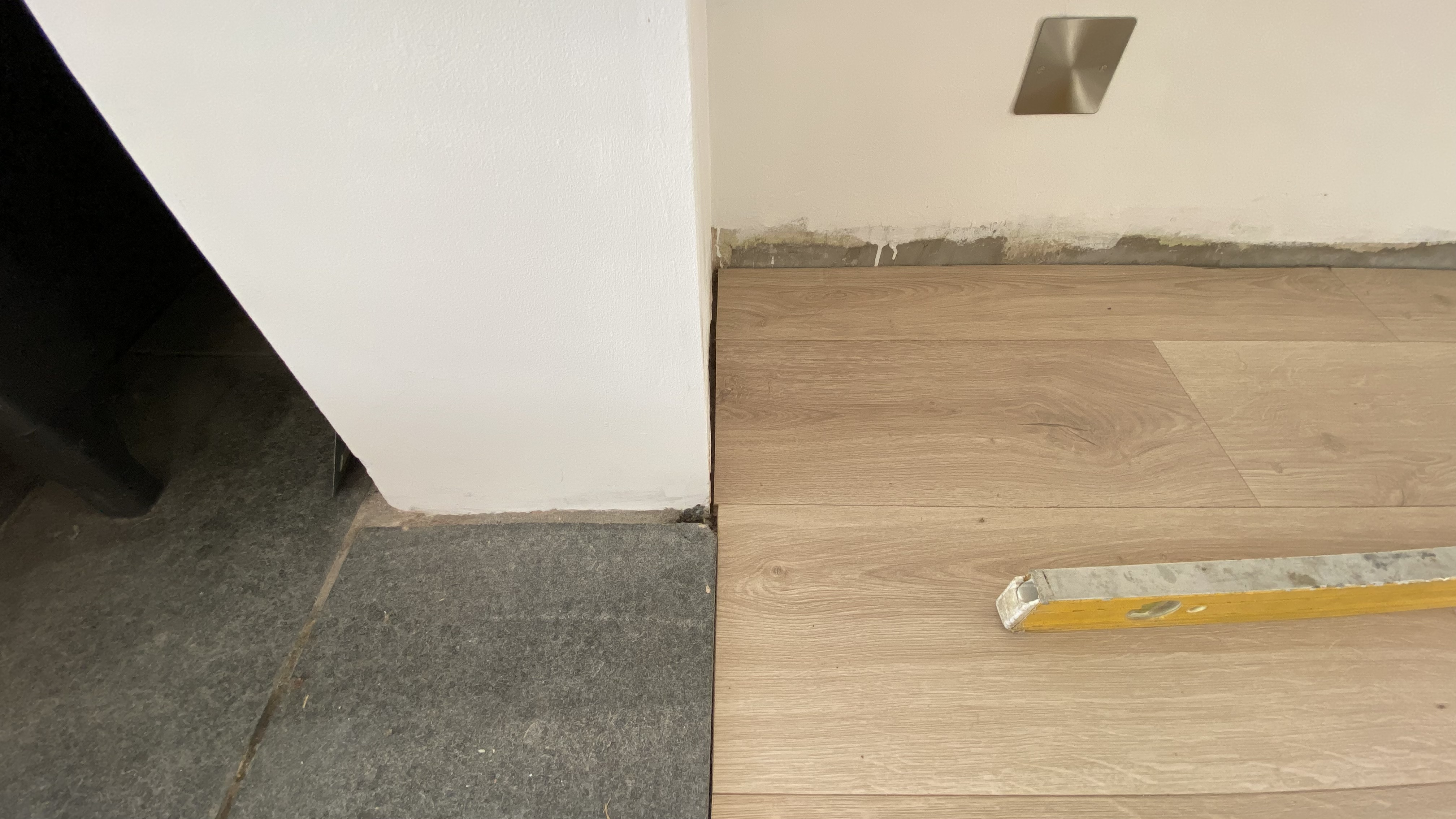
 0
0 -
Bump! Any thoughts?0
-
o
ver
thi
nki
ng
it
man.
Set back, or stepped forward (so scribed a teeny-tiny bit over that tile) will both look fine, and any discrepancy between the sides won't be noticeable.
Choose the the layout you prefer, or provides you with the best use of space.
An outie or an innie. Your choice. Both will work. Both will look absolutely fine.1 -
Compare the outie on page two with the innie on this page.
The latter appears, to me, to emphasise the chimney breast more, and makes it more prominent, more of a statement, which - now I compare them - I think I prefer. It would, tho', give you slightly less cupboard space and w'top depth, but to my eye looks the more balanced of the two options.
So, your pic above looks the optimum design to me. But this is obviously your call.
You've done the research, you have the two options, what do you think?1


Confirm your email address to Create Threads and Reply

Categories
- All Categories
- 354.8K Banking & Borrowing
- 254.6K Reduce Debt & Boost Income
- 455.6K Spending & Discounts
- 247.7K Work, Benefits & Business
- 604.7K Mortgages, Homes & Bills
- 178.7K Life & Family
- 262.3K Travel & Transport
- 1.5M Hobbies & Leisure
- 16.1K Discuss & Feedback
- 37.7K Read-Only Boards