We’d like to remind Forumites to please avoid political debate on the Forum.
This is to keep it a safe and useful space for MoneySaving discussions. Threads that are – or become – political in nature may be removed in line with the Forum’s rules. Thank you for your understanding.
📨 Have you signed up to the Forum's new Email Digest yet? Get a selection of trending threads sent straight to your inbox daily, weekly or monthly!
Have your say on the future of Competitions Time
Comments
-
The Comp-liments button colour was mentioned earlier in the thread:
Join the MSE Forum
Get the Free MoneySavingExpert Money Tips E-mail
To report inappropriate posts: click the report button
Flag a news story: news@moneysavingexpert.com1 -
Hi
Thanks for everyone who's started tagging Comps.
I've just added a new post to the tagging thread that'll give you some insight into where we're heading with Comps Time:
So, if you haven't already, please give tagging a try when creating new Comps!
Join the MSE Forum
Get the Free MoneySavingExpert Money Tips E-mail
To report inappropriate posts: click the report button
Flag a news story: news@moneysavingexpert.com0 -
I guess someone at MSE Towers has been tinkering. About half an hour ago, between Cloudflare issues, I saw a slightly different layout. The only noticeable difference was slightly different, in both format and location, skipped and entered buttons.
'...luck came to those who left a space for it.' Terry Pratchett1 -
Hi
Not that we're aware of!
Unless it looked very deliberate, I'd assume you were just seeing some of the pages without styling.
Join the MSE Forum
Get the Free MoneySavingExpert Money Tips E-mail
To report inappropriate posts: click the report button
Flag a news story: news@moneysavingexpert.com1 -
I'd like there to be tick boxes on the Take a Break and Puzzler competitions so I can tell which ones I have entered or not.
3 -
take a break generally shows the answer if you have already entered
0 -
Hi Compers,
Quick question: What do you view as essential info to be shown on the Comps board index?
When we move to the new layouts, we can make this different to the rest of the forum dependent on the needs of Compers.

(Ignore the format and ordering. This will be much better in the final version)
Options we can turn on/off:
- Category (Shown in screenshot, but obviously not needed)
- Author
- Last Comment User
- Last Comment Date
- View Count
- Comment Count
- Score Count (Comp-liments)
- Unread Count
In the final version, this same line of wrapped text will also show the Closing Date, and the tags, so obviously we'd only want to show the minimum needed in this area.
Join the MSE Forum
Get the Free MoneySavingExpert Money Tips E-mail
To report inappropriate posts: click the report button
Flag a news story: news@moneysavingexpert.com1 -
Illustration just for reference - The first of each pair is logged out, the second logged in:
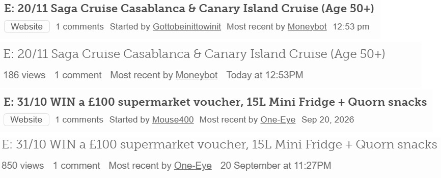
My preferences:
Closing Date - essential (and preferably the 1st thing on a line so its position never changes) (then we can stop putting E: DD/MM in the title)
Tags - essential (but possibility of multiple tags means they should not be at the start of a line with other info on that line)
View Count - essential - (gives info on popularity of thread)
Comment Count - essential
Original Author - essential (and preferably 1st or 2nd thing on a line so its position is consistent)
Date/Time started - if no comments exist - essential
Date/Time started - if comments exist - nice to have
Last Comment Username - essential
Date/Time last comment - essential
Unread Count - essential (I assume this is the "xx New" - really useful on long, regularly updated threads)Category - not needed
Score Count - don't know what this is! - so not needed1 -
Thanks for the initial feedback @One-Eye
(I already have a mockup with the Close Date first and prominent, but have to see what's possible)
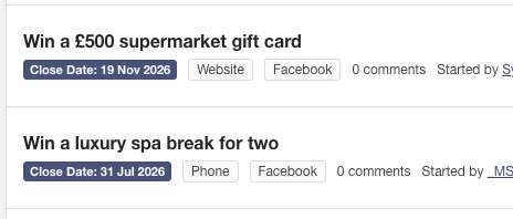
Some other points to consider that I'd like everyone's thoughts on.
- We can make some of the text in this 'meta' info line icons. This saves on space but can be confusing for new users.
- We can also add excerpts, but this will take up a lot of space, and how useful it is would depend on Compers front-loading their post with the useful info
 Join the MSE Forum
Get the Free MoneySavingExpert Money Tips E-mail
To report inappropriate posts: click the report button
Flag a news story: news@moneysavingexpert.com1 -
I like the reverse contrast closing date at the start of a line.
I don't like possibility of icons and I don't think they would save that much space…
… but I think you could replace the text Close Date with the already familiar E:
Excerpts, as can be seen in "Latest Threads", would be great. One of the most requested features from users, and the most missed from the old software, is a replacement of the "Hover" function. I don't think the resulting longer pages would be a problem on PCs but users on Phones might not be as happy.
1













Confirm your email address to Create Threads and Reply
Categories
- All Categories
- 355.8K Banking & Borrowing
- 254.9K Reduce Debt & Boost Income
- 456.2K Spending & Discounts
- 248.3K Work, Benefits & Business
- 605.9K Mortgages, Homes & Bills
- 179K Life & Family
- 263.8K Travel & Transport
- 1.5M Hobbies & Leisure
- 16.2K Discuss & Feedback
- 37.7K Read-Only Boards