We’d like to remind Forumites to please avoid political debate on the Forum.
This is to keep it a safe and useful space for MoneySaving discussions. Threads that are – or become – political in nature may be removed in line with the Forum’s rules. Thank you for your understanding.
📨 Have you signed up to the Forum's new Email Digest yet? Get a selection of trending threads sent straight to your inbox daily, weekly or monthly!
The Forum now has a brand new text editor, adding a bunch of handy features to use when creating posts. Read more in our how-to guide
Text size
Sterlingtimes
Posts: 2,578 Forumite


Is it just an age thing?
I am struggling.
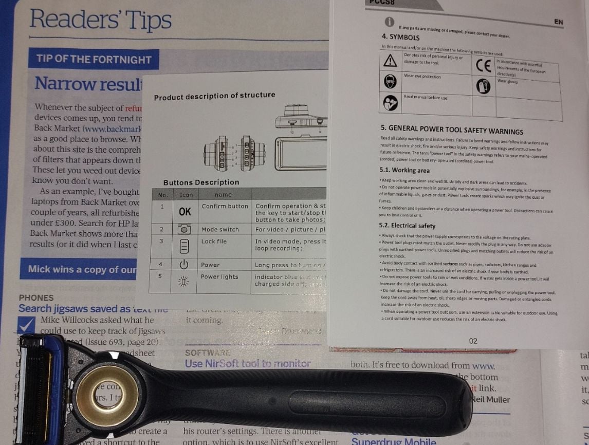
Text from Computeractive Magazine, which is quite readable.
In the middle are instructions showing figures with numbers, which is quite unreadable to me.
Right are safety instructions from a cordless screwdriver just purchased from Amazon. It's quite unreadable to me.
My Gillette Labs razor, below, is broken. I was told to read numbers from the back of the razor. I had to use intense lighting and a magnifying glass.
This is crazy.

I have osteoarthritis in my hands so I speak my messages into a microphone using Dragon. Some people make "typos" but I often make "speakos".
0
Comments
-
It's not JUST an age thing, although some of it is down to age. However, as you've noticed, lighting is key, and I'd say contrast is important too: reading black numbers off a black surface would defeat most of us, I feel!
With instruction booklets, it may be worth downloading from the website and saving so that you can enlarge the 'print' as needed. I usually have to do this because I can never find the paper original ...
I agree the magazine is quite clear and easy to read.
What drives me mad is when 'form' has taken priority over 'function'. A moody grey background image, with grey text on top, may look stunning, but it's useless! And yes, I've seen that on a website!Signature removed for peace of mind1 -
Worst for me was a IT upgrade at work about 20 years back (so not too age related) where they had a portion with turquoise text on orange background. I told them if I had to look at that my eyes would bleed. (not literally but wow was it painful!)
I've now got a 22" monitor with things enlarged to make it easy for myself and the cursor arrow is easy to see as it's about an inch long. These are more needed with age.
But for things like reading tiddly print on some object I resort to using my mobile. Take a photo (enlarged) and the enlarge it some more. Might be a bit fuzzy but it works.I’m a Forum Ambassador and I support the Forum Team on Debt Free Wannabe, Old Style Money Saving and Pensions boards. If you need any help on these boards, do let me know. Please note that Ambassadors are not moderators. Any posts you spot in breach of the Forum Rules should be reported via the report button, or by emailing forumteam@moneysavingexpert.com. All views are my own and not the official line of MoneySavingExpert.
Click on this link for a Statement of Accounts that can be posted on the DebtFree Wannabe board: https://lemonfool.co.uk/financecalculators/soa.php
Check your state pension on: Check your State Pension forecast - GOV.UK
"Never retract, never explain, never apologise; get things done and let them howl.” Nellie McClung
⭐️🏅😇🏅🏅🏅1 -
Mine probably is age related. Reading MSE absolutely no problem. Trying to read print on a coloured background, a nightmare. I landed up buying a better magnifying glass. I sonetimes feel like starting a petition to go back to written instruction manuals rather than pictures as I never GET it, but if everything is made in a foreign country then I guess we are stuck with it.
1 -
I have poor eyesight but only buy long distant glasses for driving
For internet reading I can expand the text
For print no matter how tiny I take a photo and expand it on my phone
0 -
Colour is a major problem. I started studying for a law degree when I was 50. One critical text had blocks printed in grey on a blue background. I complained to the university, and they arranged with the publisher to make a one-off print run just for me.Savvy_Sue said:What drives me mad is when 'form' has taken priority over 'function'. A moody grey background image, with grey text on top, may look stunning, but it's useless! And yes, I've seen that on a website!
I bought a light from a specialist lighting company to help me read the more challenging text.I have osteoarthritis in my hands so I speak my messages into a microphone using Dragon. Some people make "typos" but I often make "speakos".0 -
OP - Nobody has asked the obvious question - are you wearing reading glasses to a prescription from the opticians.
Most people over 50 struggle with small print without glasses. It is a normal part of ageing .
If you are wearing the right kind of reading glasses you should not really have a problem reading quite small print, as long as the light is reasonable.
Although normally for looking at a computer screen, you need some slightly weaker ones.0 -
For those who haven't discovered it yet, there is a Magnifier function on your phone under Accesibility settings (built in, no need to install an app) . It uses the camera function but operates a little differently.1
-
The OP should visit an Opticians for a checkup.0
-
I’ve been doing that for years with my iPad. One of the problems I’ve found is that if the item for which you need to read the instructions is sold in many countries then they put the instructions in these languages. As a result the font is so tiny I don’t think anyone could read it. We keep a large magnifying glass in the lounge, it’s used a lot these daysBrie said:Worst for me was a IT upgrade at work about 20 years back (so not too age related) where they had a portion with turquoise text on orange background. I told them if I had to look at that my eyes would bleed. (not literally but wow was it painful!)
I've now got a 22" monitor with things enlarged to make it easy for myself and the cursor arrow is easy to see as it's about an inch long. These are more needed with age.
But for things like reading tiddly print on some object I resort to using my mobile. Take a photo (enlarged) and the enlarge it some more. Might be a bit fuzzy but it works.0 -
Savvy_Sue said:
What drives me mad is when 'form' has taken priority over 'function'. A moody grey background image, with grey text on top, may look stunning, but it's useless! And yes, I've seen that on a website!You should be able to over-ride the site's colour choices in your browser's settings.Once upon a time it was possible to totally ignore the CSS, giving legible text, but perhaps a rather messy layout. Perhaps it still is, if you know where to look.
Eco Miser
Saving money for well over half a century1
Confirm your email address to Create Threads and Reply

Categories
- All Categories
- 353.7K Banking & Borrowing
- 254.2K Reduce Debt & Boost Income
- 455.1K Spending & Discounts
- 246.8K Work, Benefits & Business
- 603.2K Mortgages, Homes & Bills
- 178.2K Life & Family
- 260.8K Travel & Transport
- 1.5M Hobbies & Leisure
- 16K Discuss & Feedback
- 37.7K Read-Only Boards


