We’d like to remind Forumites to please avoid political debate on the Forum.
This is to keep it a safe and useful space for MoneySaving discussions. Threads that are – or become – political in nature may be removed in line with the Forum’s rules. Thank you for your understanding.
📨 Have you signed up to the Forum's new Email Digest yet? Get a selection of trending threads sent straight to your inbox daily, weekly or monthly!
The Forum now has a brand new text editor, adding a bunch of handy features to use when creating posts. Read more in our how-to guide
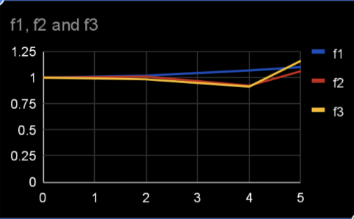
Excel chart
Comments
-
Thanks , understand what you say.SiliconChip said:I found when I was using Excel to chart the change in my blood pressure over several months following alteration to my medication that it was better to have separate charts for the systolic and diastolic readings with the y-axis (pressure) tailored to the lowest and highest readings so that the lines didn't look close to flat.Unless the prices of all of your shares are similar and have a similar degree of variation over time I think trying to show all 15 in one chart will make it difficult to see what's really happened to many of them. While it might be more effort to create separate charts I think it will give you a more meaningful picture of performance for each share.
I was trying to use line graph to help review each of 15 holdings for year 1 , then separate chart year 3 and again year 5.
I understand now I need ‘time’ so will revert to a bar chart.
appreciate all help.0 -
Doh - missed the annualised bit![Deleted User] said:
Not quite, the data set doesn't actually say what the return was at the 3 year or 5 year mark in the past - it is the annualised return over that period an therefore gives the average return over the past 3 or 5 years which is not the same as a saying what the actual return was 3 or 5 years ago.k_man said:The 'best' you could get is a graph with data at:
5 years ago
3 years ago*
1 year ago*
Current
Or years0
2
4
5
With no view of what happened between
e.g.
* data calculated backwards from 5 year and 3/1 year returns0 -
After some thought, I think we do know what the value was 5, 3 and 1 year(s) ago.
The maths is a little more complex (annualised is not the same as average).
Total return = annualised return ^ number of years
Back to the spreadsheet.0 -
For traded stock you can look up the closing daily value and download all the data you need for yearsk_man said:After some thought, I think we do know what the value was 5, 3 and 1 year(s) ago.
The maths is a little more complex (annualised is not the same as average).
Total return = annualised return ^ number of years
Back to the spreadsheet.
there are other places,
I have used HL for spot checks(probate valuations)
https://www.hl.co.uk/shares/shares-search-results/s/sainsbury-j-plc-ordinary-28,47p/dividends
and yahoo as a Xcheck and download.
https://finance.yahoo.com/quote/SBRY.L/history?p=SBRY.L
One key with data analysis start with the best source data you can get.
Then think about what it is you want to do with that and understand what that may tell you.
For stocks there is already a lot of work done and offered up for free all over the web.
2 -
I agree completely.
Don't start with this data. The summary annualised returns are based on actual data. Review that instead.
To be honest, this was more a spreadsheet and maths challenge. (I am not the OP btw)1 -
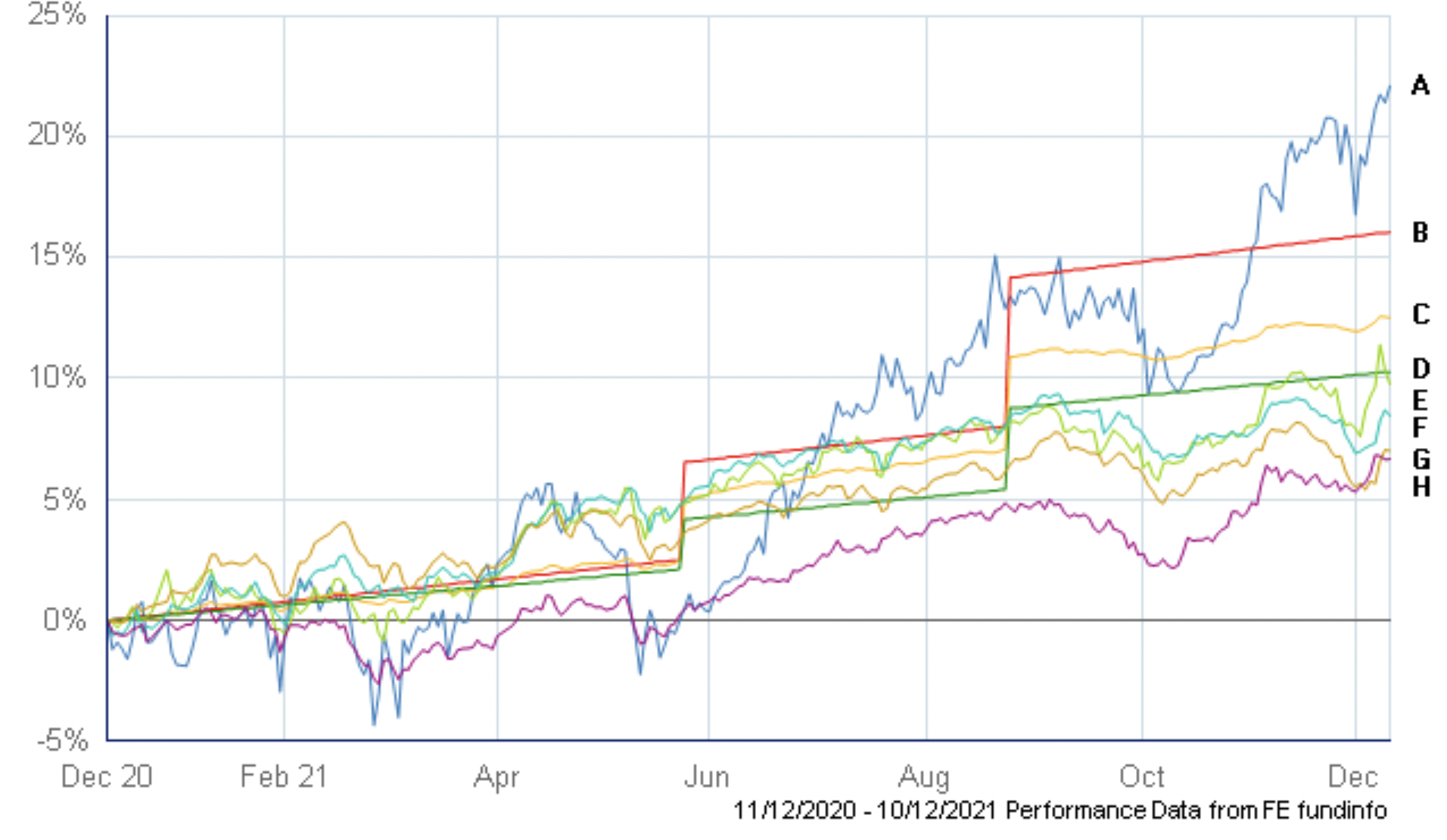
Thanks - The actual holdings are not traded stocks- rather investments within SIPP e.g Vanguard , Prudential , fidelity .- -I was looking to review % growth / loss for 1 year then a separate chart year 2 & then year 3- following feedback .I am now aware that the chart I was looking to emulate-Trustnet- copy below has 1/4ly dated info which I cannot access / be too time consuming to gather so will now use bar chart instead


0 -
Don't funds within a SIPP have daily valuations?0
-
One of the SIPP proverbs only shows MI on the day- impossible to view back- I will move forward now and use bar chart -getmore4less said:Don't funds within a SIPP have daily valuations?
Again thanks for all help/input0 -
If the underlying funds are traded then they should be on places like yahoo just need to find the right symbols.fjh said:
One of the SIPP proverbs only shows MI on the day- impossible to view back- I will move forward now and use bar chart -getmore4less said:Don't funds within a SIPP have daily valuations?
Again thanks for all help/input1
Confirm your email address to Create Threads and Reply

Categories
- All Categories
- 353.5K Banking & Borrowing
- 254.2K Reduce Debt & Boost Income
- 455.1K Spending & Discounts
- 246.6K Work, Benefits & Business
- 603K Mortgages, Homes & Bills
- 178.1K Life & Family
- 260.6K Travel & Transport
- 1.5M Hobbies & Leisure
- 16K Discuss & Feedback
- 37.7K Read-Only Boards


