We’d like to remind Forumites to please avoid political debate on the Forum.
This is to keep it a safe and useful space for MoneySaving discussions. Threads that are – or become – political in nature may be removed in line with the Forum’s rules. Thank you for your understanding.
📨 Have you signed up to the Forum's new Email Digest yet? Get a selection of trending threads sent straight to your inbox daily, weekly or monthly!
The Forum now has a brand new text editor, adding a bunch of handy features to use when creating posts. Read more in our how-to guide
Excel chart

fjh
Posts: 184 Forumite


in Techie Stuff
Been trying to create a chart but having no success.
15 lines of data in two columns- I want a line chart that shows each holding on one axis and performance on other axis.
I can create bar chart but cannot find a way to show all data lines.
This is type of chart I am trying to create .
Any suggestions please ?
15 lines of data in two columns- I want a line chart that shows each holding on one axis and performance on other axis.
I can create bar chart but cannot find a way to show all data lines.
This is type of chart I am trying to create .
Any suggestions please ?
0
Comments
-
Probably a bit more information about the data is needed to understand better.
From what you describe, two columns of data, one would be X axis and the other Y axis and therefore you could only have 1 line on the chart rather than multiple lines.
Can you give a rough idea of the data - ie column 1 date, column 2 quantity of "things" for example?
0 -
Thanks - this is for performance of investments - so Column A is name of holding - e.g Shell- total of 15 holdings- rows, column B is the % move for each row in say a year.I am looking to create a line chart similar to example attached in original post.
Help is appreciated0 -
That's 15 lines with only one point.fjh said:Thanks - this is for performance of investments - so Column A is name of holding - e.g Shell- total of 15 holdings- rows, column B is the % move for each row in say a year.I am looking to create a line chart similar to example attached in original post.
Help is appreciated
Or do you then have column C with another point for a different time period.
If you cut from the sheet and paste here it will create a table so we can see the data set.1 -
Right, so line charts are used to represent data over a period of time - in your case there is no "time" data, you have just one column giving a percent change at the current time.
What you need is many more columns to get the graph you need, each column representing a different time, for example:
But having said that, the above is not really useful or mathematically correct, showing a percent change in the value of stock doesn't give you a nice graph.
What you really want to visualise is the following, the actual value of the stock over time:
1 -
Thanksgetmore4less said:
That's 15 lines with only one point.fjh said:Thanks - this is for performance of investments - so Column A is name of holding - e.g Shell- total of 15 holdings- rows, column B is the % move for each row in say a year.I am looking to create a line chart similar to example attached in original post.
Help is appreciated
Or do you then have column C with another point for a different time period.
If you cut from the sheet and paste here it will create a table so we can see the data set.
I am looking to create a chart for each time frame if possible similar to example.Holding YTD 1 Yr 3 Yr 5 Yr Return Return Anlsd Anlsd GBP % % % Holding A 2.68 3.26 8.36 10.28 Holding B 14.11 15.17 5.19 6.03 Holding C 27.26 27.73 18.39 16.44 Holding D 13.1 15.68 11.63 11.48 Holding E 2.31 5.31 6.59 7.29 Holding F 6.59 11.14 10.91 10.21 Holding G 14.03 15.04 4.95 5.91 Holding H 9.35 9.69 5.48 - Holding I 14.95 15.36 5.14 - Holding J 6.39 7.84 8.23 6.55 Holding K 12.95 14.84 11.26 11.08 Holding L 6.1 7.17 7.78 6.5 Holding M -2.27 -0.03 5.42 3.64 Holding N -2.27 -0.03 5.42 3.63 0 -
Right, so I must admit I've got confused because what your post asks for and the example graph are two different things.fjh said:
Thanksgetmore4less said:
That's 15 lines with only one point.fjh said:Thanks - this is for performance of investments - so Column A is name of holding - e.g Shell- total of 15 holdings- rows, column B is the % move for each row in say a year.I am looking to create a line chart similar to example attached in original post.
Help is appreciated
Or do you then have column C with another point for a different time period.
If you cut from the sheet and paste here it will create a table so we can see the data set.
I am looking to create a chart for each time frame if possible similar to example.Holding YTD 1 Yr 3 Yr 5 Yr Return Return Anlsd Anlsd GBP % % % Holding A 2.68 3.26 8.36 10.28 Holding B 14.11 15.17 5.19 6.03 Holding C 27.26 27.73 18.39 16.44 Holding D 13.1 15.68 11.63 11.48 Holding E 2.31 5.31 6.59 7.29 Holding F 6.59 11.14 10.91 10.21 Holding G 14.03 15.04 4.95 5.91 Holding H 9.35 9.69 5.48 - Holding I 14.95 15.36 5.14 - Holding J 6.39 7.84 8.23 6.55 Holding K 12.95 14.84 11.26 11.08 Holding L 6.1 7.17 7.78 6.5 Holding M -2.27 -0.03 5.42 3.64 Holding N -2.27 -0.03 5.42 3.63
In your original post you said:fjh said:
15 lines of data in two columns- I want a line chart that shows each holding on one axis and performance on other axis.
Holding on one axis and performance on the other would look like this based on the data on your last post: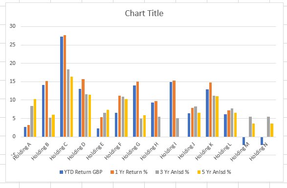
It is not possible to make that into a line graph because you don't have time basis in your data - eg by month or year - and this is where I started getting confused because the example chart in your first post shows performance over a year by month - which is what I based my replies on - showing the data month by month.
You need to have some data that shows the return for each year (or month) in your table in order to make a line graph.
Just because the 1 yr / 3yr / 5yr return data is in your table doesn't allow us mathematically to work out what the return was at any particular time in the past.
1 -
Thanks for all the help on this topic 🙏0
-
The 'best' you could get is a graph with data at:
5 years ago
3 years ago*
1 year ago*
Current
Or years0
2
4
5
With no view of what happened between
e.g.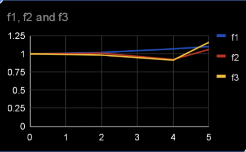
* data calculated backwards from 5 year and 3/1 year returns1 -
Not quite, the data set doesn't actually say what the return was at the 3 year or 5 year mark in the past - it is the annualised return over that period an therefore gives the average return over the past 3 or 5 years which is not the same as a saying what the actual return was 3 or 5 years ago.k_man said:The 'best' you could get is a graph with data at:
5 years ago
3 years ago*
1 year ago*
Current
Or years0
2
4
5
With no view of what happened between
e.g.
* data calculated backwards from 5 year and 3/1 year returns0 -
I found when I was using Excel to chart the change in my blood pressure over several months following alteration to my medication that it was better to have separate charts for the systolic and diastolic readings with the y-axis (pressure) tailored to the lowest and highest readings so that the lines didn't look close to flat.Unless the prices of all of your shares are similar and have a similar degree of variation over time I think trying to show all 15 in one chart will make it difficult to see what's really happened to many of them. While it might be more effort to create separate charts I think it will give you a more meaningful picture of performance for each share.0


Confirm your email address to Create Threads and Reply

Categories
- All Categories
- 353.5K Banking & Borrowing
- 254.2K Reduce Debt & Boost Income
- 455.1K Spending & Discounts
- 246.6K Work, Benefits & Business
- 603K Mortgages, Homes & Bills
- 178.1K Life & Family
- 260.6K Travel & Transport
- 1.5M Hobbies & Leisure
- 16K Discuss & Feedback
- 37.7K Read-Only Boards