We’d like to remind Forumites to please avoid political debate on the Forum.
This is to keep it a safe and useful space for MoneySaving discussions. Threads that are – or become – political in nature may be removed in line with the Forum’s rules. Thank you for your understanding.
📨 Have you signed up to the Forum's new Email Digest yet? Get a selection of trending threads sent straight to your inbox daily, weekly or monthly!
Nationwide - New Debit Cards
Comments
-
Banks have been producing more accessible items for a while - it's just that they were provided on request and not as part of their standard offering.dr_adidas01 said:GTR_King said:I wonder if more banks will add new cards like this E.G Barclays Lloyd's etcNatwest and RBS have had the notch and braille card for a while, recent Halifax credit card has the notch, First Direct Mastercard debit card has the notch and the braille dots.I think there must be some big push by the RNIB as it seems lots of banks and credit card company's are now adding these features which really should have been done a long time ago.2 -
Hopefully Lloyds will add that notch card soon and Barclays as well
0 -
I was expecting something more akin to TSB's recent offerings but have to say I'm not really impressed - it's not an improvement on the current design. Looks very cluttered. My account is a FlexBasic though, so I'll be interested to see that one.0
-
Barclays already provide high visibility debit cards, with a notch, on demand.GTR_King said:Hopefully Lloyds will add that notch card soon and Barclays as well
Lloyds new Cashback Credit Card has a notch, so they may be planning to introduce it to debit cards eventually.0 -
thanks for that would like Barclays to include the notch on all their cards0
-
It doesn't look as cluttered in real life as it seems to in those images (which I think are mine posted elsewhere). The white boxes to hide the information don't help either.Gary_S_3 said:I was expecting something more akin to TSB's recent offerings but have to say I'm not really impressed - it's not an improvement on the current design. Looks very cluttered. My account is a FlexBasic though, so I'll be interested to see that one.
I think it is a large improvement. The card isn't shiny anymore and I think it looks less outdated (the house design wasn't my favourite thing for a card design). The blue is a lot nicer as well imo. The "Building Society, Nationwide" in the middle looks very nice but is hard to get across in a photo.
0 -
Lightning360 said:
It doesn't look as cluttered in real life as it seems to in those images (which I think are mine posted elsewhere). The white boxes to hide the information don't help either.Gary_S_3 said:I was expecting something more akin to TSB's recent offerings but have to say I'm not really impressed - it's not an improvement on the current design. Looks very cluttered. My account is a FlexBasic though, so I'll be interested to see that one.
I think it is a large improvement. The card isn't shiny anymore and I think it looks less outdated (the house design wasn't my favourite thing for a card design). The blue is a lot nicer as well imo. The "Building Society, Nationwide" in the middle looks very nice but is hard to get across in a photo.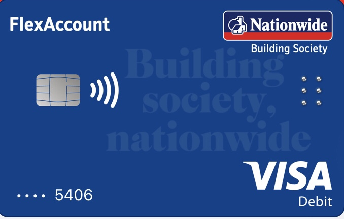 This is it from Apple Pay 👍
I personally quite like it 😎Im an ex employee RBS GroupHowever Any Opinion Given On MSE Is Strictly My Own1 -
I would say it looks even better in person. The blue is very nice and the way they've written "Building society, nationwide" is in a way that it doesn't stand out too much to be a distraction, but it is still clear to read. As I said above, the back doesn't look as cluttered as it does in the photos above and everything works well alongside each other.stclair said:Lightning360 said:
It doesn't look as cluttered in real life as it seems to in those images (which I think are mine posted elsewhere). The white boxes to hide the information don't help either.Gary_S_3 said:I was expecting something more akin to TSB's recent offerings but have to say I'm not really impressed - it's not an improvement on the current design. Looks very cluttered. My account is a FlexBasic though, so I'll be interested to see that one.
I think it is a large improvement. The card isn't shiny anymore and I think it looks less outdated (the house design wasn't my favourite thing for a card design). The blue is a lot nicer as well imo. The "Building Society, Nationwide" in the middle looks very nice but is hard to get across in a photo.This is it from Apple Pay 👍
I personally quite like it 😎0
![[Deleted User]](https://us-noi.v-cdn.net/6031891/uploads/defaultavatar/nFA7H6UNOO0N5.jpg)


Confirm your email address to Create Threads and Reply

Categories
- All Categories
- 354.8K Banking & Borrowing
- 254.5K Reduce Debt & Boost Income
- 455.6K Spending & Discounts
- 247.6K Work, Benefits & Business
- 604.6K Mortgages, Homes & Bills
- 178.6K Life & Family
- 262.2K Travel & Transport
- 1.5M Hobbies & Leisure
- 16.1K Discuss & Feedback
- 37.7K Read-Only Boards