We’d like to remind Forumites to please avoid political debate on the Forum.
This is to keep it a safe and useful space for MoneySaving discussions. Threads that are – or become – political in nature may be removed in line with the Forum’s rules. Thank you for your understanding.
📨 Have you signed up to the Forum's new Email Digest yet? Get a selection of trending threads sent straight to your inbox daily, weekly or monthly!
The Forum now has a brand new text editor, adding a bunch of handy features to use when creating posts. Read more in our how-to guide
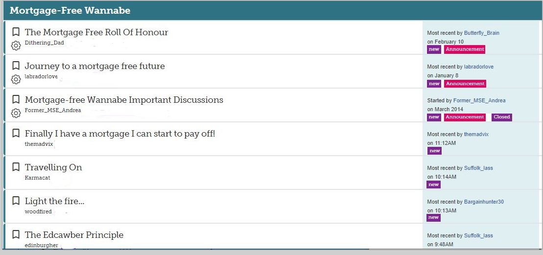
Thread List : Purple flagged items distracting from thread titles

bob_a_builder
Posts: 2,374 Forumite


The main thing here is surely the thread title, the extra purple coloured flags for New or Poll etc just distract the eye, partially because they are all over the shop based on the length of the thread creators name
Can those flags not be in another column, further to the right, or even in the current 'Most Recent' column to the right, that would seem a more logical place for them
Keep the Thread list clear and easy to read
Can those flags not be in another column, further to the right, or even in the current 'Most Recent' column to the right, that would seem a more logical place for them
Keep the Thread list clear and easy to read
4
Comments
-
Your suggested improvement makes it worse by making the last poster information harder to read. That's a key determinant of whether a thread merits attention, with last poster being known to be reliable making it less needed. Also important is the missing timestamp.
New particularly needs to be adjacent to the thread title for easy scanning and your suggestion makes scanning slower.
Using bold instead of a bright background should be enough visual distinction.0 -
jamesd said:Your suggested improvement makes it worse by making the last poster information harder to read. That's a key determinant of whether a thread merits attention, with last poster being known to be reliable making it less needed. Also important is the missing timestamp.
New particularly needs to be adjacent to the thread title for easy scanning and your suggestion makes scanning slower.
Using bold instead of a bright background should be enough visual distinction.It could be improved by saying 'Latest' rather than 'Most recent' (why use two words when one will do?).And when the timestamp is fixed the word 'on' can be dispensed with, and using the 24 hour clock obviates the need for AM and PM too.Date format - most useful and ergonomic to a UK user is dd mmm yyyy e.g.10 Feb 2020 - there is no need to spell out months in full.
The questions that get the best answers are the questions that give most detail....0 -
The purple or any color makes it hard for me to even read the text.

0 -
Agree, I am dyslexic and the "randomly" positioned purple boxes scattered down the side are terribly distracting and make it a real chore to scan the titles of threads.
Even if they could all be placed first on the left side it would be an improvement.0 -
Hi
If this has been reported in the snagging thread then we're aware of this issue and will be doing all we can to bring back as many features as possible. Check out the last post for our current priorities.
If it hasn't been reported in the snag thread, please post it up when we post the new thread in the next week or so with a list of everything reported to us.
Thanks
Join the MSE Forum
Get the Free MoneySavingExpert Money Tips E-mail
To report inappropriate posts: click the report button
Flag a news story: news@moneysavingexpert.com0


This discussion has been closed.
Confirm your email address to Create Threads and Reply

Categories
- All Categories
- 353.8K Banking & Borrowing
- 254.3K Reduce Debt & Boost Income
- 455.2K Spending & Discounts
- 246.9K Work, Benefits & Business
- 603.4K Mortgages, Homes & Bills
- 178.2K Life & Family
- 260.9K Travel & Transport
- 1.5M Hobbies & Leisure
- 16K Discuss & Feedback
- 37.7K Read-Only Boards