We’d like to remind Forumites to please avoid political debate on the Forum.
This is to keep it a safe and useful space for MoneySaving discussions. Threads that are – or become – political in nature may be removed in line with the Forum’s rules. Thank you for your understanding.
📨 Have you signed up to the Forum's new Email Digest yet? Get a selection of trending threads sent straight to your inbox daily, weekly or monthly!
The Forum now has a brand new text editor, adding a bunch of handy features to use when creating posts. Read more in our how-to guide
Very Modern Light…horizontal or vertical?

GoldenOldy
Posts: 245 Forumite


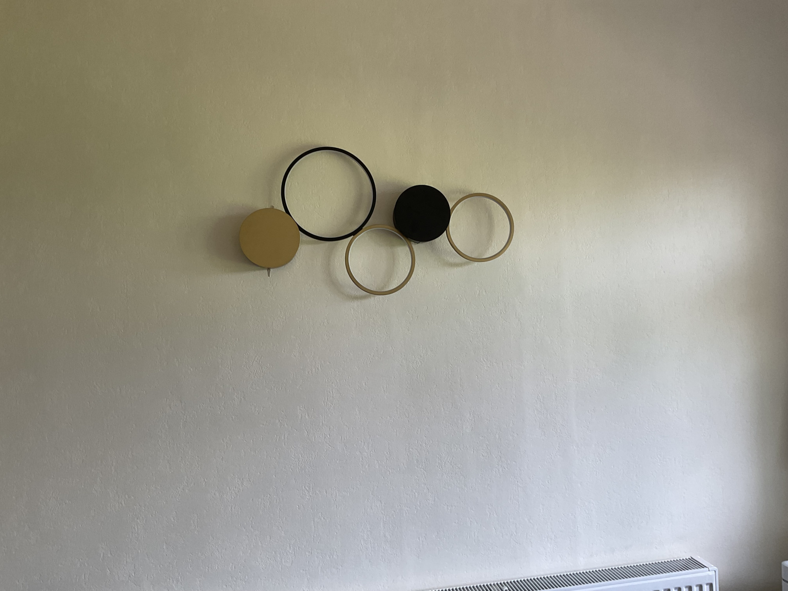
I have chosen a very modern light for my wall in a room, and am wondering which way to position it, horizontally or vertically. I have enclosed photographs and would be interested in what you stylish people think.
Thankyou
Thankyou
0
Comments
-
Horizontally.
I'd also say, that colour wise it matches the main light, but the styles are very different and that jars with me.I'm a Forum Ambassador on the housing, mortgages & student money saving boards. I volunteer to help get your forum questions answered and keep the forum running smoothly. Forum Ambassadors are not moderators and don't read every post. If you spot an illegal or inappropriate post then please report it to forumteam@moneysavingexpert.com (it's not part of my role to deal with this). Any views are mine and not the official line of MoneySavingExpert.com.4 -
Oh yes, i forgot to mention, the main light is being changed. Thankyou
1 -
Do you think it looks too small for the space? I am having difficulty finding a larger one.0
-
Not sure there's a strong reason to prefer either orientation. Unless the lighting effect is somehow better one way or the other, I'd just go with whichever you like the look of most.
To me, the horizontal arrangement looks a bit "Olympic rings gone wrong" whereas the vertical is more unique. I'd possibly have chosen the latter just based on first impressions.1 -
Thanks both, one vote for each so far then!0
-
Walls are there to be filled. If you place it vertically then that gives you space to have two decent sized pictures either side.GoldenOldy said:Do you think it looks too small for the space? I am having difficulty finding a larger one.If you're attempting to fill the wall with just that one object then horizontal might be better but you're really not filling the wall.Interior design is about the whole and how objects sit together to create one scene. It's not a scene yet.Everything that is supposed to be in heaven is already here on earth.
1 -
Sorry to be awkward, but could we please have a picture of it at 45 degrees?
No reliance should be placed on the above! Absolutely none, do you hear?4 -
Yes, thankyou for being interested.. I am coming to the conclusion it may be too small for the space so thinking perhaps a picture light with a mirror/picture underneath?
one pic below 45 degrees, one 90’s to give you scale of wall.0 -

 there we are…its quite a big wall , but it needs a light. I have only one wired up part for lighting in the wall. Thanks
0 -
It's too small. I would get two of the same, and position them close together such that they look like one light.GoldenOldy said:Do you think it looks too small for the space? I am having difficulty finding a larger one.1


Confirm your email address to Create Threads and Reply

Categories
- All Categories
- 353.6K Banking & Borrowing
- 254.2K Reduce Debt & Boost Income
- 455.1K Spending & Discounts
- 246.7K Work, Benefits & Business
- 603K Mortgages, Homes & Bills
- 178.1K Life & Family
- 260.7K Travel & Transport
- 1.5M Hobbies & Leisure
- 16K Discuss & Feedback
- 37.7K Read-Only Boards