We’d like to remind Forumites to please avoid political debate on the Forum.
This is to keep it a safe and useful space for MoneySaving discussions. Threads that are – or become – political in nature may be removed in line with the Forum’s rules. Thank you for your understanding.
📨 Have you signed up to the Forum's new Email Digest yet? Get a selection of trending threads sent straight to your inbox daily, weekly or monthly!
The Forum now has a brand new text editor, adding a bunch of handy features to use when creating posts. Read more in our how-to guide
Understanding past performance data on Vanguard site
Wobble101
Posts: 83 Forumite


I'm hoping someone here can help me understand the different data visualisations on Vanguard's site - and specifically why they vary for the same investment.
As an example, take the ESG Developed World All Cap Equity Index Fund - accumulation. https://www.vanguardinvestor.co.uk/investments/vanguard-esg-developed-world-all-cap-equity-index-fund-gbp-acc?intcmpgn=equityglobal_esgdevelopedworldallcapequityindexfund_fund_link
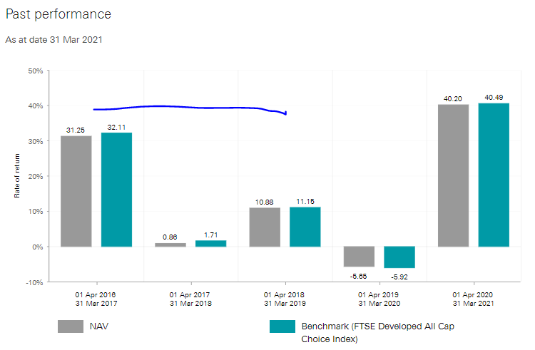
This next visual appears on the specific page about the fund (note that the starting year is 2016/17):


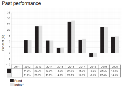
But the Key Investor Information document has a different visualisation (note this time the starting year is 2012).

There seem to be two possible reasons why they differ. Firstly, the initial starting year is different, and that then affects the % return (but if that is the case I'm still confused by why (for eg) the return is quite so low in the first 2017/18 graphic when compared with the second). Secondly, the second chart appears from the legend to be based on calendar years vs the financial ones - is that really correct or a mislabelling?
Do these two reasons explain the discrepancy between these graphics or am I missing something? If they do, why do the KII documents use calendar year when everywhere else it is financial?
Many thanks.
As an example, take the ESG Developed World All Cap Equity Index Fund - accumulation. https://www.vanguardinvestor.co.uk/investments/vanguard-esg-developed-world-all-cap-equity-index-fund-gbp-acc?intcmpgn=equityglobal_esgdevelopedworldallcapequityindexfund_fund_link
This next visual appears on the specific page about the fund (note that the starting year is 2016/17):


But the Key Investor Information document has a different visualisation (note this time the starting year is 2012).

There seem to be two possible reasons why they differ. Firstly, the initial starting year is different, and that then affects the % return (but if that is the case I'm still confused by why (for eg) the return is quite so low in the first 2017/18 graphic when compared with the second). Secondly, the second chart appears from the legend to be based on calendar years vs the financial ones - is that really correct or a mislabelling?
Do these two reasons explain the discrepancy between these graphics or am I missing something? If they do, why do the KII documents use calendar year when everywhere else it is financial?
Many thanks.
0
Comments
-
Looks like the first graph is based on last month end date (being 31st March) whilst the KII document uses calendar year ends. That’s a 3month difference for each year, and a lot can happen in 3 months!"If you aren’t willing to own a stock for ten years, don’t even think about owning it for ten minutes” Warren Buffett
Save £12k in 2025 - #024 £1,450 / £15,000 (9%)1 -
Yes the Vanguard website shows a rolling past whole year(s) view which of course was most recently just after the worst of the virus crash so the recent performance after that looks amazing. The 2020 calendar view in the key information document looks less amazing as it includes both the drop and the recovery. There will be similar differences in the previous years. Stock markets go up and down all the time so looking at slightly different 12 month periods can cause very different graphs.
0 -
They'll be no great desire to update KIID's for multiple funds every single month of the year! Though I doubt most people even bother to read them.Wobble101 said:If they do, why do the KII documents use calendar year when everywhere else it is financial?0 -
Thanks all, very helpful.1
Confirm your email address to Create Threads and Reply

Categories
- All Categories
- 353.6K Banking & Borrowing
- 254.2K Reduce Debt & Boost Income
- 455.1K Spending & Discounts
- 246.7K Work, Benefits & Business
- 603.1K Mortgages, Homes & Bills
- 178.1K Life & Family
- 260.7K Travel & Transport
- 1.5M Hobbies & Leisure
- 16K Discuss & Feedback
- 37.7K Read-Only Boards


