We’d like to remind Forumites to please avoid political debate on the Forum.
This is to keep it a safe and useful space for MoneySaving discussions. Threads that are – or become – political in nature may be removed in line with the Forum’s rules. Thank you for your understanding.
Debate House Prices
In order to help keep the Forum a useful, safe and friendly place for our users, discussions around non MoneySaving matters are no longer permitted. This includes wider debates about general house prices, the economy and politics. As a result, we have taken the decision to keep this board permanently closed, but it remains viewable for users who may find some useful information in it. Thank you for your understanding.
📨 Have you signed up to the Forum's new Email Digest yet? Get a selection of trending threads sent straight to your inbox daily, weekly or monthly!
Who'd vote for lower house prices? Not many...
Comments
-
HAMISH_MCTAVISH wrote: »
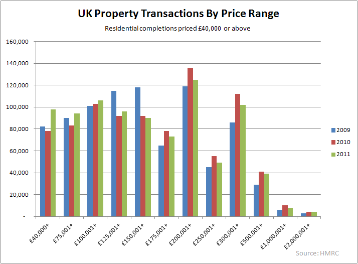
Other than the two distorting spikes at stamp duty thresholds, the pattern of sales by price also shows a sharp decrease as value increases.
What relevance is this to the discussion?
Your graph is just pointing out the obvious. Something which will never really change, regardless of affordability as there are far more lower end properties than there are higher end.0 -
HAMISH_MCTAVISH wrote: »
Other than the two distorting spikes at stamp duty thresholds, the pattern of sales by price also shows a sharp decrease as value increases.
Why relevant? And wrong (see below).FACT.0 -
HAMISH_MCTAVISH wrote: »
Other than the two distorting spikes at stamp duty thresholds, the pattern of sales by price also shows a sharp decrease as value increases.
The two "spikes" are caused by the move from £25k price range columns to £50k, then £200k (e.g. to compare like for like with the lower price ranges the 300-500 range should be one eighth of that height in average), then £500k price range columns. I guess that the smallness of the 250-300 category is partly an SD thing.FACT.0 -
Graham_Devon wrote: »The biggest crux in your argument, and one that's now plain for all to see, is the mean is moving away from the median, .
Graham, you prize ninny.
The mean will almost always increase away from the median In numerical terms in an inflationary environment.
If the median wage is 30k and the mean is 40k then the percentage is 75%, but the difference is 10k
Then move on 20 years....
If the median wage is 60k and the mean is 80k then the percentage is still 75%, but the difference is 20k
In real terms however, ie, in spending power terms, there is little difference.“The great enemy of the truth is very often not the lie – deliberate, contrived, and dishonest – but the myth, persistent, persuasive, and unrealistic.
Belief in myths allows the comfort of opinion without the discomfort of thought.”
-- President John F. Kennedy”0 -
HAMISH_MCTAVISH wrote: »
In real terms however, ie, in spending power terms, there is little difference.
And you call me a ninny!?
LOL. That's about the stupidiest thing I have heard you say. This is nothing to do with inflation, it's about wages. Inflation is a secondary factor. Footballers wages didnt go from thousands to millions within a few years just through inflation....but they WILL drag the mean up.
Destroy my figures above Hamish....go on....0 -
As a percentage, would anyone have an estimate of what proportion of voters would stand to gain directly from cheaper houses as opposed to higher priced houses.0
-
Graham
2011 full time male mean £36,511 median £28,409 all median £21,326
1997 full time male mean £21,601 median £18,558 all median £13,983
So all median was 77.8% of male full time mean and all median was 58%
in 1997 the figures were 85% and 64% so you are right to some extent.
If we reduce full time mean to bring it in line to 1997 it would be £33,422 so earnings to house price ratio becomes 4.770 -
Graham_Devon wrote: »What relevance is this to the discussion?
Seriously?
You post a graph of income distribution to prove houses are unaffordable to the average person...... And then claim a graph of house price distribution is of no relevance?there are far more lower end properties than there are higher end.
Exactly.
There are indeed far more lower priced houses than higher priced houses.
A fact that seems to be lost on you.“The great enemy of the truth is very often not the lie – deliberate, contrived, and dishonest – but the myth, persistent, persuasive, and unrealistic.
Belief in myths allows the comfort of opinion without the discomfort of thought.”
-- President John F. Kennedy”0 -
in 1997 the figures were 85% and 64% so you are right to some extent.
LOL, I can't be right "to some extent". The figures are above, and apart from a calculation gone wrong, though I don't think it has, it's clear as night follows day that the median wage has fallen away from the mean wage, meaning the graph is generously ignoring a £40,000 difference in salary vs house price.
It's just a rigid graph compaing 2 datasets as I said.
The data within the time period, however, has changed, and changed significantly, which the graph ignores.0 -
HAMISH_MCTAVISH wrote: »Seriously?
You post a graph of income distribution to prove houses are unaffordable to the average person......
I posted the graph as a representation of median vs mean. Nothing to do with that you said. You seem a tad confused in this thread.
Destroy my figures....go onnnnnnn")
Ultimately, I have just categorically proven that house prices are about 40k overvalued. But if you ignore the mean wage moving away from the median wage and pretend most people are on 37k a year....your bubble remains intact.0


This discussion has been closed.
Confirm your email address to Create Threads and Reply

Categories
- All Categories
- 355.1K Banking & Borrowing
- 254.7K Reduce Debt & Boost Income
- 455.8K Spending & Discounts
- 247.9K Work, Benefits & Business
- 605K Mortgages, Homes & Bills
- 178.8K Life & Family
- 262.7K Travel & Transport
- 1.5M Hobbies & Leisure
- 16.1K Discuss & Feedback
- 37.7K Read-Only Boards