We’d like to remind Forumites to please avoid political debate on the Forum.
This is to keep it a safe and useful space for MoneySaving discussions. Threads that are – or become – political in nature may be removed in line with the Forum’s rules. Thank you for your understanding.
Debate House Prices
In order to help keep the Forum a useful, safe and friendly place for our users, discussions around non MoneySaving matters are no longer permitted. This includes wider debates about general house prices, the economy and politics. As a result, we have taken the decision to keep this board permanently closed, but it remains viewable for users who may find some useful information in it. Thank you for your understanding.
📨 Have you signed up to the Forum's new Email Digest yet? Get a selection of trending threads sent straight to your inbox daily, weekly or monthly!
Who'd vote for lower house prices? Not many...
Comments
-
Graham_Devon wrote: »All I'm personally seeing here is:
"Please look at the highest income possible....we'll use some discrimination here...cus we can, and we'll call it positive discrimination and only look at a mans wages. We'll baulk a little as the figure is so high, but ignoring that...... We then compare that to the house price...we concludes that house prices are still overvalued, even if we stretch it over the last 30 years....you idiot, you incumbent idiot, come on everyone, call him an idiot....this proves my point that houses are, indeed, affordable".
Yer, that's not gonna go down well, and yes, it's an immature way to look at it, but sometimes just stating the obvious, and stating that the average wage should be just that, the average, just seems to pass so many of you by.
You keep on cherry picking the data to suit, but ignore all other data. Whichever way you look at it, houses are overpriced (in terms of salary). We have a current crisis of people even in them unable to afford them. We've got large support in place to protect these people.
A graph can only tell you one single side of the argument and can prove whatever you wish the graph to prove. Reality is a different ballgame, and I hate to break it to you, but the average was IS around 26k. You can choose the average you would prefer, you can choose the type of person earning you prefer to make calculations look better, but you cannot get away from reality.
Lots of stuff has changed in 30 years. We;ve got 10,000 extra households a MONTH claiming housing benefits, but you want to pretend people are actually earning an average 37k a year on one wage?! Some men, thanks to the massive wages of bankers, footballers etc dragging the line up earn 37k a year. Most do not. And it's not just men who buy houses....
You can choose what figure you like but if you are comparing today’s prices with the past you have to use the same figure all the time it’s no good saying they are 6 or 7x now but where 4 in the past if you are using one set of earnings for now and a completely different one for the past can’t you see that.0 -
You can choose what figure you like but if you are comparing today’s prices with the past you have to use the same figure all the time it’s no good saying they are 6 or 7x now but where 4 in the past if you are using one set of earnings for now and a completely different one for the past can’t you see that.
They're the same, can't you see

If you don't compare the two it's "positive discrimination":wall:
What we've got here is....... failure to communicate.
Some men you just can't reach.
:wall:0 -
You can choose what figure you like but if you are comparing today’s prices with the past you have to use the same figure all the time it’s no good saying they are 6 or 7x now but where 4 in the past if you are using one set of earnings for now and a completely different one for the past can’t you see that.
And feel free to stick to rigid calculations to come up with your viewpoint.
I'll stick to looking at the variables, and reality. For example, how far away was the mean from the median thirty years ago? Was the gap as wide as it is today with massive wages at the top end influencing your average? You probably don't know and probably don't care, but those are all the things that can influence such a rigid way of analysis....the graph won't care a jot if 30 years ago the difference between the mean and median was just 2k, and is now 11k, but it makes a huge real world difference.
I totally agree on using the same data throughout. But I don't agree you can always measure the real world which has changed so much in the meantime by the very same data and come up with a simple conclusion that every variable is still the same.
You won't convert to my way of looking at things, and I won't convert to yours. One things for sure, none are the wrong way. All I know is the average HOUSEHOLD income is around 37k. So to pretend that one person in the household's average earnings are also....37k...is a little bizzare in my book, as it suggests most households are a one working person household.
The basic flaw in your argument is to assume that everybody is earning above 50% average. That's impossible, but it's what you base your conclusions on.
Maybe the use of the word "typical earnings" would be a little easier to swallow for some.0 -
Graham_Devon wrote: »You won't convert to my way of looking at things, and I won't convert to yours. One things for sure, none are the wrong way. All I know is the average HOUSEHOLD income is around 37k. So to pretend that one person in the household's average earnings are also....37k...is a little bizzare in my book, as it suggests most households are a one working person household.
Graham,
If you agree the average household earnings is close to the ONS Male Full Time earnings, what's the issue with the calculation.
It shows what the average household is taking in and compares it to what house prices are at.
It certainly does not suggest that all households are on working person as households may contain a male who is not working or working part time.Graham_Devon wrote: ». For example, how far away was the mean from the median thirty years ago? Was the gap as wide as it is today with massive wages at the top end influencing your average? You probably don't know and probably don't care, but those are all the things that can influence such a rigid way of analysis.
________________________________________________
ONS 2011 Male Mean Full Time = £36,415
ONS 2011 All Mean = £26,623
2011 All Mean ratio to Male Mean Full time = 73.10998%
________________________________________________
ONS 2000 Male Mean Full Time = £25,594
ONS 2000 All Mean = £18,939
2000 All Mean ratio to Male Mean Full time = 73.9978%
_________________________________________________
ONS 1997 Male Mean Full Time = £21,664
ONS 1997 All Mean = £16,294
1997 All Mean ratio to Male Mean Full time = 75.21059%
_________________________________________________
Apologies, can;t quickly find ONS ASHE data pre 1997.
You can see over the last 15 years however that the All Mean average compared to the Male Mean Averge has fluctuated by only a very small ammount
1997 being just after the bottom of the previous house price correction so encompasses a full cycle.:wall:
What we've got here is....... failure to communicate.
Some men you just can't reach.
:wall:0 -
IveSeenTheLight wrote: »________________________________________________
ONS 2011 Male Mean Full Time = £36,415
ONS 2011 All Mean = £26,623
2011 All Mean ratio to Male Mean Full time = 73.10998%
________________________________________________
ONS 2000 Male Mean Full Time = £25,594
ONS 2000 All Mean = £18,939
2000 All Mean ratio to Male Mean Full time = 73.9978%
_________________________________________________
ONS 1997 Male Mean Full Time = £21,664
ONS 1997 All Mean = £16,294
1997 All Mean ratio to Male Mean Full time = 75.21059%
_________________________________________________
Apologies, can;t quickly find ONS ASHE data pre 1997.
You can see over the last 15 years however that the All Mean average compared to the Male Mean Averge has fluctuated by only a very small ammount
1997 being just after the bottom of the previous house price correction so encompasses a full cycle.
Gotta say, nice one for providing the data! And I can now shwo what I meant with the supplied data.
The difference between now and 1997 is quite stark.
In 1997, the mean was £4,470 greater than the median x 4.2 = £18,774 allowance that the graph creates in the trend line.
In 2011.the mean was £9,792 greater than the median x 4.2 = £41,126 allowance that the graph creates in the trend line.
To look into that a little further, the "allowance" (can't think of the right word there) was 10% greater than the median wage in 1997.
In 2011, the allowance was 64% greater than the median wage.
Therefore, that's how using the same rigid data over 30 years (30 years where it seems the mean keeps growing away from the median wage) leaves us with a measure that doesn't correlate with reality.
I don't think anyone can really disagree that the allowance the growing disparity between mean and median averages has created, isn't distorting reality.
Move it onto house prices at the time of the wages, and the disparity just grows even further. However, as were so keen to stick to an average trend line, that's what I have done.0 -
I'll show you how make comparison properly
2011 4.2x mean male =£152943 which is 5.74x all mean
1997 4.2x male mean £90988 which is 5.58x all mean
so not that difference.
Don't get me wrong I not saying property is cheap and it wouldn't have been better if the last boom had not occurred just that although prices are high they are not a high as some people try to make out.
As I have said before the biggest problem facing young people is the lack of good jobs.
0 -
I'll show you how make comparison properly
2011 4.2x mean male =£152943 which is 5.74x all mean
1997 4.2x male mean £90988 which is 5.58x all mean
so not that difference.
Don't get me wrong I not saying property is cheap and it wouldn't have been better if the last boom had not occurred just that although prices are high they are not a high as some people try to make out.
As I have said before the biggest problem facing young people is the lack of good jobs.
So you disagree with the maths?
When you say "properly" do you mean the correct way, or the way you wish to see it? You're still looking at mean only and appear to have completely glossed over everything that's just been said and have gone back to rigid calculations.
Mean simply looks at all salaries, includes massive whacking salaries at the top end, and picks the number in the middle. It does NOT represent the average person. It represents the middle of a number. It has, over time, grown away from the median, which your graph does not even touch upon. If you wish to stick to that, as it suits, then fair play. But please don't keep trying to tell me it's the correct way, and that's that.
There are plenty of real world flaws in it, the biggest of which I've just highlighted and you have completely ignored.
Shall we just agree that you wish to stick to the favourable number for this set of data, and I wish to look at the typical number?
For your reference... 0
0 -
Graham_Devon wrote: »So you disagree with the maths?
When you say "properly" do you mean the correct way, or the way you wish to see it? You're still looking at mean only and appear to have completely glossed over everything that's just been said and have gone back to rigid calculations.
Mean simply looks at all salaries, includes massive whacking salaries at the top end, and picks the number in the middle. It does NOT represent the average person. It represents the middle of a number.
Have you got figures for median I've got them for 2111 but not 20070 -
Have you got figures for median I've got them for 2111 but not 2007
No, but ISTL kindly provided enough to base anything on.
The biggest crux in your argument, and one that's now plain for all to see, is the mean is moving away from the median, meaning the graph shown above means less and less for the typical person. Hence no matter how many people say it's affordable, less and less can afford to buy, as the graph doesn't represent the typical person.
Not something that can really be argued, as the data is the data.0 -
Graham_Devon wrote: »
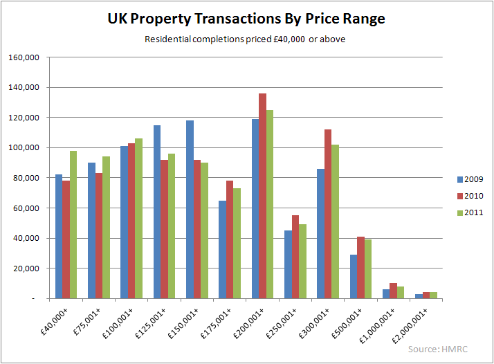
Other than the two distorting spikes at stamp duty thresholds, the pattern of sales by price also shows a sharp decrease as value increases above levels easily serviced by typical income households.
Around a third of all sales are for less than 100k, and two thirds for less than 175k.
By the time you factor in deposits, and equity from starter homes, these are easily within reach of ordinary people on ordinary wages.“The great enemy of the truth is very often not the lie – deliberate, contrived, and dishonest – but the myth, persistent, persuasive, and unrealistic.
Belief in myths allows the comfort of opinion without the discomfort of thought.”
-- President John F. Kennedy”0


This discussion has been closed.
Confirm your email address to Create Threads and Reply

Categories
- All Categories
- 355.2K Banking & Borrowing
- 254.7K Reduce Debt & Boost Income
- 455.8K Spending & Discounts
- 247.9K Work, Benefits & Business
- 605K Mortgages, Homes & Bills
- 178.8K Life & Family
- 262.7K Travel & Transport
- 1.5M Hobbies & Leisure
- 16.1K Discuss & Feedback
- 37.7K Read-Only Boards