We’d like to remind Forumites to please avoid political debate on the Forum.
This is to keep it a safe and useful space for MoneySaving discussions. Threads that are – or become – political in nature may be removed in line with the Forum’s rules. Thank you for your understanding.
📨 Have you signed up to the Forum's new Email Digest yet? Get a selection of trending threads sent straight to your inbox daily, weekly or monthly!
The Forum now has a brand new text editor, adding a bunch of handy features to use when creating posts. Read more in our how-to guide
Open Office : making document stand out.
Comments
-
I would avoid colour as it tends to look as if you have just left school and found out what a computer can do.
Are you using two colours for your name? Please don't
Don't use more than one font, with the exception of perhaps the font for your name.0 -
Another reason for not using colour is that the first pass through of a CV is a skim read to pick out the relevant keywords that they are looking for. If there is even the slightest difficulty in reading it then it will probably not get through to the next stage.
You must remember that the people that initially read your CV look at hundreds each day. If it is not easy to read then it will fail at the first hurdle.This is a system account and does not represent a real person. To contact the Forum Team email forumteam@moneysavingexpert.com0 -
I agree with Lucy, stay away from the crayons.
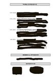
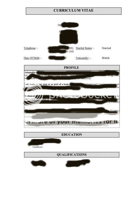
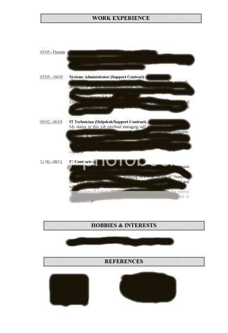
Click the thumbnails below, took 10 minutes to knock up using Office.
It's short (which means the employer won't get bored before they start), it's sweet, and it conveys everything the employer will want to immediately know.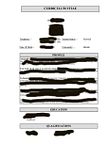
 Remember kids, it's the volts that jolt and the mills that kill.0
 -
Generally, it is the serifed fonts [TNR, Garamond] which are easiest to read in body text, because the serifs give more visual clues. Sans serif fonts work best for headlines and headings.purplerose wrote: »
Folk usually advise using a sans serif font such as Arial, Helvetica, Tahoma, Calibri as they are supposed to be easier to read or something like that.
Generally, however, AVOID TNR for cv's. The reason is that as a newspaper font it is 'semicondensed', meaning that you get more text in a given width. It works well for newspaper columns which are narrow, but it is awful for full width lines - and as Times New Roman is thought of as the default serif font, this is probably the reason for the idea that serif fonts are harder to read.
More serif fonts than you can shake a stick at listed here: http://en.wikipedia.org/wiki/List_of_typefaces#SerifHi, we’ve had to remove your signature. If you’re not sure why please read the forum rules or email the forum team if you’re still unsure - MSE ForumTeam0


This discussion has been closed.
Confirm your email address to Create Threads and Reply

Categories
- All Categories
- 353.6K Banking & Borrowing
- 254.2K Reduce Debt & Boost Income
- 455.1K Spending & Discounts
- 246.6K Work, Benefits & Business
- 603K Mortgages, Homes & Bills
- 178.1K Life & Family
- 260.6K Travel & Transport
- 1.5M Hobbies & Leisure
- 16K Discuss & Feedback
- 37.7K Read-Only Boards