We’d like to remind Forumites to please avoid political debate on the Forum.
This is to keep it a safe and useful space for MoneySaving discussions. Threads that are – or become – political in nature may be removed in line with the Forum’s rules. Thank you for your understanding.
📨 Have you signed up to the Forum's new Email Digest yet? Get a selection of trending threads sent straight to your inbox daily, weekly or monthly!
The Forum now has a brand new text editor, adding a bunch of handy features to use when creating posts. Read more in our how-to guide
Forum design/layout suggestion

edgex
Posts: 4,212 Forumite


Forum design/layout suggestion
0
Comments
-
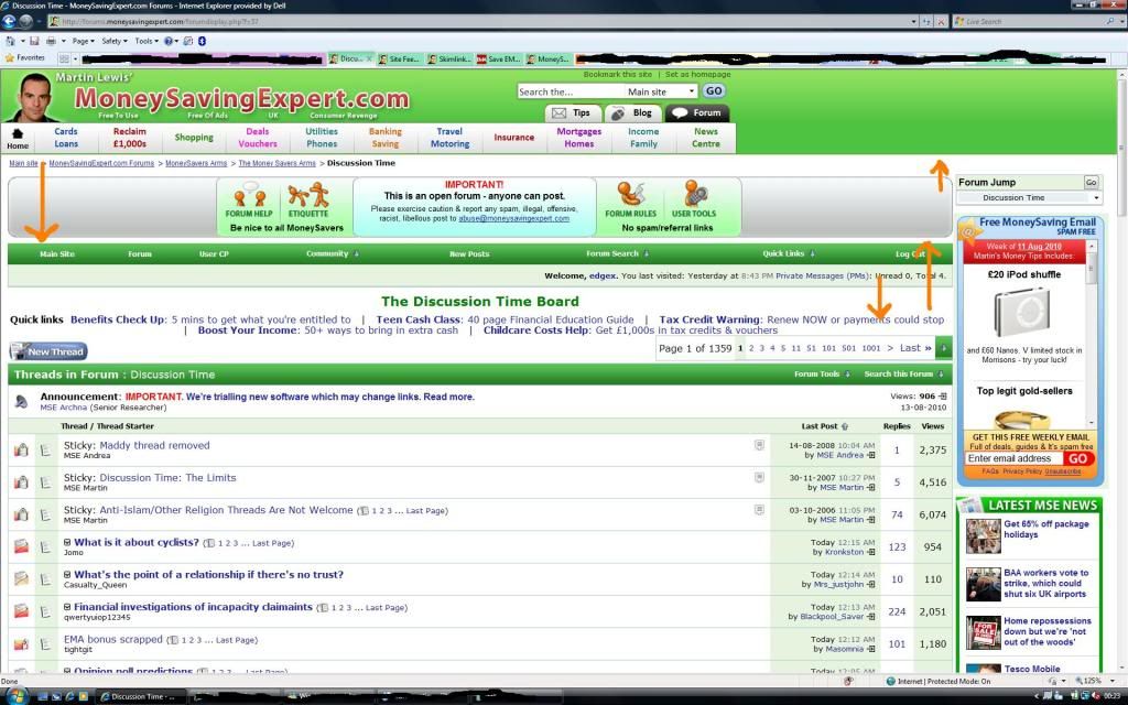
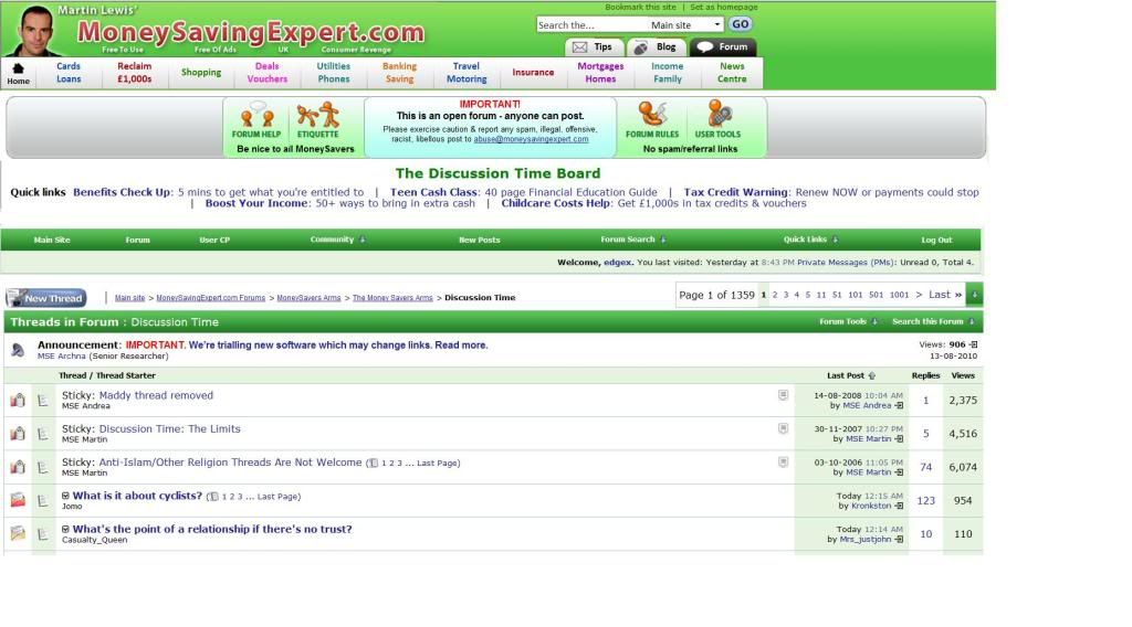
Not sure about the rest, but I would prefer it if the 'breadcrumb trail' was above the actual board title/content, rather than hiding up in the forum masthead.Free/impartial debt advice: National Debtline | StepChange Debt Charity | Find your local CAB
IVA & fee charging DMP companies: Profits from misery, motivated ONLY by greed0 -
Looks sensible to me, edgex.0
-
I think I'd posted something along those lines or at least I'd thought about it in my mind at some point. When you redid it in your second picture, it has crystalised in my mind. The space without any print looks a bit dull so now I feel it's better the way it is. Something I haven't managed to get used to after all this time is the topic titles highlighted in green as in:

It's just too prominent, looks authoritative specially because it is followed by MSE quick links, as if it's MSE news or something like that. It's enough if it shows on top (highlighted in blue) surely? Please someone tell me that I'm not on my own
  0
0


This discussion has been closed.
Confirm your email address to Create Threads and Reply

Categories
- All Categories
- 353.5K Banking & Borrowing
- 254.2K Reduce Debt & Boost Income
- 455.1K Spending & Discounts
- 246.6K Work, Benefits & Business
- 603K Mortgages, Homes & Bills
- 178.1K Life & Family
- 260.6K Travel & Transport
- 1.5M Hobbies & Leisure
- 16K Discuss & Feedback
- 37.7K Read-Only Boards