We’d like to remind Forumites to please avoid political debate on the Forum.
This is to keep it a safe and useful space for MoneySaving discussions. Threads that are – or become – political in nature may be removed in line with the Forum’s rules. Thank you for your understanding.
📨 Have you signed up to the Forum's new Email Digest yet? Get a selection of trending threads sent straight to your inbox daily, weekly or monthly!
The Forum now has a brand new text editor, adding a bunch of handy features to use when creating posts. Read more in our how-to guide
Pension Forecast, Layout Tweaked?
Secret2ndAccount
Posts: 1,017 Forumite


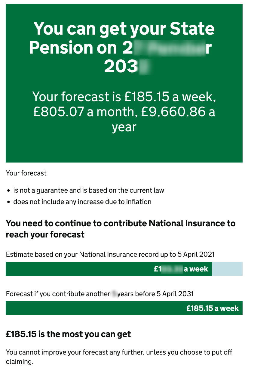
Do I have brain fade, or have they made some changes to the format of the pension forecast on gov.uk?

It still leaves the potential number in bigger text than the current actual number, which is what I would have changed. If they just took away the forecast from the big box at the top, and let the two little bar graphs do the talking, I think it would be better.

It still leaves the potential number in bigger text than the current actual number, which is what I would have changed. If they just took away the forecast from the big box at the top, and let the two little bar graphs do the talking, I think it would be better.
1
Comments
-
100% agree.
The number of posters on here who clearly haven't made it past the first figure never ceases to surprise!1 -
Interesting - will go an have a lookI think I saw you in an ice cream parlour
Drinking milk shakes, cold and long
Smiling and waving and looking so fine0 -
Yes, the top banner is indeed misleading when the fineprint says you have to contribute for four more years (i.e. excluding 2021/22 contributions which are yet to be factored in).0
-
Read the full page and seems totally self explantory.1
-
There hasn’t been any changes for a few years now. I agree that it might be better to have the top figure based on what you have so far and then underneath what you could get with more contributions.Secret2ndAccount said:Do I have brain fade, or have they made some changes to the format of the pension forecast on gov.uk?
It still leaves the potential number in bigger text than the current actual number, which is what I would have changed. If they just took away the forecast from the big box at the top, and let the two little bar graphs do the talking, I think it would be better.It’s easy enough to understand just by reading the whole forecast but I’ve come across so many who don’t read past the top headline figure. Then they get a shock when they don’t get it at SPA because they didn’t contribute further.What they should get rid of is the monthly figure as no-one is ever paid monthly. That should be replaced by the 4 weekly amount.0 -
They should also show the annual figure as weekly x 52, not weekly / 7 x 365.25
This is every bit as incorrect as the monthly figure (their annual figure / 12)0 -
I was on a Women Against State Pension Inequality fb page earlier and they recommended we print out our forecast. I was surprised at the very large format too, especially as I don't get that! I need to pay for two more years but at least I've had the 3.1% rise.£216 saved 24 October 20140
-
Understanding your forecast will be far more useful than printing it out so hopefully you're not taking advice from any of the campaign groups as most haven't a clue.youth_leader said:I was on a Women Against State Pension Inequality fb page earlier and they recommended we print out our forecast. I was surprised at the very large format too, especially as I don't get that! I need to pay for two more years but at least I've had the 3.1% rise.
The reasons for getting less than the full new state pension are usually quite straightforward. Either you reached SPA before 6th April 2016 or if after you were contracted out so paid less NI and therefore did not pay into the state earnings related pension. If this is the case then paying for years 2016 onwards will increase your pension. With payback time in less than 4 years it's well worth it.0 -
The monthly figure helps people compare it with their monthly salary. But I agree that it's confusing.What they should get rid of is the monthly figure as no-one is ever paid monthly. That should be replaced by the 4 weekly amount.0
Confirm your email address to Create Threads and Reply

Categories
- All Categories
- 354.4K Banking & Borrowing
- 254.4K Reduce Debt & Boost Income
- 455.4K Spending & Discounts
- 247.3K Work, Benefits & Business
- 604K Mortgages, Homes & Bills
- 178.4K Life & Family
- 261.5K Travel & Transport
- 1.5M Hobbies & Leisure
- 16K Discuss & Feedback
- 37.7K Read-Only Boards


