We’d like to remind Forumites to please avoid political debate on the Forum.
This is to keep it a safe and useful space for MoneySaving discussions. Threads that are – or become – political in nature may be removed in line with the Forum’s rules. Thank you for your understanding.
Debate House Prices
In order to help keep the Forum a useful, safe and friendly place for our users, discussions around non MoneySaving matters are no longer permitted. This includes wider debates about general house prices, the economy and politics. As a result, we have taken the decision to keep this board permanently closed, but it remains viewable for users who may find some useful information in it. Thank you for your understanding.
📨 Have you signed up to the Forum's new Email Digest yet? Get a selection of trending threads sent straight to your inbox daily, weekly or monthly!
The Forum now has a brand new text editor, adding a bunch of handy features to use when creating posts. Read more in our how-to guide
House prices in different countries

Wig
Posts: 14,139 Forumite
I have been trying to get some info and graphs on house prices around the world
this is an interesting one

It shows time on the X axis against multiple of average income on the Y axis
USA looks cheap 2.8 avg income and has plumetted to as low as it ever was (since 2000), Spain on the other hand has not really fallen that much despite what we are told on the news. But the page I got it from says the Spanish Gov has dubious figures, and it is in reality much lower.
And this one, you are all familiar with

Who decided to put that arbitrary red line as if that is where the market is supposed to be? Correct me if I'm wrong but isn't that red line exponential? I would think that after all these bubbles we would have learned that exponential models are just plain wrong. It should be a straight line, and there's really no saying how steep that straight line should be, it could be a lot less steep than the red line shown.
this is an interesting one

It shows time on the X axis against multiple of average income on the Y axis
USA looks cheap 2.8 avg income and has plumetted to as low as it ever was (since 2000), Spain on the other hand has not really fallen that much despite what we are told on the news. But the page I got it from says the Spanish Gov has dubious figures, and it is in reality much lower.
And this one, you are all familiar with
Who decided to put that arbitrary red line as if that is where the market is supposed to be? Correct me if I'm wrong but isn't that red line exponential? I would think that after all these bubbles we would have learned that exponential models are just plain wrong. It should be a straight line, and there's really no saying how steep that straight line should be, it could be a lot less steep than the red line shown.
0
Comments
-
Here's some more interesting charts....
International house price to income.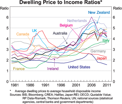
International Unemployment.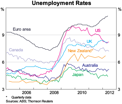
UK house prices...
(The price you actually pay, not an imaginary adjusted to inflation figure)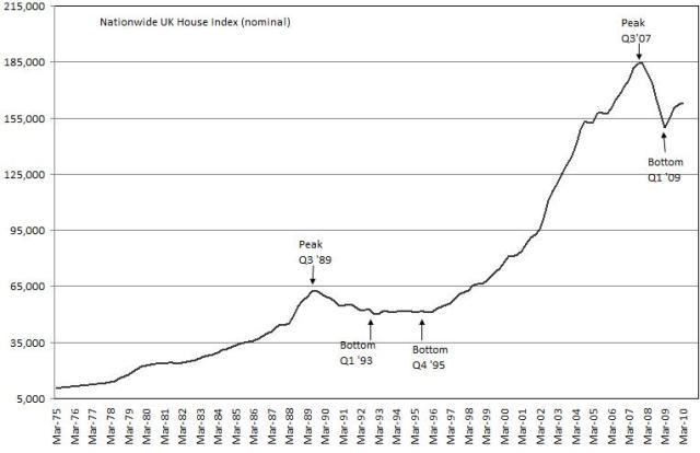
And a close up since the crash.... “The great enemy of the truth is very often not the lie – deliberate, contrived, and dishonest – but the myth, persistent, persuasive, and unrealistic.
Belief in myths allows the comfort of opinion without the discomfort of thought.”
-- President John F. Kennedy”0 -
Unemployment and UK house prices...“The great enemy of the truth is very often not the lie – deliberate, contrived, and dishonest – but the myth, persistent, persuasive, and unrealistic.
Belief in myths allows the comfort of opinion without the discomfort of thought.”
-- President John F. Kennedy”0 -
FTB mortgage costs...“The great enemy of the truth is very often not the lie – deliberate, contrived, and dishonest – but the myth, persistent, persuasive, and unrealistic.
Belief in myths allows the comfort of opinion without the discomfort of thought.”
-- President John F. Kennedy”0 -
I have been trying to get some info and graphs on house prices around the world
this is an interesting one
It shows time on the X axis against multiple of average income on the Y axis
USA looks cheap 2.8 avg income and has plumetted to as low as it ever was (since 2000), Spain on the other hand has not really fallen that much despite what we are told on the news. But the page I got it from says the Spanish Gov has dubious figures, and it is in reality much lower.
And this one, you are all familiar with
Who decided to put that arbitrary red line as if that is where the market is supposed to be? Correct me if I'm wrong but isn't that red line exponential? I would think that after all these bubbles we would have learned that exponential models are just plain wrong. It should be a straight line, and there's really no saying how steep that straight line should be, it could be a lot less steep than the red line shown.
forget Barclays and others lying about Libor, in comparison to the spanish government lies about property prices in spain. (all banks in spain would be totally insolvent if they actually wrote down the property values -- well the're insolvent anyway )
the red line doesn't seem exponential to me; just a gently rising curve
and no, there is no economic law or holy book that says the line should be straight or any other shape particularly
the line isn't what some-one 'thinks' but the result of a mathematical technique to determine the 'best fit correlation'.0 -
Moreover with incomes rising exponentially (historically) why shouldn't house prices have done the same (note I'm not saying anyhting about the future.
Also housing expenditure may be a 'residual' after other spending for example if real incomes increase realitve to all other goods excluding houses then as income increases it would be possible to maintain exactly the saem level of consumption of all other goods and pay a higher proportion of income on housing. This is likely to be a reality in the UK where desired household formation exceeds house building due to planning restrictions and thus the households have to compete against each other by offering to pay a larger proportion of their income than their competitors in order to secure one of the limited number of houses.forget Barclays and others lying about Libor, in comparison to the spanish government lies about property prices in spain. (all banks in spain would be totally insolvent if they actually wrote down the property values -- well the're insolvent anyway )
the red line doesn't seem exponential to me; just a gently rising curve
and no, there is no economic law or holy book that says the line should be straight or any other shape particularly
the line isn't what some-one 'thinks' but the result of a mathematical technique to determine the 'best fit correlation'.I think....0 -
That unemployment chart looks scary. Are things really that bad? I thought because of the Olympics everything is picking up around London. Hotels restaurants everything, what will happen after the Olympics and everyone goes home? Then all the temp staff involved with the games and security all join the dole lines?House Prices 2007/08 £200K, Silver £5oz
Ratio 40,000 oz to 1 house.
2012 Fallen to £160K, Silver risen to £20 per ounce. So house/silver ratio fallen to 8000.
Prediction for the end of the decade, will keep falling at current rate until 1000 oz or less valued same as average house.0 -
Treadstone2.0 wrote: »That unemployment chart looks scary. Are things really that bad? I thought because of the Olympics everything is picking up around London. Hotels restaurants everything, what will happen after the Olympics and everyone goes home? Then all the temp staff involved with the games and security all join the dole lines?
Not sure, but from my experience most seem to be foreign. Whether entitled to dole or not is another matter.0 -
HAMISH_MCTAVISH wrote: »FTB mortgage costs...
As great as this is it does miss a point, all it says t those who can afford houses... can afford houses.
It doesn't really show the increasing numbers of young people being priced out, I will admit this does seem to be getting better slowly.
Some interesting stats none the less.Have my first business premises (+4th business) 01/11/2017
Quit day job to run 3 businesses 08/02/2017
Started third business 25/06/2016
Son born 13/09/2015
Started a second business 03/08/2013
Officially the owner of my own business since 13/01/20120 -
Not sure, but from my experience most seem to be foreign. Whether entitled to dole or not is another matter.
If they are from EU then they will get dole.
But how much will property fall when all this supply becomes empty, and all the demand goes elsewhere?House Prices 2007/08 £200K, Silver £5oz
Ratio 40,000 oz to 1 house.
2012 Fallen to £160K, Silver risen to £20 per ounce. So house/silver ratio fallen to 8000.
Prediction for the end of the decade, will keep falling at current rate until 1000 oz or less valued same as average house.0


This discussion has been closed.
Confirm your email address to Create Threads and Reply

Categories
- All Categories
- 354K Banking & Borrowing
- 254.3K Reduce Debt & Boost Income
- 455.3K Spending & Discounts
- 247K Work, Benefits & Business
- 603.7K Mortgages, Homes & Bills
- 178.3K Life & Family
- 261.2K Travel & Transport
- 1.5M Hobbies & Leisure
- 16.1K Discuss & Feedback
- 37.7K Read-Only Boards