We’d like to remind Forumites to please avoid political debate on the Forum.
This is to keep it a safe and useful space for MoneySaving discussions. Threads that are – or become – political in nature may be removed in line with the Forum’s rules. Thank you for your understanding.
Debate House Prices
In order to help keep the Forum a useful, safe and friendly place for our users, discussions around non MoneySaving matters are no longer permitted. This includes wider debates about general house prices, the economy and politics. As a result, we have taken the decision to keep this board permanently closed, but it remains viewable for users who may find some useful information in it. Thank you for your understanding.
📨 Have you signed up to the Forum's new Email Digest yet? Get a selection of trending threads sent straight to your inbox daily, weekly or monthly!
The Forum now has a brand new text editor, adding a bunch of handy features to use when creating posts. Read more in our how-to guide
Interesting? Can it be argued?

Graham_Devon
Posts: 58,560 Forumite


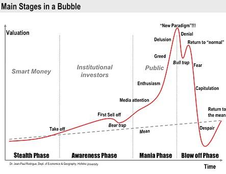
Ok, so this first picture is a chart / graph / doodle / watercolour type thing.
This second graph, covers house prices from 1975 - 2010. So this thread is NOT discussing the "bubble" in the terms we usually discuss the bubble. It's showing prices over a longer period. So let's make no mistake as to the time period we are talking here.

We can all put our own conclusions on this, along with a myriad of different ways of explaining our conclusions...such as real, nominal, blah blah.
I'll possibly put my own conclusion up later, but, just for pure interest, would like to hear what you think. Maybe cut out the bickering. I've only posted up 2 graphs with no comment at this point in time.
I know you cannot put a timescale on the first image, but it does serve as quite interesting.
0
Comments
-
Some people seem to think that prices can outstrip earnings for ever. "A new paradigm" they all cried as they poured money into InsideTrack. "Hooray for houses" they shouted as the Boe lowered interest rates to their lowest level in 300 (yep that's 300) years.
Mental house prices for mental people - imo. Now both graphs look like a bear trap. But without graphs, just looking at the last several years, surely anyone can see that prices went bonkers? Nothing that 'good' can last forever.0 -
there isn't anything to argue because the fundamental problem with this chart / graph / doodle / watercolour type thing is that it was created in 2006 after the event of most of the data - all previous data to 2006 wasn't predicted it was drawn to try and predict the Return to Mean line which is completely wrong.
http://people.hofstra.edu/jean-paul_rodrigue/jpr_blogs.html under Bubbles, Manias and Bears, oh my... (01/18/2006)
all that they seem to have got right is the drop from peak everything else going forward seems to have been wrong.0 -
I'd like to see another two lines on that second graph, the average wage and the average price of something standard like a pint of milk.
Just to prove to my bloody mother that it was harder for me than it was for her because it's a very boring argument.saving up another deposit as we've lost all our equity.
We're 29% of the way there...0 -
The problem with the second graph is that it shows nominal prices, yet includes a period of very high inflation. We would need to deflate it, perhaps by RPI and / or by average earnings, in order to be able to see whether it resembles the phenomenon shown in the doodle thing.0
-
there isn't anything to argue because the fundamental problem with this chart / graph / doodle / watercolour type thing is that it was created in 2006 after the event of most of the data - all previous data to 2006 wasn't predicted it was drawn to try and predict the Return to Mean line which is completely wrong.
http://people.hofstra.edu/jean-paul_rodrigue/jpr_blogs.html under Bubbles, Manias and Bears, oh my... (01/18/2006)
all that they seem to have got right is the drop from peak everything else going forward seems to have been wrong.
It was created in 2006 yes.
So either the creator had a crystal ball. Or the creator was correct for at least the next four years.
Or, it's all just one big canny co-incidence.
We all have our own conclusions. My problem is in the fact that for it to play out, based on the second graph, prices would have to plummet to unthinkable levels.
But then, on the other hand, even though I personally can't see prices going that insanely low, ever....banks collapsing and BOE at 0.5% was also pretty unthinkable. Both of those happened. The dotcom crash was unthinkable and that happened.
If we added inflation on, can see the chance of property prices falling that far though. i.e. 1975 levels + inflation over that period.0 -
House prices on their way down to sub 1975 levels then.
No, wait.This is a system account and does not represent a real person. To contact the Forum Team email forumteam@moneysavingexpert.com0 -
According to this, the bubble 'take off' point is 1980. The return to some sort of predicted normal sometime after 2010.
1) it strikes me that most mortgages are repaid within the 25 years.
2) the mean line has been drawn on by an idiot. House price growth is percentage based (say x% a year), the mean should be represented by an exponential line, not a straight one.0 -
it wouldn't be hard to know that if prices fall, they will rise again - that's all he has done. he has predicted nothing else.Graham_Devon wrote: »It was created in 2006 yes.
So either the creator had a crystal ball. Or the creator was correct for at least the next four years.
Or, it's all just one big canny co-incidence.
it would put prices to 1970 levels if it were correct - how likely is that?Graham_Devon wrote: »We all have our own conclusions. My problem is in the fact that for it to play out, based on the second graph, prices would have to plummet to unthinkable levels.
Dopester please don't answer that")
also, if it were so accurate how come the Return to Mean line is so very wrong?0 -
fastforward 30 years, im 99% confident that the graph from this point onwards will mirror the graph you have put up. i.e a dip, then stagnation, then all the way up to the next time we have major crash/recession/credit crunch part 2.0


This discussion has been closed.
Confirm your email address to Create Threads and Reply

Categories
- All Categories
- 354K Banking & Borrowing
- 254.3K Reduce Debt & Boost Income
- 455.3K Spending & Discounts
- 247.1K Work, Benefits & Business
- 603.7K Mortgages, Homes & Bills
- 178.3K Life & Family
- 261.2K Travel & Transport
- 1.5M Hobbies & Leisure
- 16.1K Discuss & Feedback
- 37.7K Read-Only Boards